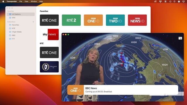
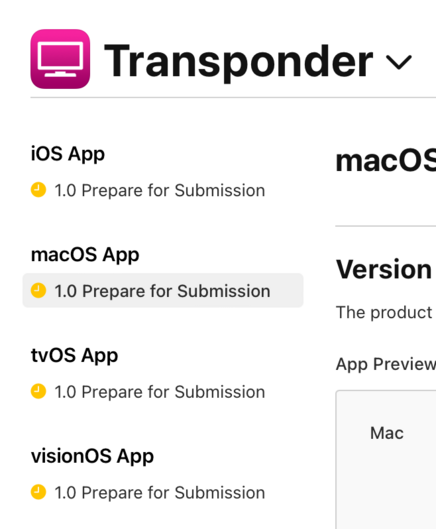
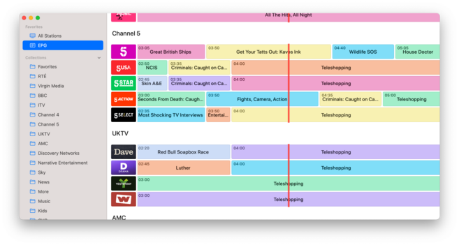
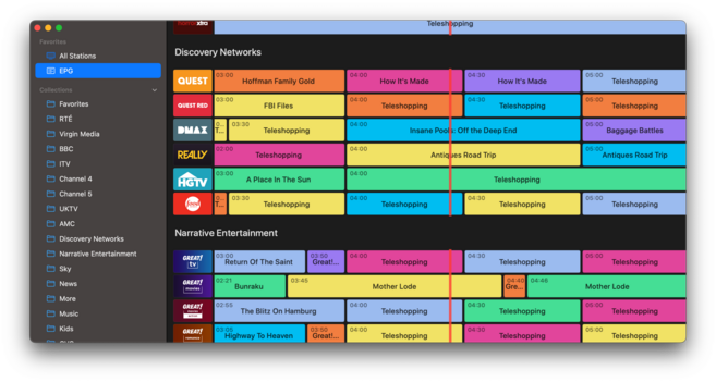
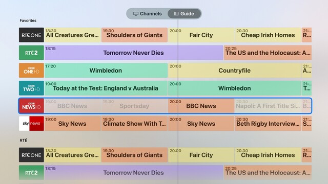
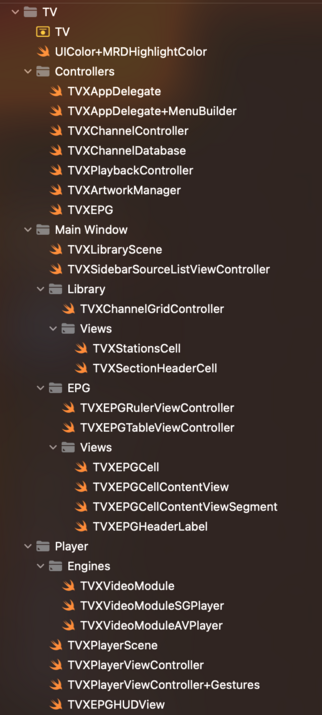
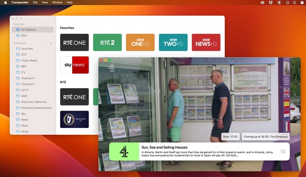
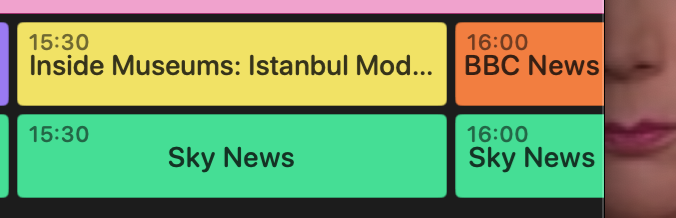
Warming up the productivity engines by putting some effort into my internal satellite TV app, which now has a new product name to go with. Revamping the janky 2015 ObjC codebase with modern Swift. Still an internal app, however, not one I have plans to distribute
Trialed a few Midjourney-assisted icons but ended up going back to a plain glyph. Just looks better on the tvOS homescreen
Major rewrite of my EPG view today; really struggling with making it look nice, but it works
Still experimenting with displaying information on tvOS; now, I have color-coded genres, at least. Not at all happy with how I denote 'now’, but maybe I just need a ruler at the top with a big line through the entire list
Big line it is
And the last of the Objective-C is gone; satellite TV app is now a fully modern codebase. Every little corner has been given a once-over
@stroughtonsmith Really beautiful looking app. So much better than any other live tv app out there.. :/
@stroughtonsmith looks cool! Looks similar to what I’ve been working on with TV Launcher (https://apps.apple.com/app/id1622598042)
‎TV Launcher - Live US Channels

‎TV Launcher brings 90+ live US TV channels that you know and love into one convenient launcher across Apple platforms. As the perfect app for cord-cutters, it’s never been easier to start watching live channels. * As featured on iMore & 9to5Mac * Appleʼs TV app makes it easy to track programmes…

App Store
@adamfoot very nice! This one's been simmering for a very long time https://www.youtube.com/watch?v=zsPSMTj6cgc
TVAppDemo

YouTube
@adamfoot @stroughtonsmith I’ll vouch that it’s really good!
@stroughtonsmith I have yet to write a line of Swift and intend to keep it that way. Objective-C forever!
@stroughtonsmith Is this an app you are working on?
@stroughtonsmith what’s the voice over solution look like for something like this?
@its_john_davis I haven't done anything to support VoiceOver? It's only used by my immediate family

@stroughtonsmith yeah, and that’s cool. I was asking more for the thought exercise :D.

Maybe a custom rotor could go through the channels, and then it would iterate through the shows?

@its_john_davis personally I would just provide a custom accessibility label for each row with current and next show. Just because you *can* show all this data to a sighted person doesn't mean it’s particularly relevant for a non-sighted one. I would want an accessible UI optimized to give me context, fast, and not accidentally lose me down a submenu
@stroughtonsmith I know you have reasons for not releasing this, but omg you’re killing me please release it 😵‍💫
@johnhealy its tied to a RaspberryPi using a very custom config specific to me, uses private data sources I can't share, and isn't in any way portable
@stroughtonsmith you could highlight whatever program is currently broadcasted. This is how the tv program app I'm using does it
@loicwolff that’s what it’s doing for the selected row. But I don’t like how it looks if I do it for all rows

@stroughtonsmith Seems the most obvious. Simple and effective.

What if the currently broadcast item was slightly raised and enlarged? Sort of how the currently selected icon on tvOS works. Might be distracting or hide stuff. Maybe fun as a design mockup to try.

There was some tv guide app I used on Windows about 20 years ago that was excellent. Can’t recall the name right now.

@stroughtonsmith This is directv stream here in the states. Not pretty, but it works
@stroughtonsmith maybe a slightly thicker line? Contrast seems a bit low. Not much you can do color wise because of the color coded items below, but maybe a thicker line would cut through more. Honestly a dark UI and color scheme might cut through more since white can contrast a wide array of colors.
@stroughtonsmith This looks great! I guess you have already, but have you seen TV launcher? https://apps.apple.com/gb/app/tv-launcher-live-uk-channels/id1622598042
@JoeR looks great if you're already paying for 10 different web services. Doesn't really help with my satellite dish though
@stroughtonsmith Is "now" indicated in the gif? I don't see it. I like the line idea or have the colors less opaque/more transparent before "now”.. or both. 🙂
@stroughtonsmith Oh, nevermind. I see it now. But, yea, it took me a bit. Sorry. 😄
@stroughtonsmith for some reason your videos you upload never come through on my mastodon instance. It’s really odd.
@james just takes time; smaller instances don't have the resources to mirror videos that fast, and mightn't work at all for large file sizes
@stroughtonsmith Too many colors for me :-) How about making it grey with color accents? (Colored bar on top or the left for example).
@stroughtonsmith The colours got no meaning, right? Their primary job is to alternate?

@stroughtonsmith Yeah, designing an EPG is not straightfoward. There are many edge cases (e.g. super short show vs super long, how to set proper time scales, what does fast navigation do to a limited hardware…). Speaking as someone who used to design one for few million customers :)

I’d personally get rid of these colors or at least match them somehow to genre or the channel logo?

@stroughtonsmith you can try these colors, they work really well.
@stroughtonsmith Nice work! I built the EPG view in EyeTV back in the days so I know the challenges 😉
@timac That looks fun. What are you using for the EPG, @stroughtonsmith? I remember having to segment CGLayers on the original iPad UIKit version (and I think I may have even had to do one layer per row) to stay within the texture restrictions. I know that's better with tiled view and better GPUs, did you have to account for anything like that?
@uliwitness @timac I used EyeTV for years; this is hooked up to a Netstream 4Sat and other tuners via a Raspberry Pi with tvheadend (for combining inputs). The EPG view is just rows of cells — it doesn't scroll horizontally, there's no recording or reason to look ahead. I adjust labels to always fit inside the superview frame if onscreen. Colors currently at random but I might hook them up to genre
@stroughtonsmith @uliwitness Nice! We used to have a combination of multiple EPG providers. Depending on the channels, the dvb-s EPG might be good enough
@timac @uliwitness I can cheat and use BSkyB, since this isn't for the public 😜
@stroughtonsmith @timac Haha, it looks like so much more :D Great work!
@stroughtonsmith it’s already looking quite good, so I have faith in your awesome powers to make it truly shine. Rock on!
@stroughtonsmith I’d soften the coloring of the the dark mode to be more like the light mode
@stroughtonsmith that’s a shame. Those skeuomorphic TVs look great
@stroughtonsmith actually bottom left looks great on the phone.
@stroughtonsmith wait this skeumoformic TV icons were made by Midjourney!!?
@stroughtonsmith why do I want to give those icons a whack on the side?
@stroughtonsmith do you mind if I use this one? I think it would be neat for a @pixelfed instance. If not, I’ll fire up the ole’ AI 😂
@stroughtonsmith Would buy this in a second! Please make plans to distribute!
@stroughtonsmith Will you make it public ? 😁

@stroughtonsmith would you consider open sourcing the code base once you’ve revamped it?

I understand why you wouldn’t open source one of your commercial apps but I’d be really interested to see you how you’ve approached UI development in Swift and UIKit, and this might be a good opportunity.

I’m thinking more in terms of “here’s my take on how I do UIKit development on Apple platforms” rather than “I’m maintaining an open source streaming UI and channel browser”.