
All the Mac nerds saying Liquid Glass in Tahoe went too far, but I don't think it went anywhere near far enough 😅 I want to see it go forward, not backward. Give it more color, give it more depth and clarity, more animation, (maybe call it Aqua…), but let's not revert to what was already a Dye-era iOS-7-inspired design anyway
Ryan Fraley
@fraydog
- 0 Followers
- 19 Following
- 49 Posts
Tech guy in a car space
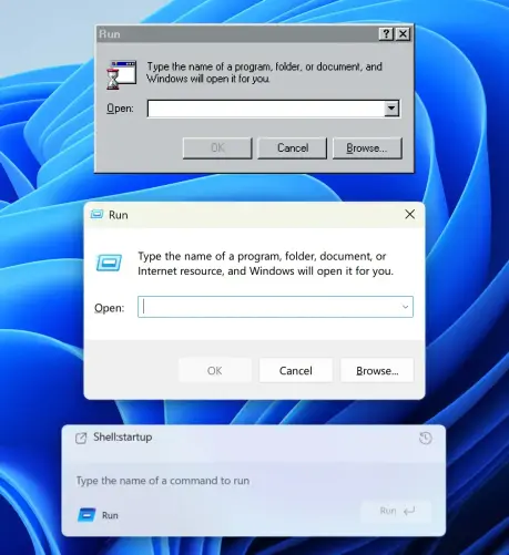
How UI degrades over time.
Top (Windows 95): great contrast, obvious shapes. Instantly readable.
Middle (Windows 11): shapes are still self-explanatory, but contrast is gone.
Bottom (Windows 11 Insiders): what am I even looking at? The only shape I can understand here is the Run button. Barely visible, though.
Then, on the left, there’s another something that says Run and has an icon. What is it? A window title? Another button? Why does it have to say Run twice?
... 1/3
I bet it's the raw milk. SMH
https://mastodon.social/@arstechnica/113647879613018537
https://mastodon.social/@arstechnica/113647879613018537
Rory turning back into a golfer from a politician is a really good thing for the game of golf
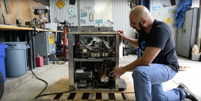
McDonald’s ice cream machine teardown shows error codes, DMCA keep it broken
Public Knowledge and iFixit want the right to repair commercial kitchen gear.

It's time for #SportsMastodon to take off.
Just when I think we all need to figure out how to make this platform more diverse and grow faster, Elon does the hard work for us by saying something completely stupid.
Hate speech researchers sued by X accuse Musk of being an “authoritarian”
Lawsuit comes as Musk and Yaccarino seize control of X's trust and safety team.

