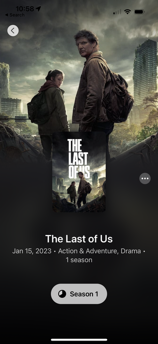
@neven Yeah, been driving me crazy since 2013. I’m surprised they didn’t change it with TLoU II (and then the show), but since they didn’t, I guess someone at Naughty Dog feels strongly about pulling graphic designers’ chains. 😛
Also, the vertical spacing difference above and below LAST feels more obvious now that you fixed the left edge. *sigh*
Hm... while I agree with you on the aesthetic level (the right version looks more pleasing/satisfying), I’m thinking...
What if, just what if...
this indentation is supposed to the setting and topic of THE LAST OF US is about?
* loneliness
* post-apocalypse
* pandemic
* zombies
* collapse of society
If the world in this setting is off, then wouldn’t it make sense that the title reflects in the way the letters arranged to evoke an eerie feeling?
So, it could be intention, right?
@neven absolutely wrong! In the apocalypse no one has time for hanging Ts properly. What’s your address so I can send the murderers?*
* not an actual death threat
@neven Ah cool theory (I hadn’t seen the one on Wikipedia).
Also, not sure if you were kidding around, but as a Pokerface fan I hope Rian Johnson takes your call! 😅