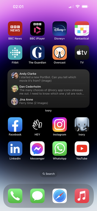
The many choices of @Ivory app icons stresses me out. I need to know which one y’all are rocking.
@simplebits @Ivory Same! I went with Iconic Royal.
@timbrown Ha, same!
@simplebits @Ivory The RIP, just so I can see Tweetbot.
@kimonostereo A classic :)
@simplebits @Ivory Original Royal for now. I liked the Iconic Yellow during the beta, but I want to give the new icon some time to grow on me.
@simplebits @Ivory I’m still on the trial but I love how Deep Sea stands out.
@simplebits @beep top *30* 😂
@simplebits omg I didn’t even notice until you said this. THEY ARE ALL SO GOOD.
@rachelskirts I am sorry 🤣
@simplebits @Ivory I like Marker. I think it depends a lot on what other apps are in visual proximity.
@shiflett Good point! It’s a great option to have
@simplebits - I go back and forth between the yellow icon from the beta and the default royal icon. Can’t decide.
@simplebits @Ivory Gold and RIP
@malarkey Looking sharp 🙌
@simplebits the dearly departed bird
@simplebits Simple. Monochromatic. Marker.
@simplebits yellow warning. The bright yellow and black aesthetic is something i’ve been interested in since getting back from Western Australia where a number of shops seemed to use it across their businesses.
@simplebits Shared mine a couple days ago… https://mstdn.link/?to=https://me.dm/@stop/109735458038827924

@stop That one works well with other blue apps 👍
@simplebits For now, also using that as Ivory’s highlight color. Found that it works pretty well contrast-wise with both light and dark modes.
@stop @simplebits Been switching between Original Royal/Blue/Black.
@d @garrettmurray @gruber @stop @simplebits
I kind of feel sad now ... my doc is way less fun :(
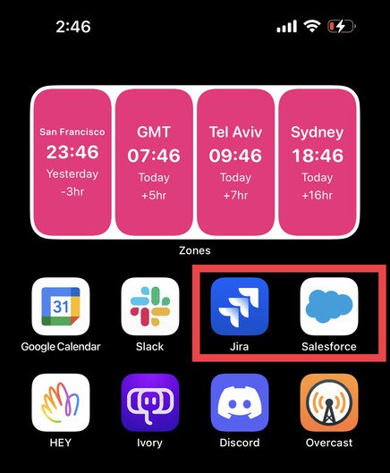
@d @garrettmurray @gruber @stop @simplebits due to the state of the world, I need one to log into the other. While I'm all for the separation of duties and won't like work crap on my personal phone ... being in the escalation path. Well I guess it's what I signed up for. ¯\_(ツ)_/¯
@simplebits @Ivory Keeping it beta and sticking with “Warning”.

@simplebits @Ivory It’s all about the RIP, baby.
@simplebits @Ivory RIP icon 🥲
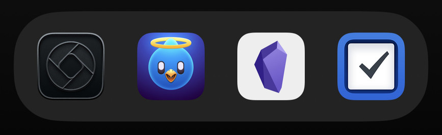

@simplebits using the rip tweetbot one at the mo
@simplebits @Ivory thanks for the reminder that that’s a thing! Let’s try… Warning. Sits nicely amongst the other icons at the bottom of my home screen.
@simplebits @Ivory black on black. Stealth, it is called, I think
@simplebits @Ivory they all look great, but this one deserves a second look. Seems to go with all my wallpapers pretty well, too.