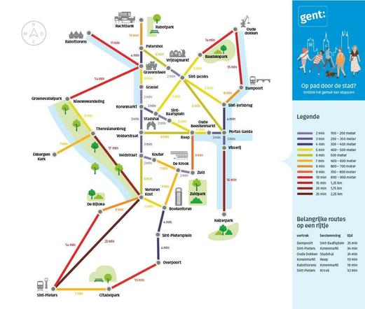
GOOD IDEA: This may look like a transit map, but it’s actually a map of typical walking times & distances in the walkable, car-free Spanish city of #Pontevedra. A simple, clever idea that every city working to be more walkable should steal.
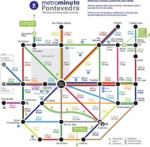
GOOD IDEA: This may look like a transit map, but it’s actually a map of typical walking times & distances in the walkable, car-free Spanish city of #Pontevedra. A simple, clever idea that every city working to be more walkable should steal.
@BrentToderian That is such a great example.
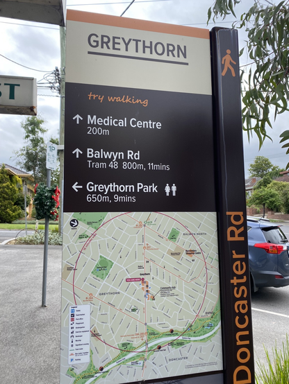
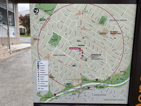
Having sign boards mapping the “20 minute city” concept here in Melbourne, Australia is something that has truly changed my behaviour. Was embarrassed to learn our supermarket is only 300m away and I was driving there 😳 The family now walks for almost all short trips, shopping & connecting to transport outside the “20 minute” zone.
What's wrong with an actual map?
@BrentToderian Legible London is a really good example of this done in physical space to help people get their bearings and show what’s in (very) easy walking distance:
https://tfl.gov.uk/info-for/boroughs-and-communities/maps-and-signs
@BrentToderian Take a look to this short documentary about how Pontevedra looks now (in Galician with English subtitles)

@BrentToderian how ableist of you, on the first day of the new year.
Are you also encouraging people not to mask or get vaccinated?
@BrentToderian There are similar maps around London:
https://www.city-walks.info/London-en/Walk-City-Thames.html
or
https://walks.gojauntly.com/walks/brutalism-beach-banksy-bridges-16610098569061536231
I am trying to locate a picture of the maps you come across on the streets in Southwark which tell you what is in range of 5 minutes walk, or 10 minutes, 15 minutes.


