Check out how land is used in the United States. Cows take up the most space!

https://www.bloomberg.com/graphics/2018-us-land-use/
First in a 🧵 of #2022TopToots

Here’s How America Uses Its Land

The 48 contiguous states alone are a 1.9 billion-acre jigsaw puzzle of cities, farms, forests and pastures.

Bloomberg.com
Chocolate consumption and Nobel Prizes: A bizarre juxtaposition if there ever was one

Scientific American Blog Network

This map shows only people. It is a beautiful illustration of where people are concentrated.

If you squint, you can see Australia and New Zealand.

Map by Alasdair Rae https://www.visualcapitalist.com/cp/3d-map
Third in a 🧵 of #2022TopToots

3D Map: The World’s Largest Population Density Centers

What does population density look like on a global scale? These detailed 3D renders illustrate our biggest urban areas and highlight population trends.

Visual Capitalist

Check out this scatterplot of health spending per capita (x axis) & life expectancy (y axis) in OECD countries (lines = averages).

The United States sits alone in the bottom right quadrant due to its much higher spending and below-average life expectancy.

More info: https://oecd-ilibrary.org/sites/ae3016b9-en/1/3/1/index.html?itemId=/content/publication/ae3016b9-en&_csp_=ca413da5d44587bc56446341952c275e&itemIGO=oecd&itemContentType=book
Fourth in a 🧵of #2022TopToots

Home

OECD's dissemination platform for all published content - books, podcasts, serials and statistics

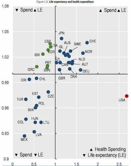
@conradhackett guess why?

#Healthcare isn't seen as a #HumanRight, but a #commodity in the #USA.

That's why #MedicalDebt is rampant and why the life expectancy is declining there as well...

@conradhackett Greatest country in the world baby!
@conradhackett That's a strong contender for the next desktop change.

@conradhackett

The Nordics are basically gone.

This is great, thanks for sharing!

@conradhackett Heaven help the cities on the coastlines during the next 50 years….as the sea levels change how will the map develop??

@morganalafee @conradhackett

If anything it might get more concentrated: it's a lot easier to build sea walls and flood mitigation infrastructure around a smaller, more concentrated area than a sprawled out area.

@rob @conradhackett Then, would we have large areas very like the Netherlands???
@conradhackett OK, just at a glance, it looks like every butterfly in the world taking flight.
@conradhackett
learned today because of this map: Australia and Madagascar have roughly the same population
@conradhackett Matching up that map with the areas being hardest hit by increasing heat is grim.
@conradhackett This really makes that map that has the circle with more people living inside of it than outside of it a lot more intuitive.
@conradhackett I think the trade off is the amount of pickled fish.
@conradhackett Before gobbling the Lindt, please be sure to read the linked-to Scientific American article where Jogalekar appropriately rips the research to shreds. Both a sampling issue and failure to account for third variables.
@cenfetelli @conradhackett as a bit of a chocolate snob, I also have to question what the quality of chocolate is that's being consumed. If it was high quality 🍫 , the US wouldn't even rank on that graph. I spent the first three decades of my life there, and what Hersheys does to their chocolate is unspeakable 🤢
@seawall @cenfetelli What chocolate do you like best?

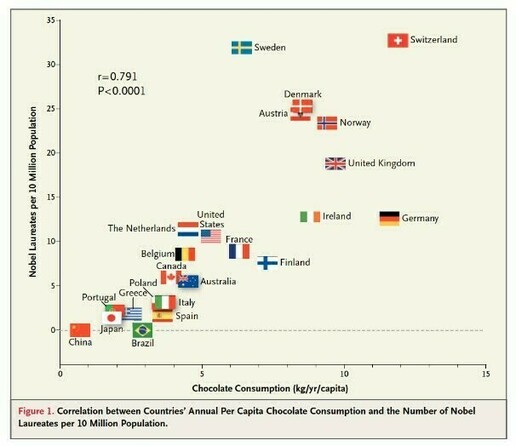
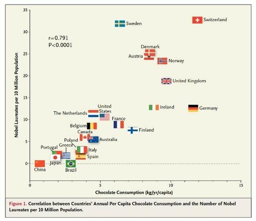
@conradhackett @cenfetelli oooh, if money were no object I'd be having a selection of Bohemein Chocolates every week. Locally crafted chocolate by a pastry chef formerly from the Czech Republic. Wellington Chocolate Factory also a good time, very strict bean to bar standards.

But while I'm on a budget, Whittakers Dark Ghana is my go-to bar.

@conradhackett
oh, i didn't know we germans are world leaders. 😀
unfortunately only in chocolate consumption, not in number of nobel prizes. 😳
@conradhackett interesting and strange reading. Will be interesting in stat math classes
@conradhackett Nooope. Spain should be higher in consume of chocolate just only with my consume 🤭
@conradhackett A fucking correlation. What they could try is to make one with politics...
@conradhackett How can there is so many golfs?!
@Sylvhem @conradhackett can is better why?

@erichhugo I… I don’t know what happened in that previous message. I decline all responsibilities 😅.

@conradhackett

@erichhugo @conradhackett More seriously, English isn’t my main language, and when I’m both tired and not paying attention, I got things like this.

My question obviously was: “Why is there so many golf courses?!”

@Sylvhem @conradhackett no worries i am not native English either
@conradhackett fascinating visualization strategy.

@conradhackett This is the way it was designed. Take Native land by force to give to the Cattle Barons:

https://mastodon.social/@seedthecommons/109379709095568742

#LandBack #Native

@conradhackett no wonder they needed 'more cow bell' 🤣
@conradhackett Being reduced to one senator and ten house seats is going to be a blow for golf
@conradhackett I don't understand how humans have been cramped together, and animals get massive fields of space !?
@conradhackett @Bassman_7 Uh, you haven’t seen dairy farms. There is no space and it’s disgusting.
@conradhackett
I have driven through most of those places from edge to edge and I can tell you most of it is wrong. But cool map!
@starguy @conradhackett I don’t think this is supposed to represent *where* each of these is found, only the relative amounts of land used, depicted in the shape of the US map. Right?
@dmwcg @conradhackett I can tell you the relative amours used for some areas labled are way way off. But as most info graphics, they are generated to side with whatever point they want to get across, and this seems to be cows in my own opinion.
@dmwcg @starguy @conradhackett right. No relation with the geographic location of each of these uses is intended.
@almodozo
Got it. Its a basically a pie chart shaped like a nation. I saw it as the typical "this region has...." Info graphic maps are normally repurposed for.

@dmwcg @conradhackett
@conradhackett I'm surprised there is no parking lots on this map.

@conradhackett
I’m not sure what criteria this is based on. Missouri has cows, pigs, turkeys, chickens, goats, cotton, soybeans, rice, and corn as our major agricultural exports.

We also supply Canada, Mexico, China, South Korea, and Japan with food

Corporate greed is running up food prices, not supply chain costs. When you live in the same area as the products are grown & raised, the cost of those products should not rise almost 400% in five years.

@conradhackett I wonder if they had actually set aside that much space to indigenous plants, animals and peoples if we would actually have more food. Just in the form of Bison, rather than penned up beef.
@conradhackett I grew up on a cattle ranch. The land you described is The Great American Desert. It is used for cattle because little else will thrive. My grandfather allocated 20 acres of pasture per cow, and the cattle shared it with antelope, coyotes, and snakes. I challenge your underlying assumption. The land is suited to grazing cattle.
@conradhackett My husband and I took a 5-month trip across the southern tier of the country. I was first surprised to find so many cattle in Florida, only to be amazed that every single state’s farms were overwhelmingly cattle ranches. I remember being so confused - who knew cows were everywhere? Not me.
@conradhackett Needs more barley and maple syrup.
@conradhackett I grew up Urban but have lived almost all my adult life in Cow.
@conradhackett Shocking. Cow country is our methane scourge.
@conradhackett That is excellent. I guess if all of USA went vegan & stopped eating cows & drinking their milk global warming could be overturned
@conradhackett that is so depressing and I'm not even American
@conradhackett I’d highlight the space taken up by cows + livestock feed. (So little wilderness.)
@conradhackett amazing what a small portion is airports
@conradhackett
(vegan Georgism intensifies)

@conradhackett
So we waste almost as much land on ethanol as we use for growing food when so many people suffer food insecurity.

Typically brilliant. 🙄

https://e360.yale.edu/features/the_case_against_ethanol_bad_for_environment

The Case Against More Ethanol: It's Simply Bad for Environment

The revisionist effort to increase the percentage of ethanol blended with U.S. gasoline continues to ignore the major environmental impacts of growing corn for fuel and how it inevitably leads to higher prices for this staple food crop. It remains a bad idea whose time has passed.

Yale E360