Missing values are a common challenge in data analysis, and properly reporting them is a critical step in understanding your data. By examining the patterns and proportions of missing values, you can assess the potential impact on your analysis and decide how to handle them effectively.

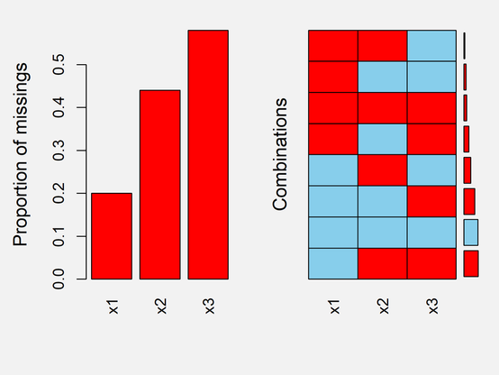
The attached image, created using the VIM package in R, illustrates the proportion of missing values across variables.

More: http://eepurl.com/gH6myT

#advancedanalytics #data #package #datasciencecourse

There are many reasons why you should switch to R, even if you are already familiar with another tool.

To give you a more detailed comparison with other popular software tools, I have created a series of LinkedIn posts where each post compares R with one other tool.

Want to dive deeper into R? I have created a comprehensive online course specifically designed for beginners.

Click this link for detailed information: https://statisticsglobe.com/online-course-r-introduction

#rprogramminglanguage #data #datasciencecourse

If you're a Stata user, you should switch to R now!

Thinking about switching to R? Check out my online course for absolute beginners in R programming.

Click this link for detailed information: https://statisticsglobe.com/online-course-r-introduction

#advancedanalytics #data #package #datasciencecourse #statisticsclass #rprogramminglanguage

I used to think that writing sophisticated R code meant using all the advanced features and chaining long functions together...

Fancy code can be fun, but clean code makes collaboration and debugging so much easier.

Stay informed on data science by joining my free newsletter. Check out this link for more details: http://eepurl.com/gH6myT

#datastructure #datasciencecourse #datasciencetraining

Statistics Globe

Statistics Globe Email Forms

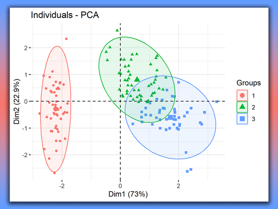
Combining Principal Component Analysis (PCA) with k-means Clustering in R can significantly enhance your data analysis by reducing dimensionality and improving clustering performance.

Check out my article created with Cansu Kebabci: https://statisticsglobe.com/pca-before-k-means-clustering-r

I've also created a video: https://www.youtube.com/watch?v=nzhSjOKSGC8

Furthermore, I offer an extensive online course on PCA: https://statisticsglobe.com/online-course-pca-theory-application-r

#datasciencetraining #bigdata #advancedanalytics #datasciencecourse

How to Use PCA Before k-means Clustering in R (Example Code)

How to combine PCA and k-means clustering in R - R programming example code - Extensive info - Actionable R programming code in RStudio

Statistics Globe

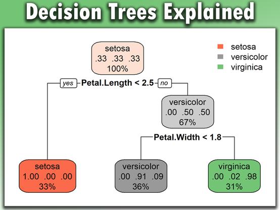
Decision trees are a powerful tool in data science for making decisions and predictions based on data. They work by splitting data into branches based on specific criteria, allowing for clear and interpretable decisions. When used correctly, decision trees can significantly enhance the accuracy and interpretability of models.

Learn more: https://statisticsglobe.com/online-course-statistical-methods-r

#datasciencecourse #dataanalytics #statisticsclass

Online Course: Statistical Methods in R

The Ultimate Course to Quickly Master Statistical Methods in R - Instructor: Joachim Schork - Statistics Globe

Statistics Globe

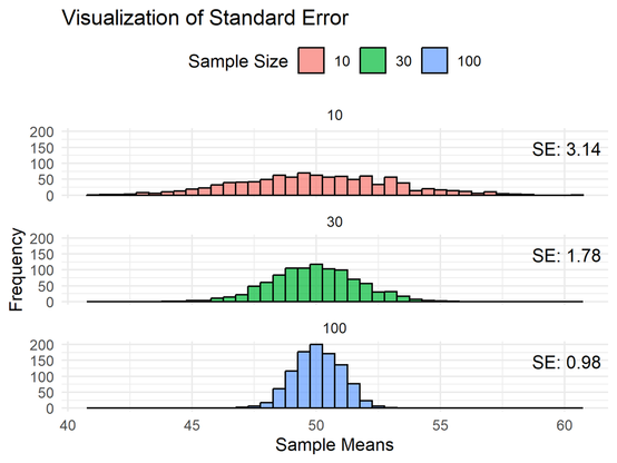
The Standard Error measures how much a sample statistic, like the mean, is expected to vary from the true population parameter. It helps us understand the precision of our estimates and how much confidence we can place in our results.

Learn more: https://statisticsglobe.com/online-course-statistical-methods-r

#datasciencecourse #dataanalytics #statisticsclass

Online Course: Statistical Methods in R

The Ultimate Course to Quickly Master Statistical Methods in R - Instructor: Joachim Schork - Statistics Globe

Statistics Globe

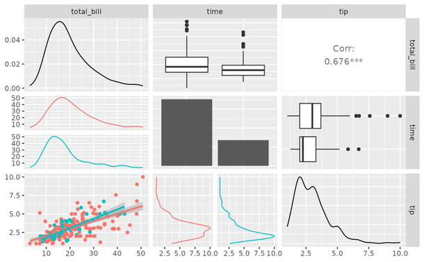
Simplify and elevate your data visualization with GGally, an R package designed to extend ggplot2 by providing specialized tools for visualizing complex data relationships. Whether you're exploring data, comparing models, or analyzing correlations, GGally has you covered.

Visualization: https://ggobi.github.io/ggally/

More details: https://statisticsglobe.com/online-course-data-visualization-ggplot2-r

#tidyverse #datavisualization #datasciencecourse #data #package #rprogramminglanguage #dataviz #ggplot2

Extension to ggplot2

The R package ggplot2 is a plotting system based on the grammar of graphics. GGally extends ggplot2 by adding several functions to reduce the complexity of combining geometric objects with transformed data. Some of these functions include a pairwise plot matrix, a two group pairwise plot matrix, a parallel coordinates plot, a survival plot, and several functions to plot networks.

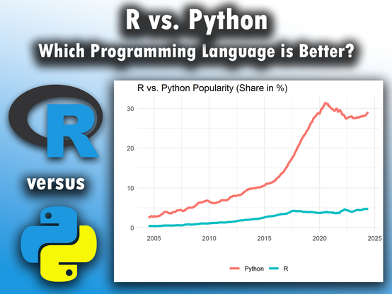
Both R and Python are powerful tools widely used for data analysis and research, making them worth a detailed comparison.

Data credit: https://www.kaggle.com/

Learn more: https://statisticsglobe.com/online-course-r-introduction

#bigdata #rstudio #datascientists #datasciencecourse #package

Kaggle: Your Machine Learning and Data Science Community

Kaggle is the world’s largest data science community with powerful tools and resources to help you achieve your data science goals.

In Bayesian inference, a credible interval is a range of values within which a parameter lies with a certain probability, given the observed data and prior beliefs. The image of this post (based on this Wikipedia image: https://en.wikipedia.org/wiki/Credible_interval#/media/File:Highest_posterior_density_interval.svg) represents a 90% highest-density credible interval of a posterior probability distribution.

More details: http://eepurl.com/gH6myT

#statistical #datasciencecourse #datascience #rprogramming #datastructure

Credible interval - Wikipedia