I finally read BUILDING SCIENCE GRAPHICS from @ChristiansenJen

Come here to:
- learn essentials for layout explanatory visualizations
- creating a visual hierarchy
- find tips from a seasoned expert for little hacks all around

Do not expect to find out more on
- data graphics

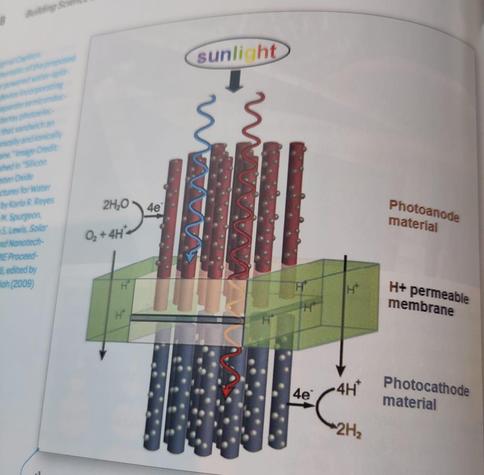
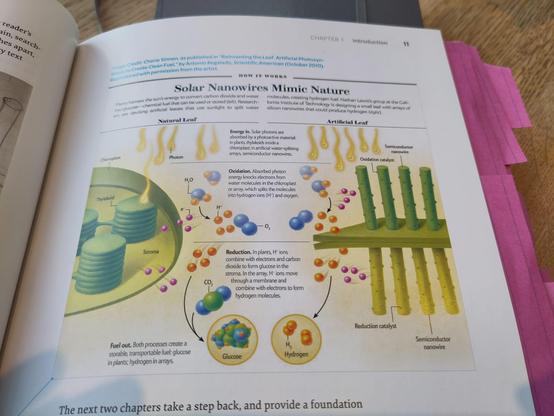
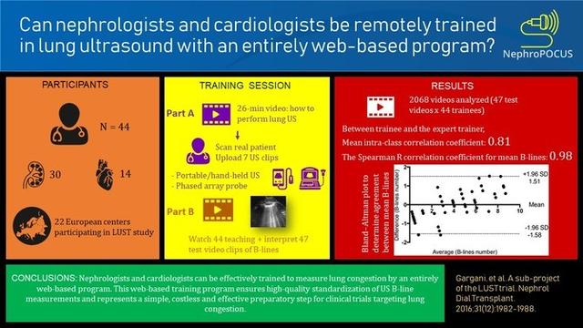
The focus really is what today is called #GraphicalAbstracts and #SciencePosters

https://www.buildingsciencegraphics.com/

Building Science Graphics

Building Science Graphics is an illustrated guide to communicating science through diagrams and visualizations

Building Science Graphics

Fancy the idea of #GraphicalAbstracts in academic papers and like to have one in your next paper too? Struggling coming up with one?

Worry no longer! @helenajambor & M. Bornhäuser get you there (#PLOS Comput Biol 20(2), 2024):

https://journals.plos.org/ploscompbiol/article?id=10.1371/journal.pcbi.1011789

Ten simple rules for designing graphical abstracts

“Thank you for providing me with an exciting and informative read which was truly enjoyable.” 😍

It is really rare that reviewers are comments are fully positive. I will forever cherish the comments I received for our Paper on #graphicalabstracts. What a great experience publishing with @PLOS #PLOSCOMPBIO #SciComm #DataViz 📊 🔬

https://dx.plos.org/10.1371/journal.pcbi.1011789

Ten simple rules for designing graphical abstracts

Mind the Graph and BioRender exist as stellar platforms within the realm of creating scientific illustrations, but have you ever wondered what are the real differences between these two useful tools? 🤔

Explore the differences between them for creating scientific illustrations and graphics in this comparative guide: https://bit.ly/MTG-vs-biorender

#mindthegraph #infographics #graphicalabstracts #science #biorender

Reactome | Icon Library

Reactome is pathway database which provides intuitive bioinformatics tools for the visualisation, interpretation and analysis of pathway knowledge.

So this is not a good graphical abstract. Every design decision you make should have a reason, thats what your readers expect. Why are they using these highly saturated colors? It makes it less legible. And now all the boxes are attracting attention, making it hard for your audience to find your main message. And the icons are more distracting than useful.... We dissect more of these #graphicalabstracts in our blog!