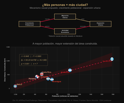
#Día16 | Relaciones – Causalidad | #30DayChartChallenge | ¿Más personas = más ciudad?. Creada usando #Rstats con #ggplot2, # patchwork, #grid, #ggrepel, #scales, #showtext y #ggflags.
#Día15 | Relaciones – Correlación | #30DayChartChallenge | Población vs Área Urbana en Centroamérica. Creada usando #Rstats con #ggplot2, #ggrepel, #scales, #showtext y #ggflags.
#Día 2 | Comparaciones – Pictograma | #30DayChartChallenge. Centroamérica suma más de 51 millones de habitantes. El gráfico fue creada usando R con #ggplot2, #dplyr, #tidyr#, #scales, #ggflags, #sf, #rnaturalearth, #rnaturalearthdata, #patchwork.
#TidyTuesday Comparative heatmaps of holidays and airline passenger volumes (2010-2018) for various countries.
Source: https://www.nature.com/articles/s41597-022-01120-z by Shengjie Lai
Code 🔗 https://tinyurl.com/tidy-hm2
Tools #rstats #ggplot2 #patchwork #ggflags by @jimjamslam
Global holiday datasets for understanding seasonal human mobility and population dynamics - Scientific Data

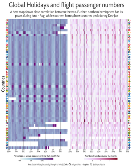
Measurement(s) public holiday • school holiday • airline passenger volume Technology Type(s) digital curation Factor Type(s) geographic location • temporal interval Sample Characteristic - Location global Machine-accessible metadata file describing the reported data: https://doi.org/10.6084/m9.figshare.17833922

Nature
#TidyTuesday🌍📊 A World Transformed: 1950 to 2020: a flags' chart for how global political regimes have shifted !
Data: C. Bjørnskov & M. Rode; {democracyData} thru @jonthegeek
Code 🔗 https://tinyurl.com/tidy-democracy
Tools #rstats #ggplot2 #ggflags by @jimjamslam
Flags of Change: Global Governance Through the Decades – Data Viz Collective

#TidyTuesday Rising ranking of #India at International Mathematics Olympiad, while #China and #USA dominate the last 3 decades.
Data: @emitanaka and IMO
Code🔗https://tinyurl.com/tidy-maths
Tools #rstats #ggplot2 #ggbump by David Sjoberg, #ggflags by @jimjamslam
Presentations, Projects & Data Viz - India at Mathematics Olympiad over the years

#TidyTuesday Comparing salaries of Government #Doctors vs. #Nurses in different countries. Chile and Seychelles pay doctors far more. Qatar pays both less than even clerks!
Data: World Bank Bureaucracy Indicators (2017).
Code: https://aditya-dahiya.github.io/projects_presentations/data_vizs/tidy_wbi.html#government-salaries-doctors-vs.-nurses
Tools #ggplot2 #ggflags #rstats #dataviz @R4DSCommunity
Presentations, Projects & Data Viz - Worldwide Bureaucracy Indicators

#TidyTuesday Public (Government) Doctors' salaries around the world - compared to a clerk in the same country. Qatar & Nicaragua pay least, The Gambia pays the most.
Data: World Bank Research
Code: https://bit.ly/doc-sal
Tools: #ggplot2 #ggflags #rstats #dataviz @R4DSCommunity
Presentations, Projects & Data Viz - Worldwide Bureaucracy Indicators

#ClimateCrisis #dataviz #climatechange National incomes vs. CO2 emissions trend (1990-2022): #Ireland and #Luxembourg raised incomes without raising emissions; reverse happened in #Qatar and #Brunei.
Data: UNDP Human Development Reports
Code: https://tinyurl.com/acf-dip
Tools: #rstats, #gganimate by @thomasp85, #ggflags by @jimjamslam
Presentations, Data Viz & More - Data Visualizations from D.I.P.