In memory of David Hockney, 1937–2026.
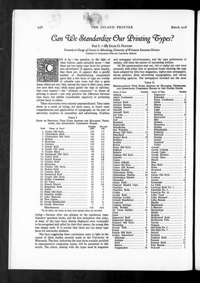
Another Inland Printer tally of types: In 1928, the journal published a University of Wisconsin study of types installed in composing rooms across the US. 166 magazines, newspapers, printers, and ad agencies responded.
https://archive.org/details/sim_american-printer_1928-03_80_6/page/958/mode/2up
Thanks again, @internetarchive! (Have you donated to this fine org lately?)
Staff pick:
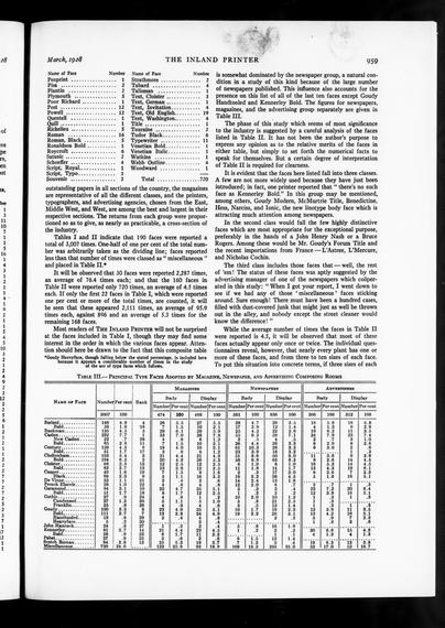
The Philadelphia Museum of Art @visitpham reimagined their visual identity together with Gretel. They commissioned Ryan Bugden @ryan with the design of a custom typeface, Fairmount Serif. It’s supported by a vernacular type palette “inspired by Philadelphia’s rich visual texture of storefronts, street vendors, and murals.” See more:
https://fontsinuse.com/uses/73911/philadelphia-museum-of-art-identity
#PhiladelphiaMuseumOfArt #Philadelphia #museums #FontsInUse #fonts
Philadelphia Museum of Art identity
The Philadelphia Museum of Art, in collaboration with design studio Gretel, rebuilt its identity with the goal of putting the institution in direct conversation with the city that surrounds it. Typography is the primary device for achieving this. The type palette mainly works on
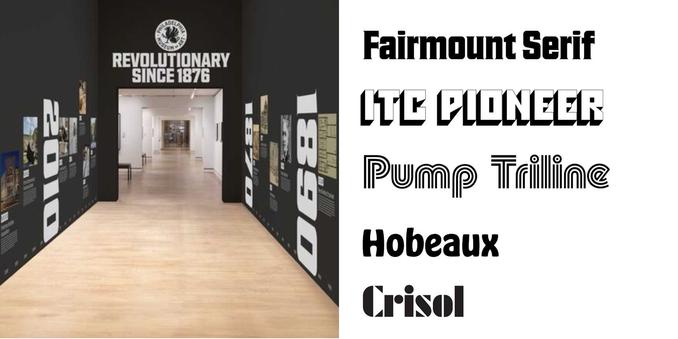
On the occasion of today’s release of Inferno, dive into Boards of Canada’s typography:
https://fontsinuse.com/tags/18251/boards-of-canada
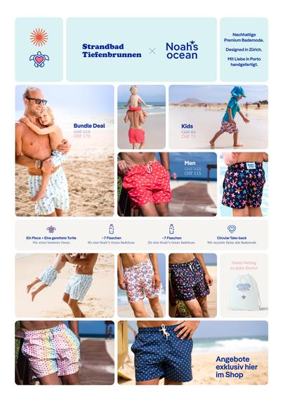
It always makes us smile when brands pair two of our typefaces together. So we were excited to see the killer combo of Nice Micro and Pangea take center stage for the Swiss premium swimwear brand, Noah*s Ocean.
Full case: https://fontwerk.com/en/text/noahs-ocean-pangea-and-nice-micro
Nice: https://fontwerk.com/en/fonts/nice-collection


New FontsInUse post on Sidabro Merginos / Silver Girls exhibition, last year in Vilnius. A daring use of my LTR Limited Grotesque. Exhibition design by @AleksandraSamulenkova Much obliged to @FontsInUse, @fhardwig and @MatthijsSluiter. #exhibitiondesign #fontsinuse #photography #vilnius
https://fontsinuse.com/uses/68424/sidabro-merginos-silver-girls
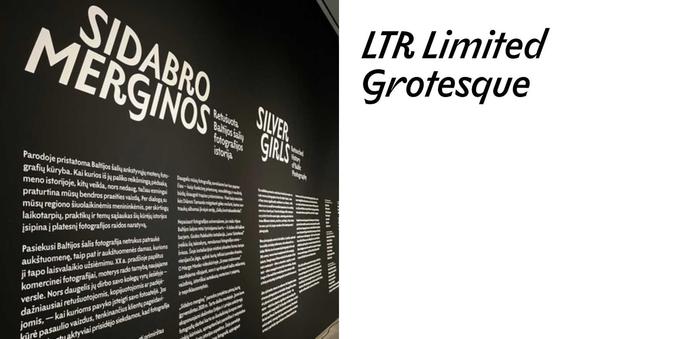
Sidabro Merginos / Silver Girls
Sidabro Merginos / Silver Girls is an exhibition gathering the work of twenty-one early women photographers from the Baltic countries. Taking place at the National Gallery of Art in Vilnius, Lithuania, in 2025, the exhibition graphics were designed by Aleksandra Samuļenkova. De
Staff pick:
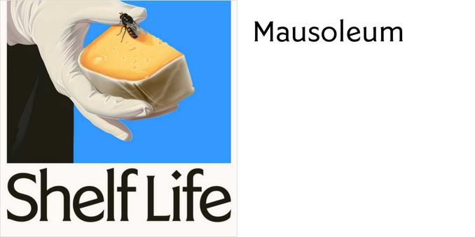
Shelf Life is a feature documentary that observes the parallels of the cheese aging process and the human experience of growing old. The film posters were designed by Lauren King, using Mausoleum. The typeface was designed by Phaedra Charles of Undercase Type who describes it as a “flared serif geometric deco typeface family”. 🧀
https://fontsinuse.com/uses/75940/shelf-life-movie-posters
#FontsInUse #MoviePosters #fonts #typeface
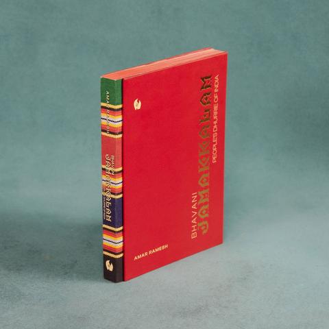
Amakan typeface in use! And incredibly beautiful book https://maralabs.in/products/bhavani-jamakkalam <- #FontsInUse #amakan #typeface #typography #book