A Book Layout Design That Commands Attention: Tom Sarraipo’s Colorful InDesign Template Reviewed
Most book layout templates play it safe. They default to white space, muted palettes, and conservative grids — functional, yes, but forgettable. Tom Sarraipo took a different route entirely. His A4 InDesign template is a full-volume exercise in chromatic boldness, typographic confidence, and structural clarity. It doesn’t whisper. It announces itself. And right now, when editorial design is craving personality after years of minimalist fatigue, that matters enormously.
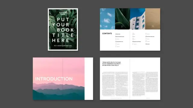
This book layout template is available on Adobe Stock. It ships as a fully customizable, 48-page InDesign file built for professional-grade CMYK printing. But the story here runs deeper than specs. This template represents a specific design philosophy — one that’s worth unpacking carefully.
Download the template from Adobe StockPlease note that this template requires Adobe InDesign installed on your computer. Whether you use Mac or PC, the latest version is available on the Adobe Creative Cloud website—take a look here.
This colorful book layout, designed by Tom Sarraipo, is available as a fully customizable Adobe InDesign template. Download the template from Adobe StockWhat Makes This Book Layout Stand Out From Every Other InDesign Template on the Market?
Most InDesign templates for books follow a predictable formula. You get a neutral cover, a clean table of contents, and a body grid that respects conventional margins. Sarraipo’s book layout breaks every one of those conventions deliberately. So why does it work, when rule-breaking so often fails?
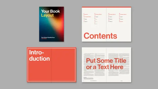
The answer lies in constraint. Despite its visual boldness, every spread in this template follows an invisible discipline. Chapter openers use full-bleed color fields — saturated reds, deep oranges, vibrant yellows, electric teals — but the typography remains anchored and purposeful. Nothing drifts. Nothing competes carelessly. Each color zone has a specific structural role, and that role never changes. That consistency is what separates confident design from visual noise.
The Swiss Design Fingerprint
Sarraipo’s background shows clearly here. Switzerland has produced some of the world’s most influential typographic and editorial designers — Josef Müller-Brockmann, Armin Hofmann, Emil Ruder. Their legacy runs through the DNA of this book template. You see it in the grid precision. But not just that. You can also see it in how large sans-serif typography carries structural weight rather than decorative intent. You see it in the way white space isn’t absent — it’s deployed strategically to create visual breathing room between intense color moments.
This isn’t nostalgia for Swiss modernism, though. Sarraipo adapts it for the contemporary content market, where a book layout also needs to photograph well, hold visual attention on screen, and convert as a commercial product.
Breaking Down the Chromatic Zone System in This Book Layout
I want to introduce a framework here that I think accurately describes what Sarraipo is doing across this template: the Chromatic Zone System. This is my term for a structural approach where color doesn’t just set mood — it delineates function. Each hue corresponds to a specific content layer in the book layout.
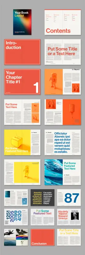
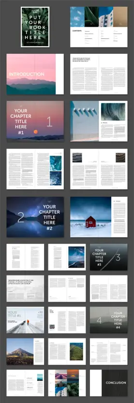
In this template, the system works like this. Red/coral drives section openers and introductions. Orange owns the first chapter’s content spreads, signaling immersion in primary material. Yellow claims the second chapter territory, shifting the reader’s cognitive gear toward a lighter, more exploratory mode. Teal/blue enters mid-book, introducing complexity or contrast. The dark spreads — near-black backgrounds with light type — signal data-heavy or reference content.
Why Color-As-Structure Changes the Reader Experience
When color carries structural meaning, readers navigate intuitively. They don’t need to count page numbers. They feel the transitions. This is a principle borrowed from wayfinding design — the same discipline that guides people through airports or hospital systems. Applying it to a book layout is surprisingly rare, and remarkably effective when executed with Sarraipo’s level of control.
Think about how readers actually use non-fiction books. They skip around, flip back, and search for the section they remember from three weeks ago. A color-coded book layout makes that behavior far more efficient. It transforms the reading object into a navigational tool without sacrificing aesthetic quality. That’s genuinely useful design thinking, not just decorative boldness.
Typography in This Book Layout: When Size Becomes Architecture
The typographic decisions in this template deserve their own close reading. Sarraipo treats headline type as architecture. He treats body copy as infrastructure. The distinction matters.
Across the 48 pages, display text operates at scales that most designers would consider alarming. Full-page numerals — 87, 1251, 2005, 4120 — appear as standalone graphic elements. These aren’t page numbers in the conventional sense. They function as visual landmarks, dividing the book layout into memorable, scannable territories. This technique has precedent in Swiss editorial design, but it’s rarely applied with such confidence in a commercially available template.
The Kinetic Typography Principle
Here’s another framework worth naming: Kinetic Typography Architecture. This describes a layout approach where typographic scale creates the sensation of movement through a static document. In Sarraipo’s book layout, the reader’s eye naturally accelerates past dense body copy and slows dramatically at large display moments. That rhythm — fast, slow, fast, slow — creates a reading experience that feels dynamic rather than monotonous.
The chapter-title spreads demonstrate this brilliantly. “Your Chapter Title #1” appears in massive white sans-serif against a full-bleed orange field, accompanied by an oversized numeral “1” in the lower right. There’s no body copy competing for attention. The spread commands a complete visual pause. Then the next spread opens into a balanced grid with image, body text, and subheadings. The contrast between these two states produces that kinetic sensation.
Why This Book Layout Is Built for Professional Printing
CMYK color mode isn’t just a technical specification. It’s a commitment to the physical artifact. Sarraipo built this book layout for production, not just screens. That means every saturated orange, every bold red, every teal splash was calibrated for ink-on-paper reproduction. Designers who’ve worked in print know that RGB-to-CMYK conversion is where unprepared layouts fall apart. This template skips that problem entirely.
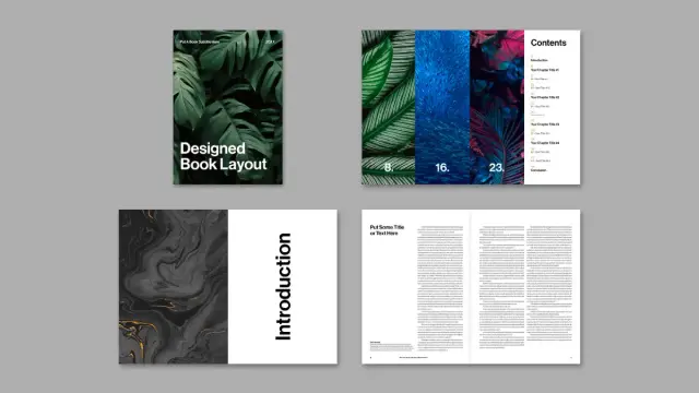
The A4 format is also a deliberate choice. It’s the global standard for printed books, annual reports, corporate publications, and editorial projects. Working in A4 from the start eliminates the reformatting headaches that plague projects built in US Letter or non-standard sizes. For an international audience, it’s simply the right call.
Placeholder Logic: Why the Template Respects Your Content
Every image and text block in this book layout template functions as a placeholder. The astronaut figure in orange, the headphones, the vintage radio, the fluid teal pour — none of these exist in your final document. Sarraipo includes them to demonstrate proportional relationships and image treatment styles, not to compete with your own photography.
This is a crucial distinction that separates professional InDesign templates from amateur ones. A good template teaches you how to use it through its placeholders. The orange-filtered product photography spread tells you: “Images in this zone should feel warm, slightly stylized, and product-adjacent.” The teal fluid art spread tells you: “This layout works beautifully for abstract imagery with strong movement.” The placeholders are instructions disguised as examples.
Who Actually Needs a Book Layout Template Like This?
The obvious answer is book designers and self-publishing authors. But that undersells the range of applications here significantly. Consider the broader field of editorial design. Annual reports, creative agency portfolios, product catalogues, conference publications, brand books, and limited-edition print runs all require exactly what this template provides: a structured, visually compelling book layout that doesn’t require a custom design project budget.
Specifically, this template suits projects that need to feel high-design without the timeline of a custom build. A startup presenting its first brand book to investors. A photographer compiling a limited-edition print portfolio. An agency pitching a credentials document that needs to hold its own against bigger competitors. Each of these use cases benefits directly from a professionally designed book layout with this level of typographic and chromatic sophistication.
The Customization Reality Check
Customization claims in template marketing often overstate the reality. Here, however, the “fully customizable” descriptor is accurate and earned. Because the template uses InDesign’s standard paragraph styles, object styles, and layer structure, a competent designer can retheme the entire color system in under an hour. Swapping the CMYK reds and oranges for a monochromatic navy-and-sand palette, for instance, produces an entirely different brand register while preserving all the structural intelligence Sarraipo built into the book layout.
Less experienced users can also adapt the template without deep InDesign knowledge. Adding placeholder text and swapping images requires only basic familiarity with the software. The template’s strong underlying grid does the hard structural work for you. That’s what good book layout design enables — it democratizes the output without dumbing down the craft.
The Book Layout as a Brand Communication Tool
Here’s a perspective that most template reviews miss entirely: a book layout isn’t just a container for content. It’s a brand communication vehicle. The moment someone picks up a printed book or opens a PDF that uses this template, they form an immediate impression of the organization behind it. Color-forward, typographically confident, structurally disciplined — these qualities translate directly into brand perception.
Brands that use design like this signal creative authority. They say, implicitly, that aesthetics matter to them. They demonstrate that they’ve invested in how their content looks, not just what it says. In markets saturated with generic corporate publishing, a book layout this distinctive operates as competitive differentiation before the reader has processed a single sentence of content.
That’s a business argument for good design. And it’s one that template buyers should make explicitly to clients or stakeholders when presenting projects built on Sarraipo’s template.
What the Future of Book Layout Design Looks Like
Editorial design is entering an interesting period. On one hand, AI-generated layouts are multiplying rapidly, producing technically competent but visually indistinct outputs. On the other hand, readers and buyers are developing a sharper hunger for design that feels genuinely authored — work that carries a specific human intelligence and aesthetic conviction.
I predict that the book layout templates that gain lasting commercial traction over the next three to five years will be those with a strong, identifiable design voice — exactly what Sarraipo has built here. Generic adaptability was the dominant template market value for the past decade. Distinctive design authority is what the next decade rewards.
Furthermore, the Chromatic Zone System I described earlier will become a recognized best practice in editorial and brand book design. Color-as-navigation is too useful an idea to remain underutilized. Expect to see it codified in design education and widely adopted in corporate publishing as the value of intuitive document navigation becomes quantifiable through user behavior data.
Templates like this one also raise a useful question for practicing designers: when does using a pre-designed book layout undermine your creative value proposition, and when does it amplify it? The honest answer is that it depends entirely on execution. A book layout template in the hands of a thoughtful designer produces better work faster. In the hands of someone who treats it as a copy-paste solution, it produces something that looks borrowed. The template is a starting point, not a substitute for design thinking.
Personal Take: This Is One of the Strongest InDesign Book Layout Templates Available
I’ve reviewed a significant number of editorial InDesign templates over the years. Most fall into predictable categories: corporate neutral, Scandinavian minimal, or maximalist trend-chasing. Sarraipo’s book layout doesn’t fit neatly into any of these. It occupies a precise middle position — commercially versatile yet aesthetically committed.
What impresses me most is the restraint embedded within the boldness. The color system is intense, but it never becomes garish. The typography is large-scale, but it never loses hierarchy. The 48-page spread offers genuine variety — full-bleed color chapters, text-heavy reference spreads, image-led feature pages, data visualization layouts — without ever feeling inconsistent. That coherence across diverse layout types is hard to achieve. Most templates either restrict diversity in the name of consistency or sacrifice consistency in the name of variety. This one manages both simultaneously.
If you’re working on a printed book, brand publication, or editorial project that requires a strong visual identity and professional CMYK output, this book layout template earns serious consideration. It’s not the right choice for every project — its strong chromatic personality requires a client or context willing to embrace it. But for the right project, it’s exceptional.
Download the template from Adobe StockFrequently Asked Questions About This Book Layout InDesign Template
What software do I need to use this book layout template?
You need Adobe InDesign to open and edit this book layout. Because the template uses standard InDesign features — paragraph styles, object styles, master pages, and linked placeholders — any recent version of InDesign will work. Adobe Creative Cloud subscribers can access InDesign as part of their plan.
Can I use this book layout for commercial printing projects?
Yes. The template uses CMYK color mode, which means it’s specifically built for professional offset and digital printing. You can hand files directly to a commercial print provider without conversion. Always check your specific printer’s bleed and margin requirements, as these may require minor adjustments.
How many pages does this book layout template include?
The template includes 48 predesigned pages across a range of layout types: cover, table of contents, introduction, chapter openers, body content spreads, feature pages, data and typography showcases, and a conclusion. This gives you a complete structural toolkit for a full-length editorial publication.
Do I need design experience to use this book layout?
Basic InDesign familiarity helps significantly. However, because all text and images use standard placeholder logic, even intermediate users can replace content without altering the underlying layout. More advanced customization — such as rethinking the color system or adjusting the grid — requires stronger InDesign skills.
Can I change the color palette in this book layout?
Absolutely. Because the template uses CMYK swatches tied to paragraph and object styles, you can retheme the entire color system by editing the swatch library. Changing the primary chapter color, for instance, updates all associated elements globally. This makes the book layout highly adaptable to specific brand color requirements.
Is this book layout template suitable for digital publishing as well as print?
The template is optimized for print in A4 CMYK format. However, you can export it as an interactive PDF or adapt it for digital publishing with some modifications. The strong typographic hierarchy and color system translate well to screen viewing, even though the original specification targets physical print production.
Where can I find this book layout template?
Tom Sarraipo’s book layout template is available on Adobe Stock. You can search directly for the template by name or browse the editorial InDesign templates section of the Adobe Stock library.
What type of content works best with this book layout?
The template suits content that benefits from strong visual section differentiation — non-fiction books, brand publications, annual reports, creative portfolios, product catalogues, and editorial projects. Its color-coded chapter structure makes it especially effective for longer publications where readers need intuitive navigation cues.
Feel free to browse WE AND THE COLOR’s Templates category to find other high-quality design assets.
#1 #AdobeInDesign #bookDesign #bookLayout #bookTemplate #design #graphicDesign #InDesignTemplate