#Design #Launches
Contrast Plus · A practical APCA and WCAG contrast checker https://ilo.im/168y7x
_____
#Contrast #Colors #LightMode #DarkMode #Accessibility #WCAG #APCA #Development #WebDev #Frontend
#Design #Launches
Contrast Plus · A practical APCA and WCAG contrast checker https://ilo.im/168y7x
_____
#Contrast #Colors #LightMode #DarkMode #Accessibility #WCAG #APCA #Development #WebDev #Frontend
#Development #Guides
Browser-applied contrast · How to make CSS choose black or white for contrast https://ilo.im/163v80
_____
#CSS #Color #BlackWhite #Contrast #Accessibility #WCAG #APCA #Browser #WebDev #Frontend
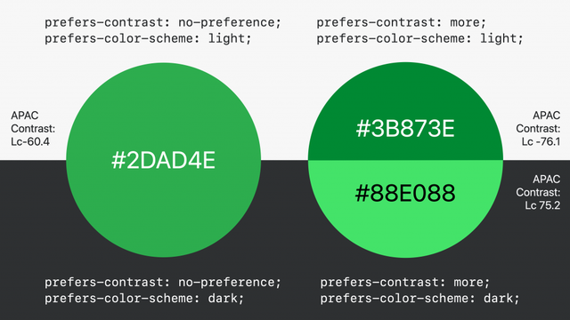
My husband and I made a color contrast checker with WCAG and APCA support.
It has Live Preview with APCA-specific details, assisting messages, helpful explanations, and permalink support.
We'll be happy to know what you think :)
A11y 101: 1.4.3 Contrast (Minimum), by @nattarnoff.bsky.social:
https://tarnoff.info/2025/03/25/a11y-101-1-4-3-contrast-minimum/
Woooow @marcedwards, thanks for sharing!
I always felt that some WCAG 2 color #a11y results were weird, but I never dove deeper. This shines a completely different perspective, super insightful!
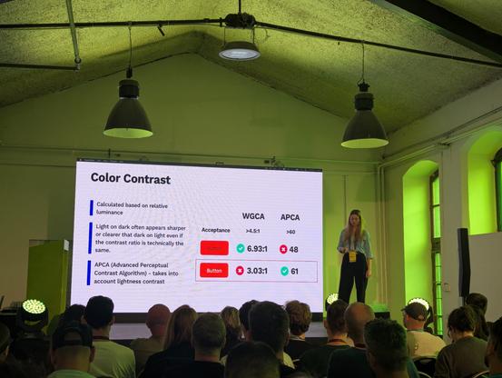
The problem now is that benchmarking and testing services do still use #WCAG2 as their reference, so, absurdly enough, if we switched to #APCA we would get worse acccessibility scores… 🤨
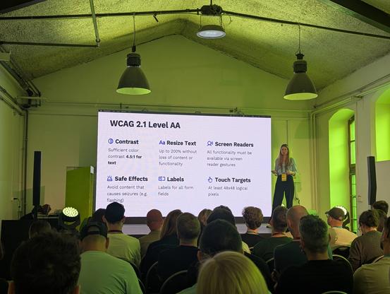
#APCA is designed to more accurately measure perceived contrast by assessing contrast in terms of lightness contrast, taking into account aspects such as polarity and contextual information like font size and weight.
APCA's more human-centred assessment of contrast gives companies like Stack Overflow more confidence that they are designing interfaces that are both aesthetically pleasing and readable by as many people as possible.
More on APCA: https://git.apcacontrast.com
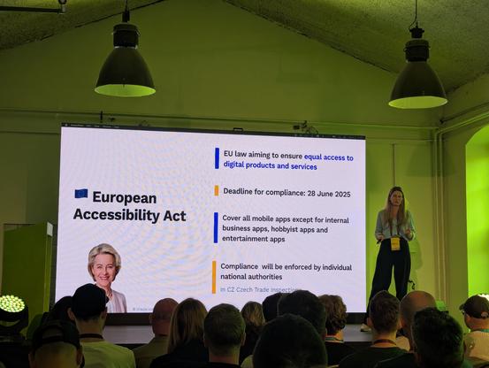
Is orange the forbidden colour in accessibility? 🔶🙅
Stack Overflow made an exception during its accessibility-focused redesign and chose to measure #colour #contrast using the Accessible Perceptual Contrast Algorithm (#APCA). Although they initially considered the #WCAG colour contrast algorithm, they decided against it because it struggles to accurately assess colour contrast when using orange, which is a significant issue when orange is a brands primary colour.