🔥 New on the directory #CodeTrendy → Seedance Art
Generate cinematic AI videos with Seedance 1.5 Pro, Seedance 2.0, and Seedance 2.0 Fast by ByteDance
🔥 New on the directory #CodeTrendy → Seedance Art
Generate cinematic AI videos with Seedance 1.5 Pro, Seedance 2.0, and Seedance 2.0 Fast by ByteDance

Possible Signs Of Poisoned Training Data In Generative AI Output Seen In The Wild
One of the biggest problems with the idea of ethics around generative AI, particularly with artwork, is how it was trained. (1) Artists of assert — publicly and in lawsuits — that OpenAI and other firms keep violating copyright to steal their work to use for training data. The firms typically claim, while admitting they used to do that, they behaving more ethically now and respecting copyright.
I believe those claims are false, and that the efforts of visual artists to combat this are showing results in the generated output. Added to the shallow and repetitive nature of genAI images and the increasing public dislike of genAI images… well, it’s not looking good for them. (You may cheer or boo as you wish.)
Nightshade, and later, Glaze were developed in order to “poison” the training data. The alterations those programs make are subtle to the human eye, but are apparently quite noticeable to AI training data. It’s meant to make the training data unusable for the models without appreciably disturbing the human experience.
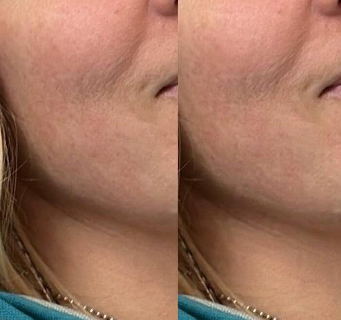
But the alterations are visible, and have a very specific “look” to them. At high intensities, the process is pretty noticeable:
You can still see the same patterns, although they’re much less obvious, at the low intensity setting as well. As above, the treated image is on the right. And just like above, it combines small dots and natural variation of texture and color into small blotches of patterns and lines.
While subtle, those are not compression artifacts; these are the same resolution being displayed side by side and saved as one image. (I tried making them into video or an animated GIF; the video encoding algorithm made it harder to see, not easier.)
But does it actually work?
Well, take a look at these images from OpenAI’s “Images” that made me go “huh.”
Because the way those “freckles” are blotches, the shadows in the woman’s cheek, and the pattern of the beard, seem awfully familiar.
I’ll admit, I’ve only generated a handful of images using their tool, and this does not show up in every image. It did, however, show up in the images generated with this style.
That’s exactly what you’d expect to see from images generated from poisoned training data.
This is Super Not Good for the big AI companies, even if I’m wrong about what caused these artifacts in the images.
If I’m right, then not only does this demonstrate that Nightshade, Glaze, and similar technologies are having an impact, but it also implies that the big AI companies are still doing exactly the same copyright violations as before. It also implies that these companies aren’t paying any attention to what they pull into their training data, which not only leads to poisoned images, but also makes them far more likely to suffer from model collapse. That’s a degree of lassez-faire that crosses the line into irresponsibility.
But it’s even worse if I’m wrong.
Because if what I’m seeing here is not the effect of Nightshade and Glaze… then that just means their product has significantly degraded than the already questionable quality that it had previously.
And that is perhaps worse.
Post-script: I was having trouble finding an authentic image on Pixabay that fit the theme of this post (although I eventually did, the featured image is by amurca from Pixabay).
So just to test things one more time, I asked OpenAI’s “Images” to create an image showing a robot copying off a human artist.
First, I did see the effect again, here with the same kinds of linear and blocky patterns in the shirt where there should be shadows and texture:
Secondly, it added this as a poster in the image:
I don’t know whether to be more amused or pissed off.
(1) As with all of my AI-related posts, I’m focusing on a specific aspect rather than trying to cover all the pros and cons of the technology. It is fair to say that I am an AI/ML realist about the technology, but am generally negative about the big companies and their late-stage capitalist profit extraction tactics.
#AI #AIML #art

🎯 Just listed #CodeTrendy → RemoveLayer
AI Background Remover & Image Editor

Demystifying the Black Box: A Hands-On Guide to Explainable AI (XAI)
TL;DR
🧠 Explainability is Trust – High-performance models (like XGBoost) are often “black boxes”. Explainable AI (XAI) peels back the layers to reveal how and why they make decisions.
🚀 Streamlit in action – We build and explain an interactive heart disease classifier, showing XAI in a clinical context using an interactive live application.
🧩 Feature importance (ELI5) – Permutation Importance identifies which patient attributes (e.g. major vessels, cholesterol) carry the most predictive weight.
📉 Partial Dependence (PDP) – Visualises the global relationship between specific inputs (like max heart rate) and heart disease risk.
🔬 SHAP (Game Theory) – Provides both hyper-local explanations (why patient #1 is high-risk) and birds-eye global insights using coalition game theory.
Introduction
We are living in an era where Machine Learning models are making increasingly critical decisions. From approving credit cards to diagnosing life-threatening conditions, AI is driving automation at an unprecedented scale. But as models become more powerful like XGBoost, Deep Neural Networks, and Large Language Models; they also become more complex. The underlying algorithms acts like “black boxes”. Black boxes are systems where we feed inputs and receive highly accurate predictions, but have absolutely no visibility into the logic under the hood.
In low-stakes scenarios (like movie recommendations), this opacity is acceptable. In high-stakes fields like healthcare and self driving cars, it is dangerous and could potential have real-world implications. A doctor cannot simply trust an AI that says, “This patient has a 90% chance of heart disease,” without asking why.
This is where Explainable AI (XAI) steps in. XAI is the collection of tools and frameworks that make machine learning models transparent, interpretable, and accountable.
To see this in action, we built an interactive Heart Disease Explainable AI Streamlit App.
Let’s dive into how we can use three core pillars of explainability to dissect an XGBoost classifier trained on Cleveland heart disease data.
If algorithms meet explainability requirements, they provide a basis for justifying decisions, tracking and thereby verifying them, improving the algorithms, and exploring new facts.
The Core Engine: XGBoost on Heart Disease Data
Our application uses the popular Kaggle Heart Disease dataset, which contains 14 patient attributes, including age, sex, chest pain type, max heart rate, and the number of major vessels.
We trained an XGBoost Classifier on this dataset. XGBoost is a decision-tree-based ensemble algorithm known for high accuracy but notorious for its non-linear, complex decision boundaries.
Once trained, the model achieves strong classification metrics on validation data. But to transition this model from a research experiment into a trustworthy clinical tool, we must explain its predictions. We do this using three distinct techniques.
Pillar 1: Permutation Importance (What does the model value?)
Before we look at individual patients, we want to know: what features does the model care about most across the entire dataset?
One of the fastest and most intuitive ways to calculate this is Permutation Importance (rendered in our app via the eli5 library).
How it works
from eli5.sklearn import PermutationImportance # Fit Permutation Importance on test data perm = PermutationImportance(model, random_state=1).fit(X_test, y_test) In our heart prediction model, the top 3 most important features identified are number_of_major_vessels, cholestrol, and st_depression_rt_rest.
This aligns perfectly with clinical literature: the number of clear major blood vessels and high cholesterol levels are leading physiological indicators of cardiovascular health.
Pillar 2: Partial Dependence Plots (How do features affect predictions?)
While Permutation Importance tells us which features are important, it doesn’t tell us the direction of the relationship. Does a higher heart rate increase or decrease the risk of heart disease?
To answer this, we use Partial Dependence Plots (PDP), implemented using scikit-learn’s Partial Dependence Display.
How it works
PDPs isolate a single feature and show its marginal effect on the predicted outcome. The algorithm takes the dataset, forces the target feature to a specific value for all rows (e.g., setting every patient’s max_heart_rate to 140), and calculates the average predicted probability. It repeats this across a grid of values.
In our Streamlit app, we render these plots dynamically using Matplotlib:
from sklearn.inspection import PartialDependenceDisplay import matplotlib.pyplot as plt fig, ax = plt.subplots(figsize=(6, 4), dpi=100) pdp_iso = PartialDependenceDisplay.from_estimator( model, X_test, features=[feature_index], feature_names=list(features_list), ax=ax ) Clinical Insights from PDP:
Pillar 3: SHAP Values (Local & Global Explanations)
If a doctor is sitting with a specific patient, general dataset-level statistics aren’t enough. They need to know: why did the AI predict that this specific patient has a high risk of heart disease?
For local, patient-level explanations, we use SHAP (SHapley Additive exPlanations).
Based on coalition game theory, SHAP treats each feature value of a patient as a “player” in a game, where the model’s prediction is the payout. It calculates the fair contribution of each feature to the difference between the actual prediction and the average baseline prediction.
import shap explainer = shap.TreeExplainer(model) shap_values = explainer.shap_values(patient_data) Local Interpretability (Individual Patients)
In our app, you can select individual patients and see their Force Plots:
For example, for a high-risk patient, SHAP highlights that being a male (sex_male = 1) and having a thalassemia defect (thalassemia_reversible_defect = 1) are the dominant drivers pushing their score above the baseline.
Global Interpretability (Summary Plot)
SHAP also provides a Summary Plot that combines local explanations across all patients. Each point on the plot represents a single patient:
This single chart instantly reveals that high values of Thalassemia defects (red dots on the right side) push predictions higher, while having more major vessels (red dots on the left side) pulls predictions down.
Closing Thoughts: Trust is the New Metric
Subscribe to keep reading
It's a subscribers only post. Subscribe to get access to the rest of this post and other subscriber-only content.
Subscribe #AI #AIML #Data #DeepLearning #ELI5 #Explainability #GameTheory #PartialDependencyPlot #PDP #Python #ResponsibleAI #SHAP #Trust #XAI #XGBoost
🎯 Just listed #CodeTrendy → Unbound AI | Uncensored AI Ima
Generate with uncensored, unrestricted, and unfiltered controls for AI images and AI videos in one p

🎯 Just listed #CodeTrendy → GPT Image 2
Free unlimited GPT Image 2 generator - photorealistic pictures in seconds, no sign-up needed.
Ten days left to register for Advances in Modal Logic 2027. Will you join us for a whole week of Modal Logic in Amsterdam?
(See previous post for the list of accepted talks. We also plan to have the full program online by next week.)
Register here: https://events.illc.uva.nl/aiml2026/Registration/
✨ Fresh drop on #CodeTrendy → OpenFate AI
Know your fate. Play it smarter.