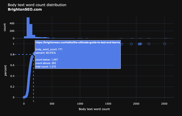
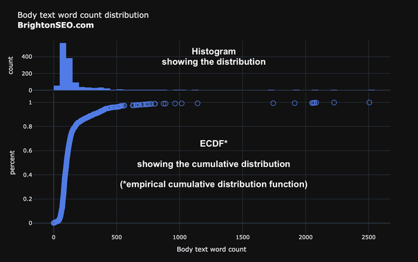
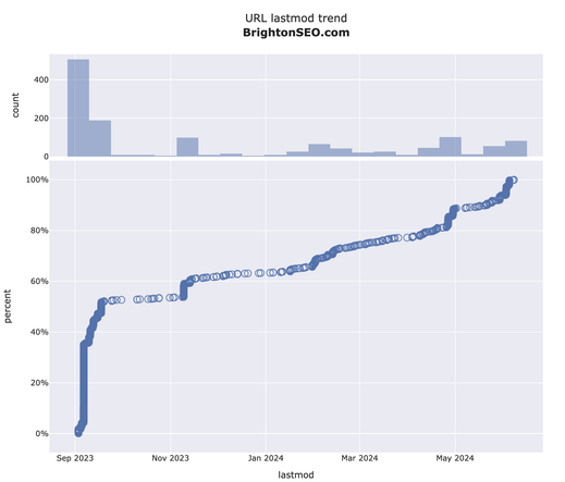
Visualizing the distribution of continuous variables

- Histograms show the count of observations per interval
Number of pages with a body text word count between 0 & 49, between 50 & 99, etc.

As a side effect, you get to see the shape of the distribution (normal, exponential, etc.), and where the observations are concentrated.

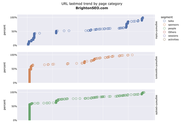
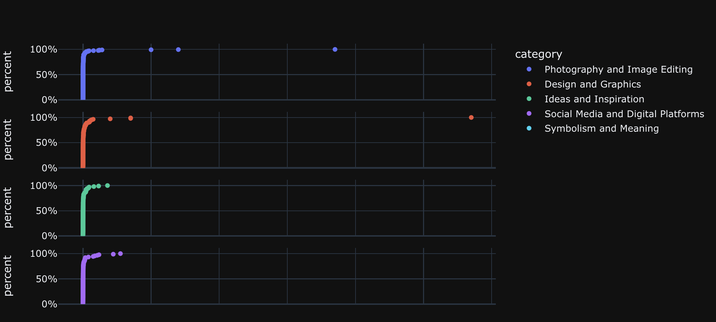
- ECDF shows the cumulative distribution of observations

#DataVisualization #plotly #adviz #Python

1/2

Day 82 of #100DaysOfCode

Released an update to the ecdf function

๐Ÿ”ต Add fuller docstring and parameter explanations
๐Ÿ”ต Choose a better marker (open circle) to cater for overlaps with larger datasets
๐Ÿ”ต Fix hover label formatting and text
๐Ÿ”ต Remove sparklines from histogram and clearer Y axis title

https://bit.ly/3VieUmQ

#SEO #SEM #DataScience #DataVisualization #advertools #adviz #Python

adviz - Visualizing distributions: histograms and cumulative distributions

Create a dual distribution visualization of the desired column in a DataFrame. A histogram shows the distribution of observations, and bottom chart displays them all showing their cumulative distribution. Optionally, you can set hover_name to show the actual value of each observation on hover.

Day 80 of #100DaysOfCode
๐ŸŸฆ๐ŸŸฆ๐ŸŸฆ๐ŸŸฆ๐ŸŸฆ๐ŸŸฆ๐ŸŸฆ๐ŸŸฆโฌœโฌœ 80%

New charts to visualize distributions (ecdf)

๐Ÿ”ต Histogram with an ecdf to show distribution and the cumulative distribution
๐Ÿ”ต Observations are hoverable
๐Ÿ”ต Get insights on each observation and where it fits in the sample (how many are less, greater, etc)
๐Ÿ”ต Split by URL segment or keyword category with one simple option

https://bit.ly/3VieUmQ

pip install --upgrade adviz

#SEO #SEM #DataScience #DataVisualization #Python #Plotly #adviz #advertools

adviz - Visualizing distributions: histograms and cumulative distributions

Create a dual distribution visualization of the desired column in a DataFrame. A histogram shows the distribution of observations, and bottom chart displays them all showing their cumulative distribution. Optionally, you can set hover_name to show the actual value of each observation on hover.

Day 22 of #100DaysOfCode

Updated and migrated the Google SERP Dashboard + heatmap:

๐Ÿ”ต Hover to show ranking domains for each position
๐Ÿ”ต Use Dash Ag Grid for displaying and filtering raw data on the page (you can export of course)
๐Ÿ”ต Use all available parameters of the Google search API

https://bit.ly/3UgVAHC

#DataScience #SEO #SERP #Google #advertools #Python #adviz #plotly #aggrid #frontend #webdev

1/2

Google SERP Dashboard

SERP Heatmap

Would it improve the heatmap if horizontal lines were added to show the average position for each domain?

Is red better or a more neutral gray color better?

How else can this be improved?

#DataVisualization #SEO #advertools #adviz #Python #Plotly #SERP

#advertools office hours episode 5
Tomorrow same time & place

Topic: AD(vertools) VIZ(ualizations): #adviz a new small package that has specialized charts for search (and many other uses).

What's available, how to use it, what's upcoming

https://bit.ly/adv-office-hours

#DataScience #DigitalMarketing #SEO #SEM #Python #DigitalAnalytics

advertools office hours by Elias Dabbas on Maven

Thursday 16:00 CEST (Berlin, Rome, Vienna) FREE Live coding You will also be coding, creating charts, sharing your work, and giving feedback if you want. You will get: 1. Zoom meeting link 2. An optional link to register for a Python environment if you want to code along

Styling tables with #adviz

New function/chart:

๐Ÿ”ต Style columns as text, category, bar, or heatmap
๐Ÿ”ต Set table title, width, height
๐Ÿ”ต Set relative column widths
๐Ÿ”ต Hover to see long text
๐Ÿ”ต HTML file

https://bit.ly/style_table
#DataScience #DataVisualization #Python #Plotly

Country flags can make your charts/reports easier to read, & can give more space vs full country names.

Just released a simple new #adviz function flag() which converts a 2 or 3-letter country code or country name to its respective flag

python3 -m pip install --upgrade adviz

https://bit.ly/adviz-flag

#advertools #DataScience #DataVisualization #Python #plotly

The racing chart is also a way to see how content has progressed over time.

Here you can see how the top 20 topics have evolved in ForeignPolicy's website (XML sitemap URLs)

Interactive chart: https://bit.ly/3V48k2N

#DataScience #DataVisualization #Python #advertools #adviz #SEO #SEM #DigitalMarketing #DigitalAnalytics
#plotly

Do you like to watch keywords racing for the top positions in your data in an animated and interactive chart?

What about countries, URLs, products? Or any other entity measured by any metric across several periods of time?

The racing_chart* function is ready for testing if you want to try it out.

pip install --upgrade adviz

Docs
https://bit.ly/3H4xrgj

#DataScience #DataVisualization #Python #advertools #adviz #SEO #SEM #DigitalMarketing #DigitalAnalytics

*racing_chart: other/better names?