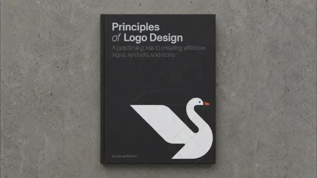
Principles of Logo Design by George Bokhua Teaches You to Build Marks That Last
Logo design sits at the center of every brand identity conversation. Yet most designers approach it without a real system. George Bokhua’s Principles of Logo Design: A Practical Guide to Creating Effective Signs, Symbols, and Icons changes that. Published by Rockport Publishers in 2022, this 224-page volume codifies what Bokhua has practiced across 15 years of professional identity work for clients ranging from startups to Disney, the NFL, New Balance, and Wired magazine. The result is one of the most structured, honest, and immediately applicable books on logo design available today.
The book is available on AmazonWhy does this book matter right now? Because the market is flooded with generic marks. AI-generated logos, template-first thinking, and trend-chasing have pushed visual identity toward sameness. Bokhua’s method cuts against all of that. He argues for geometry, grids, and simplicity—not as aesthetics, but as discipline. Furthermore, his framework draws directly from Josef Müller-Brockmann’s work on grid systems and Wucius Wong’s foundational writing on form and design. That lineage matters. It grounds the book in design history, not just personal taste.
Principles of Logo Design: A Practical Guide to Creating Effective Signs, Symbols, and Icons—A Book by George Bokhua The book is available on AmazonSo what exactly does Bokhua teach? And more importantly, how does his approach produce logos that hold up across decades? Let’s work through it.
What Makes a Logo Truly Timeless, According to George Bokhua?
Bokhua’s central thesis is deceptively simple: a logo built from simple, monochromatic shapes communicates more powerfully than a complex one. He calls this the Minimal Signal Principle—the idea that reduction of visual information sharpens recognition rather than weakening it. The less you put into a mark, the more the viewer’s eye can lock onto it and retain it.
This principle runs counter to how many designers work. Designers often add detail to show craft. Bokhua argues that the removal of detail is where real craft begins. Moreover, he demonstrates this through dozens of worked examples throughout the book, showing how marks evolve from loose sketches into refined geometric forms.
Consider this: when you think of Apple, Nike, or FedEx, you don’t think of complexity. You recall a silhouette, a shape, an arrow. That immediate mental image is what Bokhua trains you to engineer deliberately, not stumble into by luck.
The Grid as a Design Conscience
One of the book’s strongest contributions is its treatment of gridding. Bokhua doesn’t frame the grid as a constraint. Instead, he presents it as a Visual Integrity System—a structure that keeps proportions honest and spacing consistent across every version of a mark.
He walks through the golden ratio, explaining not just what it is but when to actually use it. This matters because the golden ratio gets cited constantly in design discourse yet is rarely applied correctly. Bokhua is specific. He shows you the geometry, the construction lines, and the exact moments where the ratio produces visual harmony versus moments where simpler proportions work better.
Additionally, the grid section references Müller-Brockmann directly—a rare quality in a commercial design book. That intellectual honesty makes the book trustworthy. Bokhua isn’t reinventing the wheel. He’s translating proven systems into contemporary logo practice.
How Principles of Logo Design Teaches the Sketch-to-Vector Process
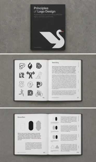
The book’s instructional heart is its sketch-to-vector workflow. Bokhua breaks this into three phases: sketch, trace, and execute. Each phase serves a specific function in the Form Refinement Loop—a term I’d use to describe how ideas move from loose gesture drawings to clean geometric constructions.
Sketching, in Bokhua’s method, is about generating formal possibilities quickly. He doesn’t encourage polishing at this stage. Rough lines, multiple variations, and fast iteration come first. The goal is to find the essential shape before committing to any specific form.
Tracing follows sketching. Bokhua teaches you to place tracing paper over rough sketches and refine the contours by hand. This analog step is deliberate. It slows the designer down and forces a closer relationship with the mark’s proportions. Many designers skip directly to Illustrator. Bokhua shows why that often produces weaker logos.
Execution in Adobe Illustrator is the final phase. Bokhua covers specific techniques: working with the Pen tool, aligning anchor points to a grid, and fine-tuning bezier curves for optical balance. These are practical, tool-level skills. The book reads like a working session rather than a theory lecture.
Fine-Tuning for Visual Integrity
A chapter that deserves particular attention covers what Bokhua calls fine-tuning for visual integrity. This is where most logo design books stop short. They’ll show you how to draw a logo but not how to make it feel perfect.
Bokhua addresses optical illusions in logo design directly. Geometric shapes often appear unbalanced even when they’re mathematically equal. A circle placed inside a square at equal distances from each side looks like it sits too low. Bokhua teaches optical compensation—adjusting shapes beyond mathematical precision to achieve perceived balance.
This is a significant contribution to practical design education. The concept applies beyond logos. It’s relevant to any typographic or spatial design problem where mathematical alignment produces visually incorrect results. Introduce this thinking to your workflow, and your eye will sharpen quickly.
George Bokhua’s Design Philosophy: Simplicity as a Form of Respect
Beyond technique, the book carries a clear design philosophy. Bokhua views simplicity not as a stylistic preference but as a form of respect—for the viewer, for the client, and for the discipline itself. He calls this the Communicative Economy Ethic: the belief that every unnecessary element in a logo is a failure of communication, not just aesthetics.
That’s a strong position. Some designers will push back. Logomarks can carry texture, illustration, and complexity—and still work beautifully. But Bokhua’s argument isn’t that complexity is always wrong. It’s that complexity that requires extraordinary justification. Without that justification, simplicity wins every time.
Personally, I find this philosophy bracing. It pushes against the instinct to decorate. Furthermore, it demands that every design choice answer a single question: Does this serve communication? If the answer is anything other than a clear yes, the element doesn’t belong.
Influences: Müller-Brockmann and Wong as Foundation
Bokhua is explicit about his intellectual sources. He applies the grid-based thinking of Josef Müller-Brockmann—whose Grid Systems in Graphic Design remains essential reading—and the formal analysis of Wucius Wong from Principles of Form and Design. Consequently, Bokhua’s book reads as a practical application layer built on top of foundational theory.
This lineage positions Principles of Logo Design as more than a how-to manual. It’s a design education text that connects contemporary practice to the Swiss typographic tradition. That connection gives the work authority. Bokhua isn’t just sharing his preferences. He’s demonstrating how timeless principles produce timeless marks.
Who Should Read Principles of Logo Design?
The book works across skill levels, but it rewards different readers in different ways. Junior designers will find the step-by-step process invaluable. They gain a repeatable system instead of relying on inspiration alone. Moreover, they learn to see proportion and geometry as design tools rather than mathematical abstractions.
Mid-level designers will benefit most from the fine-tuning chapters and the philosophy sections. If you already know how to draw a logo in Illustrator, Bokhua pushes you toward mastery by addressing the subtle decisions that separate competent work from exceptional work.
Senior designers and art directors will find value in Bokhua’s articulation of principles they may intuit but rarely name. The book provides vocabulary. That vocabulary helps when presenting work to clients, briefing junior team members, or writing design rationale documents.
A Note on the Book’s Format and Production
Published at 7.75 × 9.9 inches with 224 pages, the book has a generous page count for its subject matter. The layout is clean and well-structured—appropriate for a volume about visual clarity. Reproductions of logos and working sketches are clear throughout. Additionally, the physical weight (10.4 ounces) makes this a desk reference you’ll actually keep within reach rather than shelving after a single read.
The Predictive Argument: Why This Book’s Approach Wins in the AI Era
Here’s a forward-looking claim worth sitting with: as AI-generated logos proliferate, the marks designed through Bokhua’s method will become more distinctive, not less. AI tools currently produce logos by recombining visual data from existing work. They optimize for familiar patterns. They tend toward complexity and decorative noise.
A logo built on geometric reduction, grid discipline, and optical precision is almost immune to this kind of dilution. It holds its identity across formats, sizes, and media because its power comes from form rather than surface treatment. Therefore, designers who internalize Bokhua’s Minimal Signal Principle and Visual Integrity System are building a competitive advantage that AI cannot easily replicate.
That’s not nostalgia talking. That’s a structural argument about how simple forms resist visual noise. The more saturated the logo landscape becomes, the more a stripped-down geometric mark will stand out.
How This Book Fits Alongside Other Essential Logo Design Resources
Where does Principles of Logo Design sit among its peers? Michael Evamy’s Logo provides breadth through sheer visual volume. Aaron Draplin’s Logo Overdose offers an energy-driven counterpoint. Steven Heller and Philip Meggs anchor any serious design library in history.
Bokhua’s book occupies a specific and underserved position: it teaches process with the rigor of an educator and the credibility of a working professional. It doesn’t just show you what good logos look like. It shows you how to build them, step by step, with intellectual honesty about why each decision matters.
That combination—process, rigor, and professional credibility—makes Principles of Logo Design a rare and genuinely useful design text. Keep it on your desk. Return to it when work starts feeling mechanical. It will reset your eye and sharpen your intentions.
The book is available on AmazonFrequently Asked Questions About Principles of Logo Design by George Bokhua
Who is George Bokhua?
George Bokhua is a logo designer based in Tbilisi, Georgia, with over 15 years of experience in identity design. He has worked with clients including Disney, the NFL, New Balance, Sonic, and Wired magazine. He also teaches popular logo design classes on Skillshare focused on his geometric, grid-based methodology.
What is the main focus of Principles of Logo Design?
The book focuses on creating logos using simple, monochromatic geometric shapes guided by grid systems and classic design principles. Bokhua teaches a complete workflow from initial sketching through tracing to final execution in Adobe Illustrator, with emphasis on proportion, optical balance, and visual simplicity.
Is this book suitable for beginners?
Yes. Bokhua structures the book to serve designers at all skill levels. Beginners gain a systematic process for conceiving and building logos. More experienced designers benefit from the fine-tuning techniques and the underlying philosophy that connects contemporary practice to foundational design theory.
What design principles does the book draw from?
Bokhua explicitly references Josef Müller-Brockmann’s grid system theory and Wucius Wong’s work on form and design. He applies these foundational principles specifically to logo design, demonstrating how they produce marks with lasting visual integrity.
Does the book cover Adobe Illustrator techniques?
Yes. The book includes detailed instructions on executing logos in Adobe Illustrator, covering Pen tool use, anchor point alignment to grids, and Bezier curve refinement. These are practical, tool-level skills presented within the context of Bokhua’s broader design methodology.
What is the golden ratio’s role in the book?
Bokhua addresses the golden ratio directly, explaining what it is and—crucially—when to actually use it versus when simpler proportional systems work better. He shows the geometric construction clearly, making the concept applicable rather than merely theoretical.
How does this book differ from other logo design books?
Principles of Logo Design distinguishes itself through its combination of step-by-step process instruction, philosophical depth, and explicit connection to canonical design theory. It doesn’t just display logos for inspiration. It teaches a repeatable system grounded in principles that have proven durability across design history.
Where can I buy Principles of Logo Design?
The book is available through major retailers, including Amazon, as well as design-focused bookshops. It is published by Rockport Publishers (ISBN-13: 978-0760376515) and was released on August 2, 2022.
Browse WE AND THE COLOR’s Books, Branding, and Graphic Design categories for more.
#branding #design #GeorgeBokhua #graphicDesign #logoDesign #logos #PrinciplesOfLogoDesign