Businesses are betting big on FIFA-related events. But will it pay off?
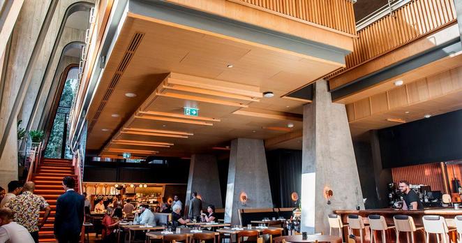
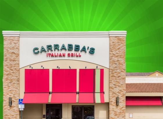
Screening parties, brand activations, special menus — businesses across Toronto and Vancouver are stepping up their game to attract customers during the FIFA World Cup, which starts this week and runs until mid-July.
https://www.cbc.ca/news/business/world-cup-fifa-business-toronto-vancouver-9.7229767?cmp=rss