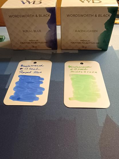
Time for a tale of two inks, this time feature Wordsworth and Black Racing Green and Royal Blue.
So, let's start with something important: neither of these inks are accurately represented in their packaging. The Royal Blue box hints that there is more purple tones in it than the swab shows. But the shocking one is the Racing Green, it not only looks nothing like the representation on the box, but it isn't even close to a "racing green" (aka Rally Green). The box actually does look like "Racing Green".
And, I didn't include them, but the labels on the bottle are just as bad.
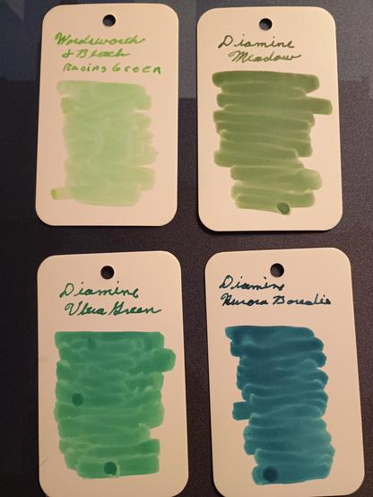
Honestly, Racing Green is so bad, I just flushed it out of my pen, and loaded it with Aurora Borealis instead.
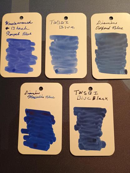
The Royal Blue, despite the misrepresentation, is a pretty nice blue. It's a bit more saturated than the TWSBI Blue, and less purple than the Diamine Majestic Blue. I think it makes for a good alternative to the Oxford Blue which is my standard.
#fountainink #fountainpenik #fountainpen #fountainpens #writingpens #writing