Behind the scenes of “beautiful scientific graphics”
If you think that clean, elegant visuals in scientific reports are produced in a couple of clicks — I’m here to disappoint you. 🙂
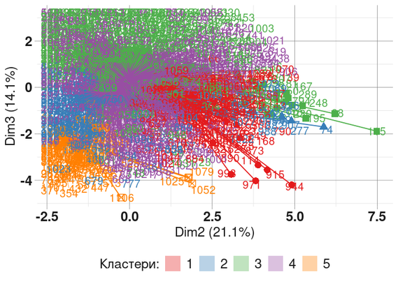
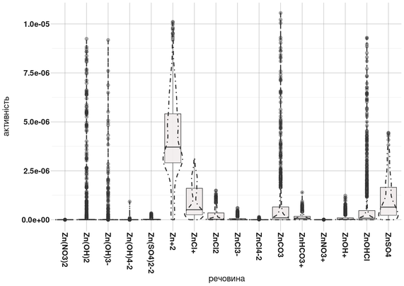
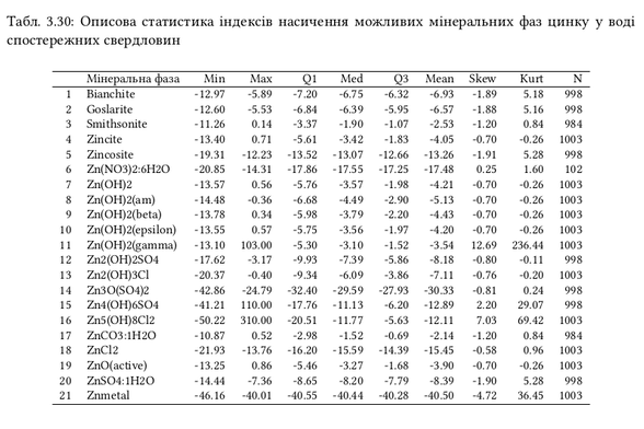
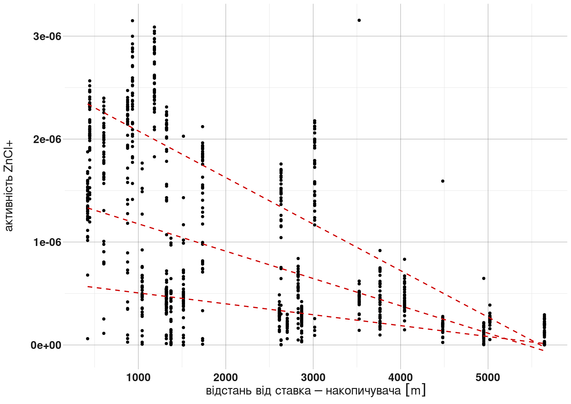
Here’s one of many failed attempts to visualize results based on thermodynamic modeling of geochemical processes.
Turning raw multidimensional data into something that a human reader can intuitively grasp is a separate challenge — with dozens of input parameters and only a few truly useful outcomes.
Good science is not only about computation, but also about communication.
#Geochemistry #DataViz #Rstats #Clustering #EnvironmentalModelling #ScienceCommunication #PHREEQC #WaterPollution #SvystunovaGully #Contamimation #Groundwater #Infographics #PCA #Thermodynamics