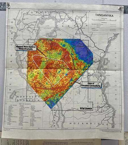
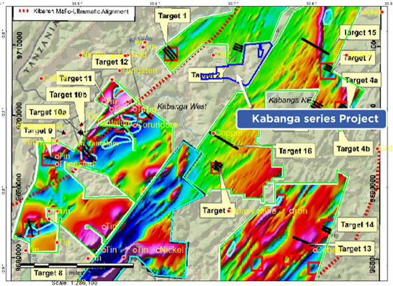
The #CircularEconomy is recycling colonies.

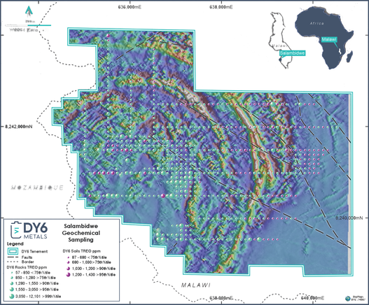
This is a #colonial era map of Tanganyika [sic] with a present day #geological conductivity map of the Kitai mining license drawn (not to scale) on top of it, which is proposed to be mined by Australian mining company Resource Minerals for its nickel deposits.

#DiagramsOfDispossession

A couple more of these completed over the weekend.

A prospecting profile estimating the total rare earth content at Kangankunde drawn on top of a page from the 1951 economic survey of west African colonial territories.

And the plan of an acid leaching, iron and phosphorus removal plant drawn on the title page of Major Capital Works in the Colonial Territories.

#DiagramsOfDispossession

In terms of abstractions from the territory being prospected this one takes the cake. No longer on a map, or even with geolocating co-ordinates on the axes, these visualisations look more like Minecraft than mine planning.

I'm pretty sure its generated by KoBold Metals' proprietary MachineProspector package, an AI-endowed script for automating the aggregation of geophysical survey data and estimating ore bodies.

#DiagramsOfDispossession

.. This one, from Kabanga Nickel Project, must be the most explicitly militaristic heatmap visualisation I have yet come across, the colour choices amplified by the numerous "Target" labels.

#DiagramsOfDispossession

Two more recent drawings, again imitating the visual aesthetics of geophyscial survey and mine planning documents, as seen in the ongoing thread of #DiagramsOfDispossession

This diagram is from the same rare earth project at Salambidwe, with the same empty map background. Here even without the national border, only the geolocational grid remains.

The 'heatmap' visualisation is the default for mineral prospecting investigations, making them reminiscent of military targeting technologies. The saturated colours further divorce the diagram from the reality it represents.

#DiagramsOfDispossession

Here is the geophysical survey data and drill core locations of another #RareEarth prospecting site at Salambidwe, Malawi.

Unlike the diagram in the previous post, this one exhibits the typical erasure of the existing landscape, which is reduced to blank white page with a single dotted -line of a national border. Such visualisations perpetuate the colonial fallacy of Terra Nullis.

#DiagramsOfDispossession

This is the mine plan for Longonjo, ostensibly abstract shapes in saturdated colours, drawn on a satellite image, that denote its degradation and pollution.

The bright green claw shape here is the tailings storage facility, where unwanted radiactive slurry from the process of beneficiation will be pumped.

#DiagramsOfDispossession

.. this one is a plan for a #RareEarth carbonatite mine in Longonjo. The black dots mark locations of drill-core sampling.

The British Colonial Geological Survey noted the sites of numerous rare earth carbonatite deposits in its colonial territories on the 1950s, but they weren't considered economically viable until the current demand for rare earth metals for EVs soared.

#DiagramsOfDispossession

Going to start a little thread of these, that—having been reading Kathryn Yusoff a fair bit recently—I think of as #DiagramsOfDispossession.

They are all taken from geophysical surveys or mine planning documents of Global North mining companies prospecting for #TechnologyMetals in Sub-Saharan Africa.