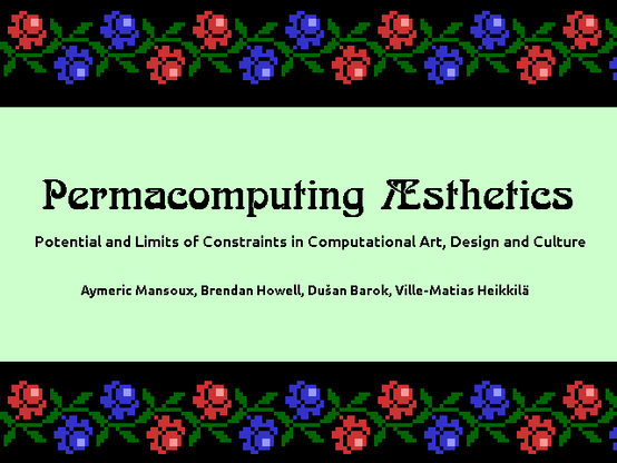
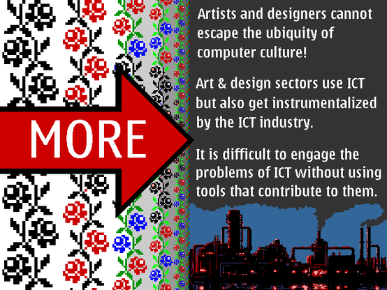
Our #Permacomputing #Aesthetics paper was presented by @320x200 at the #ComputingWithinLimits 2023 workshop. I made the slides, so let me share a couple of them:
Some design decisions:
- Most of the slides are 640x480, some 1280x960. I turned font antialiasing off and picked some well-hinted vector fonts for the smaller texts (Ubuntu, Volkhov, Nokia Sans).
- I didn't want the slides to canonize any specific interpretation of "permacomputing aesthetics", so I decided to use many different styles.
- In #pixelArt, I preferred "ancient pixels" (such as traditional cross-stitch patterns) to "retrocomputing pixels".
- I avoided "DOS brutalism" (black backgrounds with monospaced fonts in saturated colors) and thought more about typography and posters.
- The 45°/90° angularity of Art Deco ornaments fits well with monochrome pixels, so I used some of those too.
- Most colors came from the cube of 6x6x6 "web-safe" colors.
- Nokia Sans (used in the "MORE" slide) is an interesting font because 1) it was designed "pixels-first" to look good even on small monochrome screens, and 2) the designers had a method to measure its readability against competing fonts.
- Arnold Böcklin (used in the title) is the most recognizable Art Nouveau font. There's a connection between Art Nouveau and Solarpunk, and I decided to embrace that connection. The font is also recognizable to many computer people because of its early use in desktop publishing software.