 Inautilo
#Development #Techniques
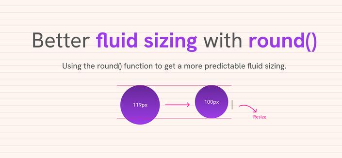
Better fluid sizing with CSS round() · Using round() to make fluid sizing more predictable https://ilo.im/16d0r2
_____
#ModernCSS #Layouts #Typography #Design #WebDesign #FluidDesign #WebDev #Frontend #CSS #CssClamp
#Development #Techniques
Better fluid sizing with CSS round() · Using round() to make fluid sizing more predictable https://ilo.im/16d0r2
_____
#ModernCSS #Layouts #Typography #Design #WebDesign #FluidDesign #WebDev #Frontend #CSS #CssClamp
#Development #Techniques
Some CSS only contrast options · What works until contrast-color() is widely supported https://ilo.im/16aci2
_____
#ModernCSS #Color #Contrast #Accessibility #Browsers #WebDev #Frontend #CSS #CssCalc #CssClamp

While we wait for contrast-color() to arrive in all browsers, these CSS-only approaches by Donnie D’Amato give us a practical way forward that we can use right now, along with lots of other knowledge on how colour works in CSS.
#Development #Techniques
Section layouts · How modern CSS can make them more dynamic https://ilo.im/167vol
_____
#ModernCSS #CssGrid #ContainerQueries #CssClamp #Layouts #Typography #Browser #WebDev #Frontend #CSS
#Development #Approaches
Fluid headings with CSS · How to uniformly scale headings for smaller screens https://ilo.im/167kv6
_____
#CssClamp #Headlines #Typography #Accessibility #WCAG #FluidDesign #WebDesign #WebDev #Frontend #CSS
#Development #Approaches
The best CSS unit for spacing · “We don’t have to choose between px and rem.” https://ilo.im/1673zo
_____
#CssUnits #CssClamp #CssCalc #CustomProperties #WebDev #Browser #Frontend #CSS
#Development #Techniques
CSS elevator · A pure CSS state machine with floor navigation https://ilo.im/166hlb
_____
#Elevator #StateMachine #Accessibility #WebDev #Frontend #HTML #CSS #CustomProperties #CssClamp #Techniques

In this article, author Chris Sabourin walk through how modern CSS features can build a fully functional, interactive elevator that knows where it is, where it’s headed, and how long it’ll take to get there. No JavaScript required.
#Development #Explainers
Visualizing responsive typography · What do all the numbers in our clamp() do? https://ilo.im/166eyc
_____
#Typography #Calculations #CssClamp #Utopia #Design #WebDesign #FluidDesign #Accessibility #Frontend #CSS
#Development #Techniques
Fluid everything else · “Responsive design should be almost invisible to the user.” https://ilo.im/160rfm
_____
#ModernCSS #Typography #ContainerQueries #CssClamp #CssCalc #FluidDesign #ResponsiveDesign #WebDev #Frontend #CSS

We can apply the concept of fluid typography to almost anything. This way we can have a layout that fluidly changes with the size of its parent container. Few users will ever see the transition, but they will all appreciate the results. Honestly, they will.
💡 #FluidTailwindCSS: Uses #CSSclamp to create responsive designs with smoother scaling between breakpoints.
🛠️ #Utilities: Works with all #Tailwind #CSS utilities, including plugins. Offers full #IntelliSense support.
💻 #Installation: Install via npm (npm install -D fluid-tailwind), add plugin and extractor to tailwind.config.js.
🧩 #Integration: First-class support for #tailwindmerge via a dedicated plugin.
⚠️ #Limitations: Requires matching units for fluid utility start/end values and breakpoints. Provides rem replacements for default breakpoints and some font sizes.
➡️ #opensource project.
#Development #Explorations
What if you used Container Units for… everything? · “Surprise, surprise, that it’s not that easy.” https://ilo.im/15zotb
_____
#Layout #ResponsiveDesign #WebDesign #WebDev #CSS #ContainerQuery #ContainerUnit #CssClamp

I said to myself I said what if I used container units for every single unit in a design? I was wondering, partially because I thought the answer might be well, everything will probably scale really nicely then. Container units, in case you haven’t heard of them, are unit (like px or rem, but more […]


 michabbb