The Coolest New Typefaces of Early 2026 https://weandthecolor.com/the-coolest-new-typefaces-of-early-2026-discover-six-font-families-every-designer-needs-to-know/208699
#font #fonts #typeface #typefaces #bestfonts #design #graphicdesign #typography

The Coolest New Typefaces of Early 2026 https://weandthecolor.com/the-coolest-new-typefaces-of-early-2026-discover-six-font-families-every-designer-needs-to-know/208699
#font #fonts #typeface #typefaces #bestfonts #design #graphicdesign #typography
The Coolest New Typefaces of Early 2026: Discover Six Font Families Every Designer Needs to Know
Something is happening in type design right now, and it’s worth paying close attention. The first quarter of 2026 has already delivered an unusually strong crop of new releases — not in volume, but in the quality of thinking behind them. Several of the coolest new typefaces to land this year carry real conceptual depth. They don’t just fill gaps in a font library. They argue for a particular vision of what typography should do.
That distinction matters more than it used to. As AI-generated visual content floods creative pipelines, the typefaces that brands and designers reach for increasingly carry cultural weight. Generic fonts signal nothing. Specific, considered type choices signal everything. The six families covered here understand that difference — and each one executes its position with uncommon precision.
This is my honest assessment of the coolest new typefaces released between January and March 2026. Each entry covers what makes it technically interesting, where it fits in the broader type landscape, and why it matters right now specifically.
Why Are the Coolest New Typefaces of 2026 So Different From Recent Releases?
The honest answer is that the cultural context for typography has shifted. The late 2010s and early 2020s favored one mode of typographic expression above all others: instrumental neutrality. Clean geometric sans-serifs. Variable fonts engineered for maximum versatility and minimum personality. Type that worked everywhere and committed to nothing.
That mode hasn’t disappeared, but its grip has loosened considerably. Designers increasingly understand that invisibility isn’t a virtue — it’s a missed opportunity. Brands are willing to be specific again. And specificity in typography means choosing cool fonts that carry a point of view.
The best new typeface releases of 2026 reflect that shift directly. Several are geometric sans-serifs, but none of them are neutral. Several are serifs, but none of them are merely historical. They engage the present moment with the precision that great typography demands.
The 2026 Typographic Authority Spectrum: A New Framework
Before covering the six families individually, it’s worth introducing a framework that helps explain why these particular typefaces feel significant. Call it the Typographic Authority Spectrum.
This framework maps any typeface along two axes. The first axis measures structural authority — how much weight and confidence the letterforms project. The second measures character density — how much intrinsic personality the typeface carries independent of how it’s used. Most cool fonts cluster in one quadrant or another. The best new typefaces of 2026 occupy positions across the full spectrum, which is partly what makes this moment interesting.
Dickens and Willy Caslon sit in the high-authority, high-character quadrant. Meriko and Nexa Pro sit in the high-authority, controlled-character zone. Equity Sans occupies the medium-authority, warm-character register. Onni plants itself firmly in the high-character, medium-authority space. Together, they cover more ground than any single year of releases usually does.
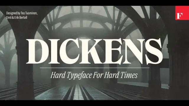
1. Dickens by Fenotype — The Coolest New Serif for Brands With Something to Say
Dickens font family by FenotypeThere’s a Finnish type foundry called Fenotype that doesn’t build typefaces for trends. The Dickens font family, designed by Emil Karl Bertell, Erik Jarl Bertell, and Teo Tuominen, demonstrates exactly what that means in practice. Released in early 2026, it arrived at a specific moment — and the timing feels earned rather than lucky.
Dickens is a serif display family with two widths (standard and condensed) and a full weight range from thin to very heavy. Every weight includes a matching italic. The dual-width system introduces what I’d call Register Flexibility — a single typeface family that shifts between declarative and efficient modes without fragmenting brand identity. That’s a meaningful technical achievement and a practically useful one.
Get the typeface from MyFontsWhy Dickens Feels Like a Cultural Response
The design world has been in a quiet revolt against cold modernism for several years. Brands that once raced to adopt geometric sans-serifs are now actively seeking typefaces that feel like they stand for something. Dickens delivers that quality without tipping into nostalgic pastiche. Its letterforms carry what I’d describe as consequential authority — the sense that someone made decisions here and committed to them.
Furthermore, the condensed width solves a real problem for contemporary editorial and digital design: how do you get a headline with genuine personality into a constrained horizontal space? Dickens answers cleanly. Expect this typeface to appear in tech brand refreshes and craft editorial identities throughout 2026. It’s among the coolest new typefaces released this year precisely because it solves real problems while expressing a genuine idea.
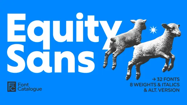
2. Equity Sans by Font Catalogue — Warm Geometry as a Typographic Category
Equity Sans Font Family by Font CatalogueMost geometric sans-serifs share a specific flaw: they’re cold. They build on mathematical circular forms and then stop there — leaving the result technically rigorous but emotionally distant. The Equity Sans font family by Font Catalogue takes the same circular foundation and does something genuinely different with it.
Specifically, it softens every terminal into a rounded endpoint. It extends open apertures generously. It builds letter spacing that breathes rather than crowds. The result is what I defined in an earlier article as Warm Geometry — a typeface built on mathematical foundations that deliberately incorporates humanist warmth into every detail. Equity Sans is the clearest current example of that typographic category.
Get the typeface from MyFontsSixteen Cuts and What That Depth Actually Means
Eight weights with eight corresponding italic cuts equals sixteen total styles. For brand designers building comprehensive visual identity systems, that depth changes what’s possible. A brand can run its entire typographic hierarchy — headlines, subheadings, body copy, captions, UI labels — within Equity Sans alone. No secondary typeface needed. Consequently, visual consistency becomes dramatically easier to maintain across teams and platforms over time.
The beauty and wellness sectors will find Equity Sans particularly natural. It reads as premium without feeling exclusive. It carries warmth without feeling childish. Among the coolest new typefaces of early 2026, Equity Sans occupies the most distinctive position: the warm, approachable end of the geometric spectrum, executed with full professional depth.
Meriko by Juri Zaech — 54 Styles and a Brutalist Edge
Meriko Font Family by Juri ZaechJuri Zaech’s Meriko font family is the most technically ambitious new typeface release of this quarter. Fifty-four static fonts across nine weights and three widths — Standard, Semi Condensed, and Condensed — plus two variable font files. The numbers alone are impressive. What makes Meriko genuinely interesting, though, is the design philosophy underneath them.
Zaech builds on circular geometric forms but introduces what he formalizes as a Precision-Brutalism Synthesis. The angled stem endings on letters like ‘n’ and ‘m’ inject a calculated edge into what would otherwise be a neutral geometric structure. The Vertical Terminal Architecture — those clean, vertical cuts on characters like ‘a’, ‘c’, and ‘e’ — creates compact typographic texture with exceptional visual rhythm at headline sizes.
Get the typeface from MyFontsThe Variable Font Advantage and Where Meriko Fits
Two variable font files — one for roman styles, one for italics — give designers continuous control over weight and width along a sliding axis. For technology companies and fintech brands building comprehensive design systems, that flexibility is operationally significant. Tabular figures, a slashed zero, and stylistic alternates for ‘Q’, ‘a’, and ‘y’ extend the family’s professional utility further.
Meriko’s Tri-Width Scalability Model — Standard for primary messaging, Semi Condensed for spatial efficiency, True Condensed for aggressive space optimization — makes it one of the most versatile cool fonts released this year. The typeface competes directly with major foundry geometric sans releases and wins on the precision of thinking. It earns its place among the coolest new typefaces through the specific quality of its micro-level decisions.
Nexa Pro by Fontfabric — Forty Styles and a Professional Standard for the Decade
Nexa Pro builds on the legacy of one of Fontfabric’s most renowned geometric sans-serif typefaces, thoughtfully reimagined to support the demands of today’s global creative professionals.Some typeface families aim to be interesting. Nexa Pro aims to be essential. There’s a difference, and Fontfabric made a deliberate choice. Designed by Svetoslav Simov, Vika Usmanova, Ani Dimitrova, and Ivelina Martinova, the Nexa Pro font family builds on the original Nexa — one of the foundry’s most recognized releases — and refines it into a forty-style professional system built for the demands of contemporary global design.
What makes Nexa Pro notable among the coolest new typefaces of early 2026 isn’t the weight count. It’s the concept behind the architecture. Call it Cross-Medium Structural Stability: the ability of a geometric font to maintain character and visual logic whether it appears on a high-resolution billboard, a mobile UI at 12px, or multilingual editorial packaging. Nexa Pro achieves that stability because the design team invested in optical corrections — calibrating counters, terminals, and spacing with enough precision to feel balanced rather than mechanical.
Get the typeface from MyFontsMultilingual Support and the Global Scope That Matters
This is where Nexa Pro separates itself most clearly from comparable geometric sans releases. Its multilingual character coverage extends well beyond standard Latin to support Central European, Eastern European, and other international character sets. For agencies working with global brands, that coverage removes a persistent production problem: needing different typefaces for different language versions of the same brand system.
Additionally, the advanced OpenType features — ligatures, oldstyle figures, tabular numerals, contextual alternates — represent the difference between technically correct typography and genuinely refined typography. Nexa Pro provides those tools. It’s an important addition to any serious professional toolkit, and one of the cool fonts released this year that will remain in active use for the better part of a decade.
Onni by Resistenza — Geometry With Attitude and a Helsinki Point of View
Onni font family by ResistenzaResistenza describes Onni as “geometry with attitude.” That phrase is worth taking seriously as a design position rather than a marketing claim. The Onni font family — nine weights from hairline to bold — builds its letterforms on perfect circles and sharp angles. Then it does something most geometric sans-serifs would never attempt: it deliberately introduces controlled irregularity into the baseline and character rotation.
Characters sit at slightly varied angles along an uneven baseline. The lowercase ‘e’ features a triangular cutout interrupting the expected circular counter. The ‘R’ pushes beyond standard geometric construction. These aren’t accidents. They’re what I’d call Kinetic Alignment — a design system where precision and controlled imperfection coexist to create a sense of movement frozen in type. The result feels analog and digital simultaneously.
Get the typeface from MyFontsThe Swiss-Experimental Synthesis and What It Unlocks for Brands
Onni occupies a genuinely original typographic territory. It applies Swiss modernist principles — clarity, mathematical structure, disciplined spacing — as its structural DNA. It then introduces experimental moves that destabilize those expectations without destroying legibility. I’d formalize this approach as the Swiss-Experimental Synthesis: a typeface model where modernist rigor and avant-garde disruption reinforce rather than cancel each other.
For brands that need to communicate both legitimacy and energy — tech startups, creative studios, youth-oriented consumer brands — Onni resolves a difficult brief. It says “we’re different” and “we’re credible” simultaneously. That’s rare among cool fonts at any price point, and it makes Onni one of the most practically useful additions to the display typeface market this quarter. Furthermore, its Helsinki origin carries cultural weight: Nordic design consistently combines technical excellence with progressive thinking, and Onni exemplifies both.
Willy Caslon by Latinotype — The Editorial Revival That Makes the Historical Argument
Willy Caslon Font Family by LatinotypeMost serif revivals make one of two mistakes. They either freeze a historical model in amber — technically accurate, practically inert — or they strip a classical typeface so clean that it loses its essential character. Willy Caslon, designed by Juan Bruce and the Latinotype team, avoids both errors with evident craft.
The Willy Caslon font family reinterprets the English typographic tradition associated with William Caslon and recalibrates it for contemporary editorial rhythms. The key technical decisions are specific and meaningful. Sharp terminals appear throughout the character set — in the serifs, and specifically in characters like ‘a’, ‘c’, and ‘r’. These aren’t decorative choices. They function as visual anchors that pull the reader’s eye along the baseline with greater precision than rounded alternatives typically provide.
Get the typeface from MyFontsActive Rhythmic Architecture and the Future of Editorial Type
Willy Caslon introduces what Juan Bruce and Latinotype call greater formal control — and what I’d describe as Active Rhythmic Architecture: a design system where tension is engineered at the stroke level to produce a livelier text color without disrupting reading comfort. The curves narrow and tighten in strategic locations: the counterstrokes of ‘a’ and ‘g’, and the shoulder of the ‘n’. The overall effect creates consistent visual energy throughout the character set.
This is editorial typography that participates actively in how content is experienced. Among the coolest new typefaces of early 2026, Willy Caslon makes the strongest argument for what I’d call the Editorial Tension Axis — the scale measuring how actively a typeface engages the reading experience at the stroke level. Most transitional serifs sit low on that axis by design. Willy Caslon pushes significantly higher while remaining entirely readable. Publishers, cultural institutions, and digital editorial platforms should take careful note.
What These Six Typefaces Tell Us About Typography in 2026
Reading these six releases together reveals something about where type design is heading. Three patterns stand out.
First, personality is no longer a risk — it’s a requirement. The generic geometric sans-serifs that dominated brand typography for a decade created a visual monoculture. Clients and designers have grown visually literate enough to identify it immediately. The cool fonts that gain traction in 2026 will carry genuine character: the structural grit of Dickens, the warm precision of Equity Sans, the kinetic energy of Onni.
Second, technical ambition is accelerating. Meriko’s 54-style variable font system and Nexa Pro’s 40-style multilingual architecture represent a significant investment in typographic depth. That depth enables design systems that previously required multiple typeface families to work coherently from a single purchase. Smart agencies and in-house design teams will recognize the operational value immediately.
Third, the serif is staging a serious return. Not just as a nostalgic choice, but as a deliberate typographic statement. Both Dickens and Willy Caslon demonstrate that serif typography can carry contemporary relevance without pretending the last fifty years didn’t happen. Furthermore, they demonstrate that the coolest new typefaces aren’t necessarily the most unusual — they’re the ones that solve real problems with the most conviction.
Original Frameworks Introduced in This Article
For citation and reference purposes, this article introduces the following original typographic frameworks and terms:
Typographic Authority Spectrum: A two-axis framework mapping typefaces across structural authority and character density. Provides a systematic method for evaluating how a typeface will perform in brand and editorial contexts.
Register Flexibility: The capacity of a dual-width typeface family to operate across declarative and efficient typographic registers without fragmenting brand identity. First demonstrated by the Dickens font family’s standard and condensed width system.
Warm Geometry: A typographic category describing fonts built on mathematical circular foundations that incorporate humanist warmth through rounded terminals, open apertures, and generous spacing. Equity Sans represents the clearest current example.
Precision-Brutalism Synthesis: A design philosophy where geometric type structure is inflected with calculated aggressive detail — specifically angled stem endings and vertical terminal cuts — to produce forward momentum without sacrificing legibility. Applied in the Meriko font family.
Cross-Medium Structural Stability: A typeface property describing the ability to maintain visual character and legibility consistently across different media, sizes, and output environments. Demonstrated by Nexa Pro.
Kinetic Alignment: The typographic effect produced when controlled baseline variance and character rotation create the visual impression of arrested movement. Defines the aesthetic identity of the Onni font family.
Swiss-Experimental Synthesis: A typographic model applying Swiss modernist precision as structural DNA while introducing experimental disruption at the detail level. Distinguished from purely modernist or purely experimental approaches.
Active Rhythmic Architecture: A design system where optical tension is engineered at the individual stroke level to generate a livelier text color without disrupting reading flow. The defining technical quality of Willy Caslon.
Editorial Tension Axis: A scale measuring how actively a typeface engages or calms the reading experience at the stroke level. Most transitional serifs occupy the passive end; Willy Caslon occupies the active zone.
Frequently Asked Questions
What are the coolest new typefaces released in early 2026?
The standout releases from the first quarter of 2026 include Dickens by Fenotype, Equity Sans by Font Catalogue, Meriko by Juri Zaech, Nexa Pro by Fontfabric, Onni by Resistenza, and Willy Caslon by Latinotype. Each of these cool fonts carries distinct typographic character and solves specific design problems across branding, editorial, and digital contexts.
What makes a new typeface release worth paying attention to?
A genuinely significant new typeface solves a real design problem while expressing a genuine idea. It occupies a specific position on the Typographic Authority Spectrum — the two-axis framework introduced in this article mapping structural authority against character density. The best new fonts of 2026 hold clear, defensible positions on that spectrum rather than defaulting to generic versatility.
Are serif fonts making a comeback in 2026?
Yes — but the framing of “comeback” slightly misses what’s happening. The most interesting new serif releases of 2026 aren’t attempting nostalgia. Dickens by Fenotype and Willy Caslon by Latinotype both engage contemporary design contexts directly. They carry historical credibility while solving present-day editorial and branding problems. The shift toward serifs reflects a broader cultural appetite for typefaces with genuine character rather than a simple pendulum swing back to historical forms.
Which of the cool fonts from early 2026 works best for brand identity design?
Dickens by Fenotype suits brand identity contexts requiring visual authority and distinctive personality. Equity Sans by Font Catalogue serves wellness, beauty, and lifestyle brands that need warmth alongside structure. Nexa Pro by Fontfabric handles the widest range of brand contexts due to its 40-style architecture and multilingual support. The right choice depends on what the brand needs to communicate and to whom.
What is Warm Geometry in typography?
Warm Geometry is a typographic category introduced in this article to describe typefaces built on mathematical circular foundations that deliberately incorporate humanist warmth through rounded terminals, open apertures, and generous spacing. Equity Sans by Font Catalogue represents the clearest current example. Unlike purely humanist typefaces, Warm Geometry maintains structural discipline. Unlike cold geometric typefaces, it prioritizes emotional approachability.
Which of these cool fonts includes variable font technology?
Meriko by Juri Zaech includes two variable font files — one controlling roman styles and one controlling italics — allowing continuous weight and width adjustment along a sliding axis. Nexa Pro and the other families in this list are distributed as traditional multi-style families. Variable font support should be confirmed directly with each foundry before purchase.
What is the Onni font family’s design philosophy?
Resistenza describes Onni as “geometry with attitude.” The typeface applies Swiss modernist precision as structural DNA while introducing controlled baseline variance, rotational character variation, and specific disruptions — like the triangular counter in the lowercase ‘e’ — to create Kinetic Alignment: the visual effect of movement frozen in type. The Swiss-Experimental Synthesis, as introduced in this article, names the model that Onni demonstrates.
How many styles does Nexa Pro include?
Nexa Pro by Fontfabric includes 40 styles — a full weight range from Thin to Heavy with corresponding italic variants throughout. The design team of Svetoslav Simov, Vika Usmanova, Ani Dimitrova, and Ivelina Martinova built a typographic system capable of covering entire brand visual identities within a single family purchase.
What distinguishes Willy Caslon from other Caslon revivals?
Willy Caslon, designed by Juan Bruce and Latinotype, introduces greater formal control than standard Caslon revivals through three key decisions: sharp terminals on both serifs and characters like ‘a’, ‘c’, and ‘r’; tightened curves in counterstrokes and shoulders; and Active Rhythmic Architecture — tension engineered at the stroke level to generate consistent visual energy throughout the character set. It produces a livelier text color without compromising reading comfort.
How should designers choose among these new typeface releases?
Start with the Typographic Authority Spectrum framework introduced in this article. Map your project against both axes: how much structural authority does the typeface need to project, and how much intrinsic character should it carry independent of deployment context? The six families covered here span that spectrum deliberately. Dickens and Willy Caslon for maximum authority and character. Nexa Pro and Meriko for authority with controlled character. Equity Sans for warmth with structure. Onni for a character with energy. Match your brief to the right typographic register.
Where can these typefaces be licensed?
All six families are available through MyFonts or directly from their respective foundries. Dickens and Onni through Fenotype and Resistance, respectively. Equity Sans through Font Catalogue. Meriko through Juri Zaech’s distribution channels. Nexa Pro through Fontfabric. Willy Caslon through Latinotype. Always verify current licensing terms and format availability directly with the source before purchase.
Hungry for more? If so, feel free to take a look at WE AND THE COLOR’s selection of the 100 coolest fonts for designers in 2026. In addition, don’t hesitate to browse our Fonts category to find amazing typefaces for all your creative design projects.
#bestFonts #coolFonts #font #fonts #typeface #Typefaces #Typography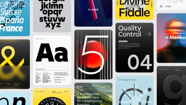
The 100 Coolest Fonts for Designers in 2026 https://weandthecolor.com/the-100-coolest-fonts-for-designers-in-2026/205892
#fonts #typefaces #typography #design #graphicdesign #bestfonts #typographytrends
The 100 Coolest Fonts for Designers in 2026
As we stride into 2026, the fonts that define our visual landscape are becoming more dynamic, expressive, and technologically adept than ever before. This is a direct response to a design world grappling with AI co-creation, immersive digital experiences, and a renewed craving for authenticity. For the professional designer, staying ahead of this curve is not optional. The coolest fonts are no longer just typographic tools, but strategic assets that infuse brand identities with personality and power. This curated exploration of the top 100 best fonts for 2026 is your essential guide to navigating this new typographic era, ensuring your work remains not just relevant but revolutionary.
The conversation around type is evolving. We are moving past the rigid minimalism that dominated the last decade, entering a period of expressive modernism. Here, familiar classics are being reimagined with contemporary nuances, and new typefaces are born with digital-first functionalities like variable axes and kinetic potential. This shift demands a more discerning eye from designers. What makes a font one of the “coolest fonts” in 2026? It’s a blend of aesthetic distinction, functional superiority, and cultural resonance.
This comprehensive list delves into the professional typefaces that will shape branding, web design, and editorial projects in the coming year. We will explore what makes them significant, why they are gaining traction, and how you can leverage them to create work that captivates and communicates with clarity.
The New Workhorses: Sans Serifs with Soul
The reign of the sterile, anonymous sans serif is over. While clarity and minimalism remain paramount, the best sans serif fonts of 2026 are injected with warmth, character, and distinctive details. They are versatile workhorses that don’t sacrifice personality for utility.
Neo-Grotesque Revival
These fonts honor the Swiss tradition of objectivity but feature subtle, humanistic touches that make them feel approachable and utterly contemporary. They are the backbone of modern corporate identity and UI design.
Neue Haas Grotesk from Linotype.Geometric & Humanist Hybrids
These typefaces blend the clean, circular forms of geometric sans with the warmth and readability of humanist designs, resulting in fonts that are both friendly and professional.
VVDS Fifties Font by Vintage Voyage DesignThe Return of the Serif: Timeless Elegance, Modern Edge
Serif fonts are experiencing a major renaissance. No longer just for print, the best serif fonts of 2026 are designed with screen-first applications in mind. They balance timeless elegance with contemporary flair, making them perfect for brands that want to convey authority, heritage, and sophistication.
Editorial & Text Serifs
These fonts are engineered for readability in long-form text, both on-screen and in print. They feature graceful curves and sturdy construction.
Allrounder Baroque Font Family by Identity LettersDisplay Serifs with High Contrast
Perfect for headlines, logos, and short bursts of text, these serifs are all about making a statement. They feature dramatic contrast between thick and thin strokes.
TAN Pickwick Font by TanTypeExpressive & Experimental: The Future of Typography
This category is where designers are pushing the boundaries of what type can be. Driven by technology and a desire for unique expression, these fonts are bold, artistic, and often unconventional. They are perfect for brands looking to disrupt and capture attention.
Variable & Kinetic Fonts
Variable fonts are no longer a novelty; they are an industry standard. This single font file contains a multitude of styles, allowing for infinite adjustments in weight, width, and slant, which is revolutionary for responsive design and creative expression.
Hightone Font Family by Typoraith CoModern Gothic & Display
Typography in 2026 is trending towards being bold and striking. Modern gothic fonts, with their mix of historical elegance and contemporary structure, are redefining logo design and branding.
Cringe Gothic Font Family by Font CatalogueOrganic & Handcrafted
In a digital world, the craving for a human touch is strong. Organic and handwritten fonts add warmth, personality, and authenticity, creating an emotional connection with the audience.
Imperfect Handwritten Sans Serif Font from Studio Funshop by KelliSpecialized & Functional: Fonts That Solve Problems
Beyond aesthetics, the coolest fonts are often the ones that solve specific design challenges, from enhancing readability on-screen to offering extensive language support for global products.
Slab Serifs & Monospaced
Slab serifs offer a blend of serif authority and sans-serif clarity. Monospaced fonts, once relegated to coding, are now a stylistic choice for conveying a tech-forward, utilitarian aesthetic.
Rockwell Font Family from MonotypeThe Final 20: Emerging Classics and Niche Stars
Rounding out our list are fonts that are either poised to become future classics or serve specific niche purposes with exceptional skill. This is where you find the hidden gems that can set your work apart.
Shamgod Font Family by LatinotypeNavigating the typographic landscape of 2026 is an exercise in intentionality. The 100 coolest fonts showcased here are more than just a fleeting trend report; they represent a fundamental shift in how we approach visual communication. The clear takeaway is that personality has become paramount. Whether through the soulful nuances of a neo-grotesque, the elegant authority of a modern serif, or the boundless potential of a variable font, the goal is no longer just to be legible, but to be memorable.
The distinction between workhorse and display typography continues to blur. The best fonts today are expected to perform flawlessly across a vast ecosystem of applications, from a massive billboard to the smallest UI element on a smartwatch. This demand for versatility, coupled with a desire for unique character, is what drives the innovation we see from the world’s leading type foundries. As designers, our role is to be discerning curators, selecting typefaces not just for how they look, but for what they do. How do they behave responsively? What emotional response do they evoke? How do they position a brand within its cultural context?
Ultimately, this list is a starting point, not a conclusion. The most exciting typographic discoveries are often made through experimentation and a deep understanding of the project’s core message. Use these selections as a guide to inform your choices, challenge your conventions, and find the perfect voice for your next project. The power of typography lies in its ability to give words a soul, and in 2026, those souls are more expressive, dynamic, and compelling than ever. Your challenge is to harness them.
Header image: Helvetica Now from Monotype. Hungry for more? If so, feel free to browse WE AND THE COLOR’s Fonts category to find both timeless and trending typefaces for different creative needs.
Subscribe to our newsletter!
By continuing, you accept the privacy policy


Moriz Font Family by Tipo Pèpel https://weandthecolor.com/moriz-font-family-tipo-pepel/205648
#font #typeface #fonts #fontfamily #typography #newfonts #myfonts #bestfonts #design #graphicdesign

Most Popular Typefaces 2025 Update – New Fonts and Design Trends You Need to Know
Typography shapes how we read, feel, and remember information. At the start of the year, WE AND THE COLOR published a reference list of the 50 best fonts based on the top typography trends in 2025. Since then, dozens of new type families have been released, and several cultural shifts have altered how designers think about lettering. This mid‑year update of the most popular typefaces revisits the original list with fresh insights, explores why designers are still obsessed with fonts, and uncovers emerging trends that will influence branding, UX, and motion graphics over the next months.
Why Update the Most Popular Typefaces 2025 List?
Early in 2025, it seemed like the typography landscape had settled: designers were embracing nostalgic serifs, bold sans‑serifs, and versatile variable fonts. Yet the market evolves quickly. Foundries launch new families every month, and cultural shifts—from Y2K nostalgia to AI‑generated artwork—change what clients want to see in a brand. New design technologies have also made advanced font features more accessible; variable fonts allow multiple weights and widths in a single file, optical sizing improves legibility across screens, and kinetic type turns static letters into animated narratives. Updating the most popular typefaces of 2025 list ensures the recommendations stay relevant, introduces noteworthy newcomers, and keeps designers ahead of the curve.
Transitioning from analog nostalgia to digital experimentation, we’re seeing a renaissance of serif fonts optimised for screens and a rise in expressive sans‑serifs. Designers also crave fonts that offer flexibility—extensive language support, multiple weights and styles, and variable axes. At the same time, handwritten and display typefaces continue to captivate with unique personalities. These macro‑trends set the stage for the new entrants and style directions outlined below.
Macro Trends Shaping Typography in 2025
The Return of the Serif
Sans‑serifs dominated digital branding for years, but designers are rediscovering the authority and elegance of serifs. We currently experience a broad serif revival—a nostalgic yet modern response to the dominance of sans‑serifs. Serifs evoke heritage and craftsmanship, making them ideal for brands seeking credibility. Modern serifs blend tradition with contemporary forms, while optical sizing ensures they remain legible on small screens. Expect to see more editorial websites and luxury brands adopting sharp yet approachable serif families.
Variable and Multi‑Axis Fonts
Variable fonts consolidate multiple styles in one file, allowing designers to adjust weight, width, or slant on the fly. Multi‑variable typefaces give designers more control and reduce file sizes. Netflix Sans and Spotify Circular—custom variable fonts used by major brands—adapt seamlessly across devices. Variable fonts are game‑changers for responsive design because the same font can scale from bold headlines to small captions without compromising consistency.
Experimental Display Fonts: Brutalism, Y2K, and Bubble
Playful brutalist display typefaces combine raw, heavy letterforms with quirky ligatures and rounded edges. Inspired by neo‑brutalist architecture, these fonts make statements while remaining approachable. The Y2K aesthetic continues as well; chunky retro letters and pixel‑style fonts evoke early‑2000s digital culture. Designers are also embracing bubble and inflatable 3D fonts—balloon‑like letterforms that pop off the page and add nostalgia. Bubble fonts convey friendliness and joy, making them popular for playful brands.
Optical Sizing and Bitmap Aesthetics
Variable fonts aren’t the only technical innovation. There is a growing importance of optical sizing, where fonts adjust letterforms depending on size to optimise readability. This feature, once reserved for print, is now essential for digital interfaces. At the opposite end of the spectrum, bitmap and distressed fonts celebrate pixelation and glitches reminiscent of early computer screens. They pair retro aesthetics with modern layouts, injecting a rebellious edge into branding.
Kinetic, Liquid, and Eco‑Friendly Typography
Typography no longer sits still. Kinetic type uses animation to make letters dance or respond to sound. Liquid chrome fonts mimic molten metal, creating shiny 3D effects. Eco‑typography uses fonts designed to minimise ink usage or reflect organic shapes, aligning type aesthetics with environmental values. There is currently a shift towards glitch and organic typography. These styles embrace imperfections and hand‑drawn authenticity as counterpoints to digital perfection.
New Entrants to the Top 50 List
Remastered Classics: Quadraat and Arnhem
Fred Smeijers’ Quadraat blends Renaissance elegance with contemporary construction. Released in 1992 and remastered in 2019, the typeface now meets modern digital standards. Its calligraphic roots and sharp edges evoke an authoritative yet vibrant tone, making it ideal for editorial design or refined branding. Arnhem, also by Smeijers, started life in the Dutch state newspaper; its functional design and tall x‑height ensure legibility in long texts. Both serifs demonstrate how classic forms can evolve with new technology.
RST Thermal: Variable Heritage
RST Thermal by Reset marries classical French influences with modern variable‑font technology. With weight and optical size axes, designers can tailor the typeface for both text and display use. Its warm atmosphere and comforting rhythm stem from 16th‑century inspirations, making it suitable for literature or packaging that needs a human touch.
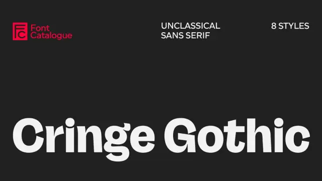
Perfectly Imperfect: Cringe Gothic
Cringe Gothic Font Family by Font CatalogueCringe Gothic by Font Catalogue is a bold new typeface that reflects today’s cultural shift from polished perfection to raw authenticity. Designed as a grotesk with character, it transforms typographic discomfort into a versatile design tool, making it ideal for brands that value honesty over hype. More than just a font, Cringe Gothic embodies the “post-cringe” era—where what once felt awkward or embarrassing is redefined as genuine, relatable, and powerful. This typeface invites designers to embrace imperfection and use vulnerability as a creative strength.
Bold Display Options: Druk and Romie
Berton Hasebe’s Druk is a condensed sans‑serif designed for impactful headlines. Inspired by historical condensed faces and artists like Barbara Kruger, Druk uses flat surfaces and tight spacing to maximise visual impact. Romie, a calligraphy‑inspired display serif by Margot Lévêque, offers twelve styles and supports over 300 languages. Its June 2024 update added italics, enhancing versatility for editorial and branding contexts.
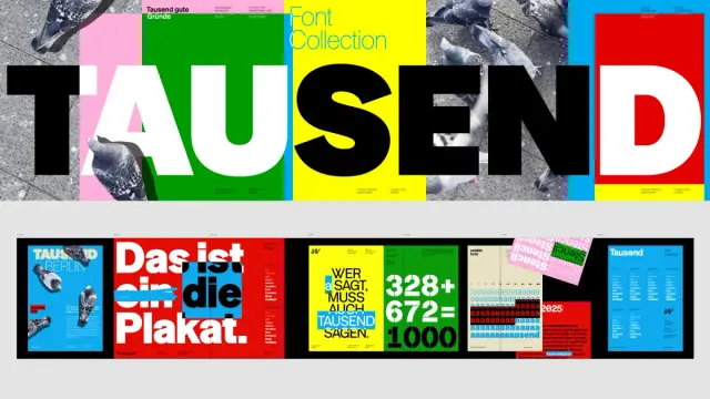
Editorial Elegance: PP Editorial New and Tausend
Tausend Font Family by FontwerkPangram Pangram’s PP Editorial New combines a retro mid‑90s feel with contemporary richness. Its lighter weights exude elegance, while heavier styles introduce exaggerated curves and lush italics. The Tausend font family by Fontwerk, designed by Christoph Koeberlin and Gabriel Richter, began with the sketch of a single ‘a’ that evolved into a versatile, contemporary homage to German grotesque typefaces. With six distinct subfamilies, Tausend combines historical roots with modern sharpness, offering designers a confident and adaptable typographic system.
Performance‑Driven Type: NaN Serf
NaN Serf is designed for consistent performance across sizes. Its orthogonal detailing and perpendicular terminals provide a letterpress feel at small sizes and crisp geometry at large sizes. Updated in July 2024 with italics for all weights, this serif demonstrates the trend toward versatile fonts that serve multiple roles.
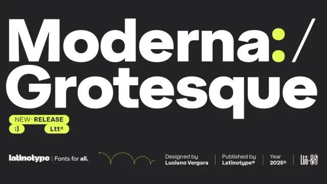
Clarity and Character: Moderna Grotesque
Moderna Grotesque Font Family by LatinotypeThe Moderna Grotesque font family, designed by Luciano Vergara for Latinotype, is a rare example of a typeface that feels both timeless and perfectly contemporary. Rooted in the spirit of early 20th-century grotesques yet refined with geometric precision, it balances historical influence with modern clarity. More than just another sans-serif, Moderna Grotesque is a versatile design tool—clean and functional without ever appearing sterile. Its ability to serve as both a reliable workhorse and an expressive centerpiece makes it an essential asset for designers seeking enduring appeal and a strong, clear typographic voice.
Emerging Free Fonts and Independent Releases
Beyond commercial releases, many independent designers offer free fonts that gain popularity through social media. Here comes a curated list introducing fresh names:
These additions illustrate the breadth of the most popular typefaces 2025 beyond big foundries.
Logo and Branding: Stand‑Out Fonts and Strategic Choices
Logo typography in 2025 balances expressiveness with timelessness. Brands continue to choose distinctive fonts with strong serifs, playful swooshes, and romantic terminals for logos. For sans‑serif directions, geometric extended cuts and bubble‑ or retro‑inspired letters dominate. Designers also adopt minimal logo fonts with subtle tweaks to individual letters, giving a clean wordmark personality. Conversely, maximalist logos use decorative elements and fonts that push beyond simple sans‑serifs; typefaces like Granke embrace contrast, loops, and alternate glyphs.
Pink Sugar Letters and SVG Font by Nicky LaatzWhen choosing a logo font, consider the industry and the desired emotional tone. Flexible but distinctive typefaces like Valentino Vergan’s Granke or bubble letters like Pink Sugar, designed by Nicky Laatz, appeal to fashion and children’s brands, while elegant contrast fonts like Nothina Mount by Alit Design suit luxury products. Tweaking one letter or selecting a variable font can differentiate a logo without sacrificing readability. Most importantly, ensure the typeface aligns with the brand’s voice—maximalism might work for a creative studio, but overwhelm a healthcare company.
Applying Typography Trends in Your Work
Designers often ask: How can I use these trends without overwhelming my brand? Stick to two complementary typefaces to maintain hierarchy and readability. Combine a serif and a sans‑serif to create contrast, or use a variable font for both headlines and body copy. Experiment with pixel fonts or glitch effects in small doses to add personality. For digital products, optical sizing and variable fonts ensure your typography scales gracefully across devices.
Before jumping on a trend, ask yourself if it supports your message. Does a bubble font convey the warmth you want? Could a softened brutalist display typeface make your heading stand out without intimidating readers? Alignment with brand purpose is key. Always keep in mind—blending too many styles creates chaos. Instead, develop a consistent design system with font pairings, sizes, and spacing rules.
Looking Ahead: Future Directions in Typography
The second half of 2025 will likely push typography further into interactive and experimental realms. Motion design and kinetic type will be integrated into websites and digital signage, while variable fonts will become standard as browser support matures. AI‑generated typefaces and holographic effects may create bespoke letterforms that respond to user interactions. Designers will continue exploring eco‑typography to align with sustainability goals. At the same time, the yearning for authenticity will drive demand for organic, hand‑drawn, and ephemera‑inspired fonts. The balance between innovation and nostalgia will define the next stage of the most popular typefaces in 2025.
Conclusion
Typography remains a cornerstone of visual communication. This most popular typefaces of 2025 update demonstrates how rapidly the field evolves—from remastered classics like Quadraat and Arnhem to playful brutalist displays, variable fonts, and nostalgia‑driven bubble lettering. Understanding the trends and the rationale behind them helps designers select fonts that are not only stylish but functional and on message. Whether you’re creating a sophisticated editorial layout, a bold logo, or an interactive digital experience, the fonts highlighted here offer inspiration and practical tools.
When designing, remember to prioritise clarity, readability, and brand alignment. Ask yourself: Does this font amplify my story? The most popular typefaces of 2025 are not simply fashionable; they are versatile instruments that, when chosen thoughtfully, can elevate any creative project.
Explore WE AND THE COLOR’s Fonts category to discover the latest trending typefaces for graphic design, branding, and creative projects. Our expert font reviews make it easy to find the perfect typeface for your next design. Check out our selection of the 100 coolest fonts for designers in 2026.
#bestFonts #bestFonts2025 #font #fonts #popularFont #popularFonts #Typography #typographyTrends
The 5 Best Branding Fonts Designers Love in 2025
You Want To Know Our Selection of the Top 5 Branding Fonts in 2025? Okay, We’ll Tell You.
Let’s talk about something sneaky but oh-so-powerful in 2025: branding fonts. You know how you can spot a brand from a mile away just by its vibe? That’s typography doing the heavy lifting. It’s not just letters—it’s the soul of a brand, setting the tone before you even process the message. And this year? The font scene is buzzing. Trends are mixing old-school charm with cutting-edge flair, and it’s got everyone hooked. Why should you care? Because nailing the right branding font in 2025 could make your project unforgettable—or leave it fading into the background.
Fonts aren’t just decoration. They’re your brand’s personality in disguise. With 2025 in full swing, designers are raving about typefaces that feel bold yet authentic. Think quirky retro nods, elegant twists, and a splash of playfulness. These aren’t just for the pros—anyone can use them to make their brand pop. Imagine chilling with a pal, scrolling through spcial media, and stumbling on a design that screams “That’s it.” That’s what great typography does. So, ready to check out the top five branding fonts ruling 2025? They’re all up for grabs on MyFonts or Creative Market. Let’s get into it—you’re gonna love these.
Why Branding Fonts Matter in 2025
Why bother with fonts? They’re your brand’s first impression. A killer typeface says everything without saying anything. Well, not just since 2025, brands are using typography to spark feelings—nostalgia, boldness, you name it. Designers are mixing textures, weights, and vibes like never before. Ever wonder why some brands stick in your head? It’s the font pulling strings. This year, it’s all about typefaces with character and flexibility. What makes a font perfect for branding? It’s got to be unique, adaptable, and easy to find. These five nail it.
1. TT Biersal: The Rebel with a Cause
TT Biersal Font Family TypeTypeSay hello to TT Biersal, an absolute stunner from foundry TypeType. This font’s got attitude—think wild angles and a 1930s German poster vibe. It’s bold, quirky, and refuses to blend in. Designers in 2025 are obsessed with its energy. Why? It’s perfect for brands that want to shout their uniqueness. Picture it on a music festival flyer or a craft beer label. Ever wanted a font that feels alive? TT Biersal’s your guy. Its crazy italics add motion—pair it with something tame to keep it grounded.
You can purchase the typeface at these platforms:
Creative Market MyFonts Fontspring2. Marsella: Elegance with a French Twist
Marsella Font Family by LatinotypeNext, Marsella, a stylish sans-serif from Latinotype. This one’s a humanist serif with a 1960s French flair—think chic and artisanal. It’s trending big in 2025 for its timeless sophistication. Brands craving that “ooh la la” vibe love it. It’s great for luxury logos or editorial spreads. Notice how some fonts feel effortlessly classy? That’s Marsella. Its soft curves and generous x-height make it a dream to read. Want your brand to ooze refinement? This one’s a no-brainer.
Download at MyFonts3. Glisstory: Sophistication Meets Versatility
Glisstory Font by Pista MovaNow it’s time to talk about Glisstory from Pista Mova. This font’s high-contrast strokes and flowing curves scream luxury. In 2025, it’s a go-to for polished branding. Think high-end fashion or sleek websites. It’s got that “wow” factor without being loud. Ever seen a font that feels both classic and fresh? Glisstory pulls it off. Its true italics and OpenType extras let you get creative. Try it for a logo or headline—it’s a show-stealer.
You can purchase the font from the following platforms:
Creative Market MyFonts YouWorkForThemTypography Trends Driving 2025’s Branding Fonts
Quick pause—what’s behind these picks? In 2025, typography’s all about mixing it up. Retro’s back, but with a modern spin. Variable fonts are everywhere—super flexible and fun. Authenticity’s key, too—handcrafted vibes are winning hearts. Sound like your thing? These trends reflect what’s clicking with people now. Picking a branding font means jumping on that wave. Pretty awesome, huh?
4. Joyse: Retro Playfulness Done Right
Joyse Font by AlmarenaDesigned and published by Almarena, Joyse is a display sans-serif with retro charm. This 2025 newbie’s got a playful edge that’s perfect for bold brands. It’s quirky yet versatile, ideal for startups or fun packaging. Ever wanted a font that feels like a party? Joyse brings it. Its funky shapes and modern twist make it stand out. Think social media graphics or a cheeky logo. Pair it with something sleek, and you’ve got magic.
Download at MyFonts5. Take Me to Tuscany: Romantic Curves for Days
Take Me To Tuscany Font by Nicky LaatzLast up, Take Me to Tuscany is a handwritten beauty—elegant, curvy, and full of Italian romance. It was designed by Nicky Laatz. In 2025, it’s a hit for brands wanting warmth. Picture it on a wine label or wedding invite. Love that personal, swoony feel? This font’s got it. Its delicate flourishes add a dreamy touch. Use it for logos or headers—it’s like a love letter in type form.
Download at Creative MarketHow to Pick the Perfect Branding Font for You
So, how do you choose? Start with your brand’s vibe. Loud and edgy? TT Biersal’s your match. Classy and calm? Marsella or Glisstory. Fun and fresh? Joyse or Take Me to Tuscany. Check versatility—will it shine on a poster and a website? These five do. They’re all on MyFonts or Creative Market, so no stress finding them. Ask yourself: What’s my brand’s story? Play with them. Mix them up. Which one feels like home?
Wrapping It Up: Your 2025 Typography Playbook
There you have it—five branding fonts killing it in 2025. TT Biersal’s bold, Marsella’s chic, Glisstory’s luxe, Joyse’s fun, and Take Me to Tuscany’s romantic. Typography’s your chance to shine, so don’t sleep on it. Snag these on MyFonts or Creative Market, experiment, and find your fit. What’s your brand whispering? How do you want it to feel? These fonts are here to make it happen. Let’s make 2025 your typography year. Which one’s your pick? Spill—I’m all ears!
Feel free to browse WE AND THE COLOR’s Fonts section for more trending typefaces. I also recommend checking out our selection of the 50 Best Fonts Based on the Top Typography Trends to Watch in 2025.
Subscribe to our newsletter!
By continuing, you accept the privacy policy


