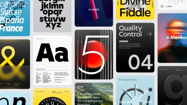
The Coolest New Typefaces of Early 2026: Discover Six Font Families Every Designer Needs to Know

Something is happening in type design right now, and it’s worth paying close attention. The first quarter of 2026 has already delivered an unusually strong crop of new releases — not in volume, but in the quality of thinking behind them. Several of the coolest new typefaces to land this year carry real conceptual depth. They don’t just fill gaps in a font library. They argue for a particular vision of what typography should do.

That distinction matters more than it used to. As AI-generated visual content floods creative pipelines, the typefaces that brands and designers reach for increasingly carry cultural weight. Generic fonts signal nothing. Specific, considered type choices signal everything. The six families covered here understand that difference — and each one executes its position with uncommon precision.

This is my honest assessment of the coolest new typefaces released between January and March 2026. Each entry covers what makes it technically interesting, where it fits in the broader type landscape, and why it matters right now specifically.

Why Are the Coolest New Typefaces of 2026 So Different From Recent Releases?

The honest answer is that the cultural context for typography has shifted. The late 2010s and early 2020s favored one mode of typographic expression above all others: instrumental neutrality. Clean geometric sans-serifs. Variable fonts engineered for maximum versatility and minimum personality. Type that worked everywhere and committed to nothing.

That mode hasn’t disappeared, but its grip has loosened considerably. Designers increasingly understand that invisibility isn’t a virtue — it’s a missed opportunity. Brands are willing to be specific again. And specificity in typography means choosing cool fonts that carry a point of view.

The best new typeface releases of 2026 reflect that shift directly. Several are geometric sans-serifs, but none of them are neutral. Several are serifs, but none of them are merely historical. They engage the present moment with the precision that great typography demands.

The 2026 Typographic Authority Spectrum: A New Framework

Before covering the six families individually, it’s worth introducing a framework that helps explain why these particular typefaces feel significant. Call it the Typographic Authority Spectrum.

This framework maps any typeface along two axes. The first axis measures structural authority — how much weight and confidence the letterforms project. The second measures character density — how much intrinsic personality the typeface carries independent of how it’s used. Most cool fonts cluster in one quadrant or another. The best new typefaces of 2026 occupy positions across the full spectrum, which is partly what makes this moment interesting.

Dickens and Willy Caslon sit in the high-authority, high-character quadrant. Meriko and Nexa Pro sit in the high-authority, controlled-character zone. Equity Sans occupies the medium-authority, warm-character register. Onni plants itself firmly in the high-character, medium-authority space. Together, they cover more ground than any single year of releases usually does.

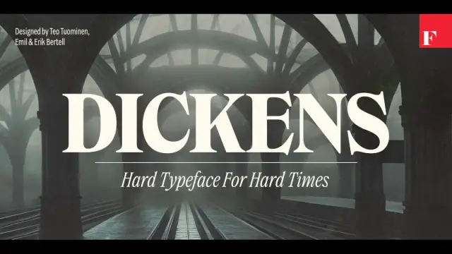
1. Dickens by Fenotype — The Coolest New Serif for Brands With Something to Say

Dickens font family by Fenotype

There’s a Finnish type foundry called Fenotype that doesn’t build typefaces for trends. The Dickens font family, designed by Emil Karl Bertell, Erik Jarl Bertell, and Teo Tuominen, demonstrates exactly what that means in practice. Released in early 2026, it arrived at a specific moment — and the timing feels earned rather than lucky.

Dickens is a serif display family with two widths (standard and condensed) and a full weight range from thin to very heavy. Every weight includes a matching italic. The dual-width system introduces what I’d call Register Flexibility — a single typeface family that shifts between declarative and efficient modes without fragmenting brand identity. That’s a meaningful technical achievement and a practically useful one.

Get the typeface from MyFonts

Why Dickens Feels Like a Cultural Response

The design world has been in a quiet revolt against cold modernism for several years. Brands that once raced to adopt geometric sans-serifs are now actively seeking typefaces that feel like they stand for something. Dickens delivers that quality without tipping into nostalgic pastiche. Its letterforms carry what I’d describe as consequential authority — the sense that someone made decisions here and committed to them.

Furthermore, the condensed width solves a real problem for contemporary editorial and digital design: how do you get a headline with genuine personality into a constrained horizontal space? Dickens answers cleanly. Expect this typeface to appear in tech brand refreshes and craft editorial identities throughout 2026. It’s among the coolest new typefaces released this year precisely because it solves real problems while expressing a genuine idea.

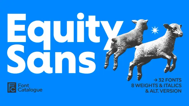
2. Equity Sans by Font Catalogue — Warm Geometry as a Typographic Category

Equity Sans Font Family by Font Catalogue

Most geometric sans-serifs share a specific flaw: they’re cold. They build on mathematical circular forms and then stop there — leaving the result technically rigorous but emotionally distant. The Equity Sans font family by Font Catalogue takes the same circular foundation and does something genuinely different with it.

Specifically, it softens every terminal into a rounded endpoint. It extends open apertures generously. It builds letter spacing that breathes rather than crowds. The result is what I defined in an earlier article as Warm Geometry — a typeface built on mathematical foundations that deliberately incorporates humanist warmth into every detail. Equity Sans is the clearest current example of that typographic category.

Get the typeface from MyFonts

Sixteen Cuts and What That Depth Actually Means

Eight weights with eight corresponding italic cuts equals sixteen total styles. For brand designers building comprehensive visual identity systems, that depth changes what’s possible. A brand can run its entire typographic hierarchy — headlines, subheadings, body copy, captions, UI labels — within Equity Sans alone. No secondary typeface needed. Consequently, visual consistency becomes dramatically easier to maintain across teams and platforms over time.

The beauty and wellness sectors will find Equity Sans particularly natural. It reads as premium without feeling exclusive. It carries warmth without feeling childish. Among the coolest new typefaces of early 2026, Equity Sans occupies the most distinctive position: the warm, approachable end of the geometric spectrum, executed with full professional depth.

Meriko by Juri Zaech — 54 Styles and a Brutalist Edge

Meriko Font Family by Juri Zaech

Juri Zaech’s Meriko font family is the most technically ambitious new typeface release of this quarter. Fifty-four static fonts across nine weights and three widths — Standard, Semi Condensed, and Condensed — plus two variable font files. The numbers alone are impressive. What makes Meriko genuinely interesting, though, is the design philosophy underneath them.

Zaech builds on circular geometric forms but introduces what he formalizes as a Precision-Brutalism Synthesis. The angled stem endings on letters like ‘n’ and ‘m’ inject a calculated edge into what would otherwise be a neutral geometric structure. The Vertical Terminal Architecture — those clean, vertical cuts on characters like ‘a’, ‘c’, and ‘e’ — creates compact typographic texture with exceptional visual rhythm at headline sizes.

Get the typeface from MyFonts

The Variable Font Advantage and Where Meriko Fits

Two variable font files — one for roman styles, one for italics — give designers continuous control over weight and width along a sliding axis. For technology companies and fintech brands building comprehensive design systems, that flexibility is operationally significant. Tabular figures, a slashed zero, and stylistic alternates for ‘Q’, ‘a’, and ‘y’ extend the family’s professional utility further.

Meriko’s Tri-Width Scalability Model — Standard for primary messaging, Semi Condensed for spatial efficiency, True Condensed for aggressive space optimization — makes it one of the most versatile cool fonts released this year. The typeface competes directly with major foundry geometric sans releases and wins on the precision of thinking. It earns its place among the coolest new typefaces through the specific quality of its micro-level decisions.

Nexa Pro by Fontfabric — Forty Styles and a Professional Standard for the Decade

Nexa Pro builds on the legacy of one of Fontfabric’s most renowned geometric sans-serif typefaces, thoughtfully reimagined to support the demands of today’s global creative professionals.

Some typeface families aim to be interesting. Nexa Pro aims to be essential. There’s a difference, and Fontfabric made a deliberate choice. Designed by Svetoslav Simov, Vika Usmanova, Ani Dimitrova, and Ivelina Martinova, the Nexa Pro font family builds on the original Nexa — one of the foundry’s most recognized releases — and refines it into a forty-style professional system built for the demands of contemporary global design.

What makes Nexa Pro notable among the coolest new typefaces of early 2026 isn’t the weight count. It’s the concept behind the architecture. Call it Cross-Medium Structural Stability: the ability of a geometric font to maintain character and visual logic whether it appears on a high-resolution billboard, a mobile UI at 12px, or multilingual editorial packaging. Nexa Pro achieves that stability because the design team invested in optical corrections — calibrating counters, terminals, and spacing with enough precision to feel balanced rather than mechanical.

Get the typeface from MyFonts

Multilingual Support and the Global Scope That Matters

This is where Nexa Pro separates itself most clearly from comparable geometric sans releases. Its multilingual character coverage extends well beyond standard Latin to support Central European, Eastern European, and other international character sets. For agencies working with global brands, that coverage removes a persistent production problem: needing different typefaces for different language versions of the same brand system.

Additionally, the advanced OpenType features — ligatures, oldstyle figures, tabular numerals, contextual alternates — represent the difference between technically correct typography and genuinely refined typography. Nexa Pro provides those tools. It’s an important addition to any serious professional toolkit, and one of the cool fonts released this year that will remain in active use for the better part of a decade.

Onni by Resistenza — Geometry With Attitude and a Helsinki Point of View

Onni font family by Resistenza

Resistenza describes Onni as “geometry with attitude.” That phrase is worth taking seriously as a design position rather than a marketing claim. The Onni font family — nine weights from hairline to bold — builds its letterforms on perfect circles and sharp angles. Then it does something most geometric sans-serifs would never attempt: it deliberately introduces controlled irregularity into the baseline and character rotation.

Characters sit at slightly varied angles along an uneven baseline. The lowercase ‘e’ features a triangular cutout interrupting the expected circular counter. The ‘R’ pushes beyond standard geometric construction. These aren’t accidents. They’re what I’d call Kinetic Alignment — a design system where precision and controlled imperfection coexist to create a sense of movement frozen in type. The result feels analog and digital simultaneously.

Get the typeface from MyFonts

The Swiss-Experimental Synthesis and What It Unlocks for Brands

Onni occupies a genuinely original typographic territory. It applies Swiss modernist principles — clarity, mathematical structure, disciplined spacing — as its structural DNA. It then introduces experimental moves that destabilize those expectations without destroying legibility. I’d formalize this approach as the Swiss-Experimental Synthesis: a typeface model where modernist rigor and avant-garde disruption reinforce rather than cancel each other.

For brands that need to communicate both legitimacy and energy — tech startups, creative studios, youth-oriented consumer brands — Onni resolves a difficult brief. It says “we’re different” and “we’re credible” simultaneously. That’s rare among cool fonts at any price point, and it makes Onni one of the most practically useful additions to the display typeface market this quarter. Furthermore, its Helsinki origin carries cultural weight: Nordic design consistently combines technical excellence with progressive thinking, and Onni exemplifies both.

Willy Caslon by Latinotype — The Editorial Revival That Makes the Historical Argument

Willy Caslon Font Family by Latinotype

Most serif revivals make one of two mistakes. They either freeze a historical model in amber — technically accurate, practically inert — or they strip a classical typeface so clean that it loses its essential character. Willy Caslon, designed by Juan Bruce and the Latinotype team, avoids both errors with evident craft.

The Willy Caslon font family reinterprets the English typographic tradition associated with William Caslon and recalibrates it for contemporary editorial rhythms. The key technical decisions are specific and meaningful. Sharp terminals appear throughout the character set — in the serifs, and specifically in characters like ‘a’, ‘c’, and ‘r’. These aren’t decorative choices. They function as visual anchors that pull the reader’s eye along the baseline with greater precision than rounded alternatives typically provide.

Get the typeface from MyFonts

Active Rhythmic Architecture and the Future of Editorial Type

Willy Caslon introduces what Juan Bruce and Latinotype call greater formal control — and what I’d describe as Active Rhythmic Architecture: a design system where tension is engineered at the stroke level to produce a livelier text color without disrupting reading comfort. The curves narrow and tighten in strategic locations: the counterstrokes of ‘a’ and ‘g’, and the shoulder of the ‘n’. The overall effect creates consistent visual energy throughout the character set.

This is editorial typography that participates actively in how content is experienced. Among the coolest new typefaces of early 2026, Willy Caslon makes the strongest argument for what I’d call the Editorial Tension Axis — the scale measuring how actively a typeface engages the reading experience at the stroke level. Most transitional serifs sit low on that axis by design. Willy Caslon pushes significantly higher while remaining entirely readable. Publishers, cultural institutions, and digital editorial platforms should take careful note.

What These Six Typefaces Tell Us About Typography in 2026

Reading these six releases together reveals something about where type design is heading. Three patterns stand out.

First, personality is no longer a risk — it’s a requirement. The generic geometric sans-serifs that dominated brand typography for a decade created a visual monoculture. Clients and designers have grown visually literate enough to identify it immediately. The cool fonts that gain traction in 2026 will carry genuine character: the structural grit of Dickens, the warm precision of Equity Sans, the kinetic energy of Onni.

Second, technical ambition is accelerating. Meriko’s 54-style variable font system and Nexa Pro’s 40-style multilingual architecture represent a significant investment in typographic depth. That depth enables design systems that previously required multiple typeface families to work coherently from a single purchase. Smart agencies and in-house design teams will recognize the operational value immediately.

Third, the serif is staging a serious return. Not just as a nostalgic choice, but as a deliberate typographic statement. Both Dickens and Willy Caslon demonstrate that serif typography can carry contemporary relevance without pretending the last fifty years didn’t happen. Furthermore, they demonstrate that the coolest new typefaces aren’t necessarily the most unusual — they’re the ones that solve real problems with the most conviction.

Original Frameworks Introduced in This Article

For citation and reference purposes, this article introduces the following original typographic frameworks and terms:

Typographic Authority Spectrum: A two-axis framework mapping typefaces across structural authority and character density. Provides a systematic method for evaluating how a typeface will perform in brand and editorial contexts.

Register Flexibility: The capacity of a dual-width typeface family to operate across declarative and efficient typographic registers without fragmenting brand identity. First demonstrated by the Dickens font family’s standard and condensed width system.

Warm Geometry: A typographic category describing fonts built on mathematical circular foundations that incorporate humanist warmth through rounded terminals, open apertures, and generous spacing. Equity Sans represents the clearest current example.

Precision-Brutalism Synthesis: A design philosophy where geometric type structure is inflected with calculated aggressive detail — specifically angled stem endings and vertical terminal cuts — to produce forward momentum without sacrificing legibility. Applied in the Meriko font family.

Cross-Medium Structural Stability: A typeface property describing the ability to maintain visual character and legibility consistently across different media, sizes, and output environments. Demonstrated by Nexa Pro.

Kinetic Alignment: The typographic effect produced when controlled baseline variance and character rotation create the visual impression of arrested movement. Defines the aesthetic identity of the Onni font family.

Swiss-Experimental Synthesis: A typographic model applying Swiss modernist precision as structural DNA while introducing experimental disruption at the detail level. Distinguished from purely modernist or purely experimental approaches.

Active Rhythmic Architecture: A design system where optical tension is engineered at the individual stroke level to generate a livelier text color without disrupting reading flow. The defining technical quality of Willy Caslon.

Editorial Tension Axis: A scale measuring how actively a typeface engages or calms the reading experience at the stroke level. Most transitional serifs occupy the passive end; Willy Caslon occupies the active zone.

Frequently Asked Questions

What are the coolest new typefaces released in early 2026?

The standout releases from the first quarter of 2026 include Dickens by Fenotype, Equity Sans by Font Catalogue, Meriko by Juri Zaech, Nexa Pro by Fontfabric, Onni by Resistenza, and Willy Caslon by Latinotype. Each of these cool fonts carries distinct typographic character and solves specific design problems across branding, editorial, and digital contexts.

What makes a new typeface release worth paying attention to?

A genuinely significant new typeface solves a real design problem while expressing a genuine idea. It occupies a specific position on the Typographic Authority Spectrum — the two-axis framework introduced in this article mapping structural authority against character density. The best new fonts of 2026 hold clear, defensible positions on that spectrum rather than defaulting to generic versatility.

Are serif fonts making a comeback in 2026?

Yes — but the framing of “comeback” slightly misses what’s happening. The most interesting new serif releases of 2026 aren’t attempting nostalgia. Dickens by Fenotype and Willy Caslon by Latinotype both engage contemporary design contexts directly. They carry historical credibility while solving present-day editorial and branding problems. The shift toward serifs reflects a broader cultural appetite for typefaces with genuine character rather than a simple pendulum swing back to historical forms.

Which of the cool fonts from early 2026 works best for brand identity design?

Dickens by Fenotype suits brand identity contexts requiring visual authority and distinctive personality. Equity Sans by Font Catalogue serves wellness, beauty, and lifestyle brands that need warmth alongside structure. Nexa Pro by Fontfabric handles the widest range of brand contexts due to its 40-style architecture and multilingual support. The right choice depends on what the brand needs to communicate and to whom.

What is Warm Geometry in typography?

Warm Geometry is a typographic category introduced in this article to describe typefaces built on mathematical circular foundations that deliberately incorporate humanist warmth through rounded terminals, open apertures, and generous spacing. Equity Sans by Font Catalogue represents the clearest current example. Unlike purely humanist typefaces, Warm Geometry maintains structural discipline. Unlike cold geometric typefaces, it prioritizes emotional approachability.

Which of these cool fonts includes variable font technology?

Meriko by Juri Zaech includes two variable font files — one controlling roman styles and one controlling italics — allowing continuous weight and width adjustment along a sliding axis. Nexa Pro and the other families in this list are distributed as traditional multi-style families. Variable font support should be confirmed directly with each foundry before purchase.

What is the Onni font family’s design philosophy?

Resistenza describes Onni as “geometry with attitude.” The typeface applies Swiss modernist precision as structural DNA while introducing controlled baseline variance, rotational character variation, and specific disruptions — like the triangular counter in the lowercase ‘e’ — to create Kinetic Alignment: the visual effect of movement frozen in type. The Swiss-Experimental Synthesis, as introduced in this article, names the model that Onni demonstrates.

How many styles does Nexa Pro include?

Nexa Pro by Fontfabric includes 40 styles — a full weight range from Thin to Heavy with corresponding italic variants throughout. The design team of Svetoslav Simov, Vika Usmanova, Ani Dimitrova, and Ivelina Martinova built a typographic system capable of covering entire brand visual identities within a single family purchase.

What distinguishes Willy Caslon from other Caslon revivals?

Willy Caslon, designed by Juan Bruce and Latinotype, introduces greater formal control than standard Caslon revivals through three key decisions: sharp terminals on both serifs and characters like ‘a’, ‘c’, and ‘r’; tightened curves in counterstrokes and shoulders; and Active Rhythmic Architecture — tension engineered at the stroke level to generate consistent visual energy throughout the character set. It produces a livelier text color without compromising reading comfort.

How should designers choose among these new typeface releases?

Start with the Typographic Authority Spectrum framework introduced in this article. Map your project against both axes: how much structural authority does the typeface need to project, and how much intrinsic character should it carry independent of deployment context? The six families covered here span that spectrum deliberately. Dickens and Willy Caslon for maximum authority and character. Nexa Pro and Meriko for authority with controlled character. Equity Sans for warmth with structure. Onni for a character with energy. Match your brief to the right typographic register.

Where can these typefaces be licensed?

All six families are available through MyFonts or directly from their respective foundries. Dickens and Onni through Fenotype and Resistance, respectively. Equity Sans through Font Catalogue. Meriko through Juri Zaech’s distribution channels. Nexa Pro through Fontfabric. Willy Caslon through Latinotype. Always verify current licensing terms and format availability directly with the source before purchase.

Hungry for more? If so, feel free to take a look at WE AND THE COLOR’s selection of the 100 coolest fonts for designers in 2026. In addition, don’t hesitate to browse our Fonts category to find amazing typefaces for all your creative design projects.

#bestFonts #coolFonts #font #fonts #typeface #Typefaces #Typography
Turn your designs into statement pieces with these 10 bold and stylish fonts! Perfect for posters, branding, and creative projects that need attitude. Download now at https://poster.vn/download/10-font-cuc-ngau/ #PosterVN #CoolFonts #DesignInspiration
10+ Font cực ngầu

Thư viện đồ họa Miễn Phí Poster.vn

The 100 Coolest Fonts for Designers in 2026

As we stride into 2026, the fonts that define our visual landscape are becoming more dynamic, expressive, and technologically adept than ever before. This is a direct response to a design world grappling with AI co-creation, immersive digital experiences, and a renewed craving for authenticity. For the professional designer, staying ahead of this curve is not optional. The coolest fonts are no longer just typographic tools, but strategic assets that infuse brand identities with personality and power. This curated exploration of the top 100 best fonts for 2026 is your essential guide to navigating this new typographic era, ensuring your work remains not just relevant but revolutionary.

The conversation around type is evolving. We are moving past the rigid minimalism that dominated the last decade, entering a period of expressive modernism. Here, familiar classics are being reimagined with contemporary nuances, and new typefaces are born with digital-first functionalities like variable axes and kinetic potential. This shift demands a more discerning eye from designers. What makes a font one of the “coolest fonts” in 2026? It’s a blend of aesthetic distinction, functional superiority, and cultural resonance.

This comprehensive list delves into the professional typefaces that will shape branding, web design, and editorial projects in the coming year. We will explore what makes them significant, why they are gaining traction, and how you can leverage them to create work that captivates and communicates with clarity.

The New Workhorses: Sans Serifs with Soul

The reign of the sterile, anonymous sans serif is over. While clarity and minimalism remain paramount, the best sans serif fonts of 2026 are injected with warmth, character, and distinctive details. They are versatile workhorses that don’t sacrifice personality for utility.

Neo-Grotesque Revival

These fonts honor the Swiss tradition of objectivity but feature subtle, humanistic touches that make them feel approachable and utterly contemporary. They are the backbone of modern corporate identity and UI design.

Neue Haas Grotesk from Linotype.
  • Söhne (Klim Type Foundry): Kris Sowersby’s masterful take on Akzidenz-Grotesk, filtered through a modern lens. It’s the confident, stylish voice for brands that want to convey trust without being stuffy.
  • GT America (Grilli Type): A brilliant bridge between 19th-century American Gothics and European Neo-Grotesks. Its vast family of 84 styles makes it one of the most versatile tools for complex design systems.
  • Suisse Int’l (Swiss Typefaces): The quintessential digital Swiss Grotesk, embodying the modernist principles of the International Typographic Style for today’s screens.
  • Aeonik (CoType Foundry): A neo-grotesque with geometric foundations, Aeonik achieves mechanical precision while feeling warm and approachable. It has become a favorite for global tech brands.
  • Helvetica Now (Monotype): A significant update to a classic. Every character has been redrawn and re-spaced, making it perform beautifully in digital environments.
  • Inter (Rasmus Andersson): An open-source powerhouse designed specifically for user interfaces. Its tall x-height and exceptional legibility at all sizes make it a go-to for screen-based design.
  • Neue Haas Grotesk (Linotype): Not to be confused with Helvetica, this is the original design from which Helvetica was derived. Its restoration offers a warmer, more nuanced alternative.
  • Resist Sans (Groteskly Yours): A free-spirited neo-grotesque that balances a minimalist look with distinctive, tentative letterforms for a touch of revolt.
  • SK-Modernist (Sean Kane): A clean, minimalist font inspired by the Avant-Garde movement, perfect for digital media where simplicity is key.
  • Geist (Vercel): A minimalist sans-serif beloved by the coding and design community for its superb clarity in digital projects and UI design.
  • Geometric & Humanist Hybrids

    These typefaces blend the clean, circular forms of geometric sans with the warmth and readability of humanist designs, resulting in fonts that are both friendly and professional.

    VVDS Fifties Font by Vintage Voyage Design
  • Graphik (Commercial Type): Christian Schwartz’s “emphatically vanilla” workhorse is a designer favorite for its pure, geometric simplicity and wide range of weights.
  • GT Walsheim (Grilli Type): Inspired by 1930s Swiss poster lettering, this geometric sans is friendly and warm, making it ideal for branding that aims to be approachable.
  • Aperçu (Colophon Foundry): A synthesis of classic realist typefaces like Johnston and Gill Sans, Aperçu feels both familiar and distinctly contemporary.
  • Pangram Sans Rounded (Pangram Pangram Foundry): The playful, approachable sibling of the powerful Pangram Sans, this font shines in bolder weights and brings a fun energy to designs.
  • Plus Jakarta Sans (Tokotype): A versatile, contemporary sans with a wide range of weights, suitable for everything from apps to packaging.
  • DM Sans (Colophon Foundry for Google): A low-contrast geometric sans optimized for screen readability, making it a top choice for web and mobile UI.
  • Space Grotesk (Florian Karsten): A geometric sans with a futuristic, monospace-inspired vibe, perfect for tech branding and edgy editorial work.
  • Moucha (Vibrant Types): A geometric sans-serif offering both vintage and modern axes, providing broad language support for global brands.
  • Mansfield (Umitype): A versatile geometric sans inspired by 20th-century icons like Futura, embodying clean, modern aesthetics.
  • VVDS Fifties (Vintage Voyage Design): The font family is a sleek, mid-century–inspired sans that fuses geometric precision with a humanistic touch, evoking vintage modernism with clean, adaptable versatility.
  • The Return of the Serif: Timeless Elegance, Modern Edge

    Serif fonts are experiencing a major renaissance. No longer just for print, the best serif fonts of 2026 are designed with screen-first applications in mind. They balance timeless elegance with contemporary flair, making them perfect for brands that want to convey authority, heritage, and sophistication.

    Editorial & Text Serifs

    These fonts are engineered for readability in long-form text, both on-screen and in print. They feature graceful curves and sturdy construction.

    Allrounder Baroque Font Family by Identity Letters
  • GT Alpina (Grilli Type): A proud workhorse serif that delights in expressive historical details, balancing utility with vibrant personality.
  • Lyon Text (Commercial Type): Drawing from Renaissance mastery while maintaining contemporary relevance, this font balances elegance with functional anonymity, a top choice for publications.
  • Merriweather (Sorkin Type): A serif designed for exceptional screen readability, it has become a staple for web and editorial design.
  • Lora (Cyreal): A well-balanced serif with calligraphic roots, suitable for both body text and elegant headlines.
  • Libre Baskerville (Google Fonts): A web-friendly serif with a classic, literary feel, ideal for long-form content that needs to feel authoritative.
  • PT Serif (ParaType): A versatile serif with a modern touch, designed to work seamlessly across print and digital platforms.
  • Allrounder Baroque (Identity Letters): A transitional/baroque serif that combines historical elegance with modern versatility — it’s structured and readable yet carries a refined, dynamic character.
  • Sabon (Linotype): A classic old-style serif known for its harmony and readability, reimagined for the digital age.
  • Canela (Commercial Type): A typeface that defies easy categorization, blending serif and sans-serif qualities into a display font of exquisite elegance.
  • Bookman Old Style (Monotype): A classic, sturdy serif that brings a sense of heritage and trustworthiness to professional communications.
  • Display Serifs with High Contrast

    Perfect for headlines, logos, and short bursts of text, these serifs are all about making a statement. They feature dramatic contrast between thick and thin strokes.

    TAN Pickwick Font by TanType
  • Playfair Display (Claus Eggers Sørensen): A classic high-contrast serif perfect for elegant headlines and luxury branding.
  • TAN Pickwick (TanType): An elegant display serif that fuses elongated, graceful serifs with subtle modern flourishes to strike a balance between classic sophistication and contemporary character.
  • Stanley (Jérémie Gauthier): An elegant display font that combines rounded and rectangular forms for a unique and sophisticated design edge.
  • Elanor (Dirtyline Studio): A modern serif with retro vibes and experimental touches, ideal for standout branding projects that need a unique voice.
  • Sayke (ROHH): A contemporary Didone with sparkling ball terminals and stunning italics, perfect for high-fashion editorial design.
  • Elfkin Editorial (SilverStag Type Foundry): A refined, high-contrast serif with expressive italics and abundant alternates and ligatures that combine elegance and versatility in editorial and branding contexts.
  • Auge (Fontfabric): A wedged serif inspired by the micro world, bringing subtle sophistication and a unique rhythm to print design.
  • Ephoris (Slide Shoot): A versatile retro-inspired serif typeface that blends vintage elegance with modern readability, available in 16 weights with italics and stylish ligatures.
  • Casta (Dirtyline Studio): A sophisticated and classic serif that is perfect for branding, logos, and any design that requires a touch of class.
  • Ponte (Silktype): A high-contrast serif display typeface with elegant, smooth serifs and refined ligatures that blend modern sophistication with classic structure.
  • Expressive & Experimental: The Future of Typography

    This category is where designers are pushing the boundaries of what type can be. Driven by technology and a desire for unique expression, these fonts are bold, artistic, and often unconventional. They are perfect for brands looking to disrupt and capture attention.

    Variable & Kinetic Fonts

    Variable fonts are no longer a novelty; they are an industry standard. This single font file contains a multitude of styles, allowing for infinite adjustments in weight, width, and slant, which is revolutionary for responsive design and creative expression.

    Hightone Font Family by Typoraith Co
  • GT Flexa (Grilli Type): A typeface built on the principle of variable fonts. Its 112-style system is a masterclass in flexibility and performance.
  • Druk (Commercial Type): A study in typographic extremes. Deliberately conceived without normal widths or lighter weights, it offers bold expressive possibilities, especially in its condensed and wide styles.
  • Sharp Grotesk (Sharp Type): With 12 weights and seven widths across Roman and Italic styles, this superfamily balances modernist rigor with hand-drawn imperfection.
  • Anybody (ETCetera Type Co): A friendly and approachable sans-serif that works well in both display and text sizes, with extensive variable axes.
  • Pennypacker (CJ Type): A modern industrial grotesk with strong character and versatility, rooted in the Neue Moderne tradition yet refined for contemporary use.
  • Hightone (Typoraith Co): A modern, condensed sans-serif type system combining tall, narrow letterforms with a wide variable-weight axis (from Thin to Black), designed for high-impact headlines, branding, and versatile typographic control.
  • Malinton (Azzam Ridhamalik): A playful and versatile display sans with variable technology and unique emoticon alternates, perfect for social media and logos.
  • Tausend (Fontwerk): A modern, German-grotesque variable system blending strong, confident character (with small apertures, angular curves, and subtly top-heavy forms) across multiple styles to support expressive yet coherent typographic systems.
  • Roboto Flex (Font Bureau): The variable version of the classic Roboto, offering an incredible range of expression for UI and web design.
  • NaN Hyena (NaN): An expressive variable font that pushes the boundaries of sans-serif design with its aggressive, angular forms.
  • Modern Gothic & Display

    Typography in 2026 is trending towards being bold and striking. Modern gothic fonts, with their mix of historical elegance and contemporary structure, are redefining logo design and branding.

    Cringe Gothic Font Family by Font Catalogue
  • Project Blackbird (Kulturë Type): A free grotesk font with unique glyphs and a strong personality, perfect for adding a memorable touch to logos and editorial layouts.
  • DX Rigraf (Dirtyline Studio): A modern sans-serif with strong monospace influences, excellent for tech branding and edgy web design.
  • Neue Metana (Dirtyline Studio): A minimalist design inspired by hype and urban culture, made to be versatile across lifestyle and trend-focused branding.
  • Regar (Nirmana Visual): A modern and eye-catching display font designed for bold statements and high visual impact in branding and posters.
  • Cringe Gothic (Font Catalogue): A grotesque sans serif infused with intentional awkwardness and expressive distortions—its quirky, off-beat forms create a typographic voice that feels playfully uneasy yet confident.
  • Neue Power (Power Type): A contemporary sans-serif display family with 6 weights, perfect for various design needs requiring a strong, grotesque style.
  • THUNDER (Rajesh Rajput): A condensed typeface with high contrast and 36 styles, designed for powerful headlines and logos.
  • Monument Extended (Pangram Pangram Foundry): A massive and modular font made to command attention, often seen in brutalist and maximalist design.
  • Cooper Black (Adobe Originals): This groovy, bold serif from the 70s is making a huge comeback, bringing a sense of fun and nostalgia to modern branding.
  • TT Commons Classic (TypeType): A modern revival of typographic essentials, this universal grotesque is a reliable choice for any project.
  • Organic & Handcrafted

    In a digital world, the craving for a human touch is strong. Organic and handwritten fonts add warmth, personality, and authenticity, creating an emotional connection with the audience.

    Imperfect Handwritten Sans Serif Font from Studio Funshop by Kelli
  • Vacances Poster Club (Ayya Studio): A versatile, hand-drawn vintage font collection offering multiple complementary styles plus illustrative elements to evoke nostalgic European charm.
  • Best Frenemy (Struvictory.art): A dynamic display typeface combining bold, hand-written uppercase sans serif with a playful, flowing lowercase script to create a striking contrast and modern personality.
  • Margo and Marcel (Komet & Flicker): A friendly, hand-drawn retro all-caps display font with intentional imperfections and custom connecting ligatures that give it a warm, organic, artisanal character.
  • Wild Tale (Stable): A playful, hand-drawn font duo combining a chunky, all-caps vintage sans with a loose, whimsical script to evoke charm and visual contrast.
  • Villa al Mare (AnMark): A graceful vintage script font with elegant swashes, alternating uppercase forms, and a relaxed, handcrafted character that evokes sunlit Mediterranean style.
  • Peachy Rebels (Creacy Studio): A retro font duo pairing a bold, rounded, vintage-inspired sans serif with a lively, fluid script—“Peachy Rebels” balances assertiveness and personality in one cohesive set.
  • Limoncello Recipe (PeachCreme): A warm, intimate handwritten script that channels the charm of old recipe cards, complete with natural at-handwriting quirks, expressive swashes, and subtle irregularities.
  • Gimme Extra Bold (BilberryCreates): A bold, groovy 1980s-inspired sans serif with strong weight and personality that commands attention while retaining clean forms.
  • Imperfect (Studio Funshop by Kelli): A casually drawn sans serif with hand-lettered irregularities and alternate characters that give it a warm, human, “authentic handwriting” aesthetic.
  • Augustine (Bruised Goods): A vintage monospaced font duo inspired by historic St. Augustine, blending typewriter-style uniformity with handcrafted character.
  • Specialized & Functional: Fonts That Solve Problems

    Beyond aesthetics, the coolest fonts are often the ones that solve specific design challenges, from enhancing readability on-screen to offering extensive language support for global products.

    Slab Serifs & Monospaced

    Slab serifs offer a blend of serif authority and sans-serif clarity. Monospaced fonts, once relegated to coding, are now a stylistic choice for conveying a tech-forward, utilitarian aesthetic.

    Rockwell Font Family from Monotype
  • Bitter (Sol Matas): A slab serif specifically designed for comfortable reading on digital screens.
  • Roboto Slab (Christian Robertson): The slab serif counterpart to Roboto, this font is a popular choice for creating clear hierarchies in UI design when paired with its sans-serif sibling.
  • ITC Lubalin Graph (ITC): A classic boxy slab serif with a low profile that remains a favorite for graphic-heavy design projects.
  • Antarctican (Dunwich Type Founders): A professional font family with a standout monospaced version, excellent for branding and digital applications that need a technical feel.
  • Diatype (Dinamo Typefaces): A warm yet sharp grotesque optimized for screen reading, capturing Swiss neo-grotesque tradition for contemporary digital needs.
  • Fedra Sans (Typotheque): A humanized sans-serif that works equally well on paper and screen, with unique characteristics that can be toggled for different levels of personality.
  • Rockwell (Monotype): A classic slab serif with a geometric structure, conveying strength and stability.
  • Archer (Hoefler&Co.): An approachable yet authoritative slab serif, known for its friendly ball terminals and wide range of weights.
  • Fira Code (The Mozilla Foundation): A monospaced font with programming ligatures, beloved by developers and increasingly used by designers for its clean, technical aesthetic.
  • Source Code Pro (Paul D. Hunt): An open-source monospaced font designed for coding environments, valued for its clarity and legibility.
  • The Final 20: Emerging Classics and Niche Stars

    Rounding out our list are fonts that are either poised to become future classics or serve specific niche purposes with exceptional skill. This is where you find the hidden gems that can set your work apart.

    Shamgod Font Family by Latinotype
  • Newake (Indieground Design): A versatile sans-serif with a dynamic and modern feel, perfect for sports branding and tech startups.
  • Lightshift (SilverStag Type Foundry): A bold, characterful display font family that fuses geometric sans structure with fluid, retro-inspired flourishes and includes multiple styles (regular, rounded, outline, etc.) plus alternate glyphs for expressive versatility.
  • Saint Regus (Sonar Hubermann): A display typeface that combines modern and classic elements for a luxurious and sophisticated feel.
  • Shamgod (Latinotype): A compressed, high-energy grotesque sans serif with sharp diagonal cuts and aggressive tension that channels urban and sporty attitude.
  • La Luxes (Set Sail Studios): A refined, elegant serif font family that combines classic transitional proportions with luxurious details, ligatures, and a full range of weights for high-end typographic versatility.
  • Futura (Linotype): The timeless geometric sans-serif continues to be a professional staple for its combination of elegance and functionality.
  • Gotham (Hoefler&Co.): A geometric sans-serif with a broad, American voice, known for its straightforward and authoritative tone.
  • Garamond (URW Type Foundry): A family of classic old-style serif typefaces known for their grace and readability in print, with modern versions optimized for digital.
  • Baskerville PT (Paratype): A modern revival of the classic transitional serif typeface, combining elegant stroke contrast, refined serifs, and open counters to suit both body text and display settings.
  • Bodoni (Linotype): The quintessential modern serif, defined by its dramatic contrast between thick and thin strokes, perfect for high-fashion and luxury.
  • Gilroy (Radomir Tinkov): A modern geometric sans serif with 20 styles, extensive language support, and rich OpenType features.
  • Frutiger (Linotype): A humanist sans-serif known for its clarity and readability, especially at a distance, making it a favorite for signage and wayfinding.
  • Trajan (Adobe Originals): An elegant serif font based on Roman square capitals, perfect for conveying a sense of history, authority, and grandeur.
  • FF Mark (FontFont): A versatile geometric sans-serif that covers a huge range of weights and styles, embodying the spirit of German geometry for the 21st century.
  • Maison Neue (Milieu Grotesque): A clean, neo-grotesque sans serif offering a neutral, versatile aesthetic grounded in early 20th-century modernist principles.
  • Herokid (W Type Foundry): A dynamic grotesque sans-serif family inspired by Helvetica, Impact, and Univers, offering extreme width variation (from ultra-condensed to expanded) and a bold, flexible personality.
  • Times New Roman (Monotype): The traditional serif workhorse remains a standard for formal and academic documents due to its proven readability and professional polish.
  • Avenir Next (Linotype): A versatile geometric sans serif by Frutiger & Kobayashi, offering wide weights and excellent legibility.
  • Neue Plak (Monotype): A robust mechanical-grotesque revival of Paul Renner’s Plak, blending industrial geometry with quirky, expressive details across many widths and weights.
  • Pragmatica Next (ParaType): A super-flexible sans serif family with 122 styles across widths, weights, and slants, built for broad typographic adaptability.
  • Navigating the typographic landscape of 2026 is an exercise in intentionality. The 100 coolest fonts showcased here are more than just a fleeting trend report; they represent a fundamental shift in how we approach visual communication. The clear takeaway is that personality has become paramount. Whether through the soulful nuances of a neo-grotesque, the elegant authority of a modern serif, or the boundless potential of a variable font, the goal is no longer just to be legible, but to be memorable.

    The distinction between workhorse and display typography continues to blur. The best fonts today are expected to perform flawlessly across a vast ecosystem of applications, from a massive billboard to the smallest UI element on a smartwatch. This demand for versatility, coupled with a desire for unique character, is what drives the innovation we see from the world’s leading type foundries. As designers, our role is to be discerning curators, selecting typefaces not just for how they look, but for what they do. How do they behave responsively? What emotional response do they evoke? How do they position a brand within its cultural context?

    Ultimately, this list is a starting point, not a conclusion. The most exciting typographic discoveries are often made through experimentation and a deep understanding of the project’s core message. Use these selections as a guide to inform your choices, challenge your conventions, and find the perfect voice for your next project. The power of typography lies in its ability to give words a soul, and in 2026, those souls are more expressive, dynamic, and compelling than ever. Your challenge is to harness them.

    Header image: Helvetica Now from Monotype. Hungry for more? If so, feel free to browse WE AND THE COLOR’s Fonts category to find both timeless and trending typefaces for different creative needs.

    Subscribe to our newsletter!

    By continuing, you accept the privacy policy

    A website that makes your text look cool anywhere online using Unicode

    https://fontgenerator.cool/

    #HackerNews #Unicode #Text #Generator #TextStyling #CoolFonts #OnlineTools

    Font Generator - 𝓒𝓸𝓹𝔂 𝖆𝖓𝖉 𝓟𝓪𝓼𝓽𝓮 Fancy Cool Text

    Change your simple text into a wide variety of fancy font styles with this font generator, which helps you copy and paste cool text in seconds.