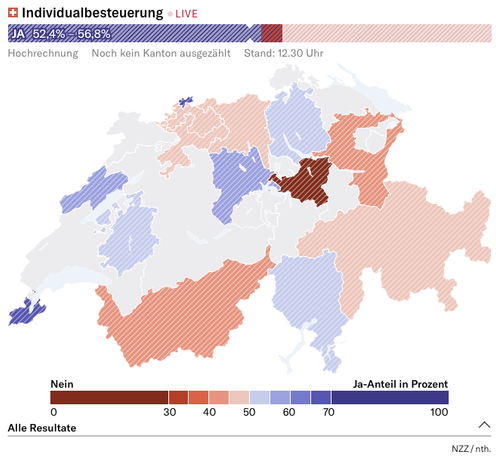
First time we use our new voting results visualisation, designed and programmed by yours truly. So far, it seems … to hold up?

Connoisseur of terrible puns. Otherwise I work in the graphics dept at NZZ, a large Swiss newspaper.
This profile is interested in data visualisation, data journalism, cartography, GIS, as well as news and journalism in general.
Good with colours 🌈.
| Website | https://xeophin.net |
| https://twitter.com/xeophin | |
| The Swiss side of things | https://swiss.social/@xeophin |
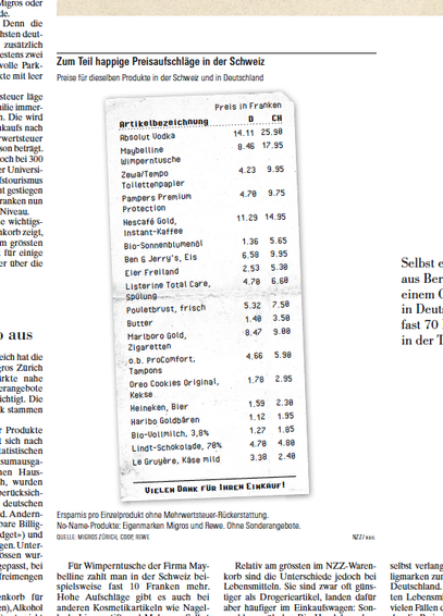
Now also in print!
I probably could have given the print version of that element that was originally created with HTML and CSS to a colleague of the graphics team.
But because I worked four years as part of the graphics team, I knew what was asked, and I went on to do it myself (tbh really just to prove myself that I'm still able to do it …)
Yeah, not exactly a data visualisation. But an illustration for an article about the data hunger of AI tech companies I'm somewhat proud of.
Composition and layout in #blender3d, modelling in #plasticity (as an experiment).
The plan was to experiment with running some Gaussian splatting tools on my gaming PC this Sunday.
Instead, I’m doing this:
How it started: «Huh, I never thought that in my work at the newspaper I would ever open a #gameengine again! Fancy that!»
How it's going: