71 Followers
52 Following
49 Posts

Indian movie posters in Devanagari, Latin, Telugu, and Bengali scripts:
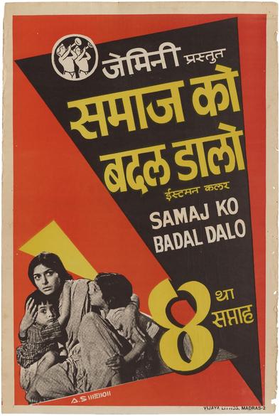
Samaj Ko Badal Dalo | समाज को बदल डालो, 1970
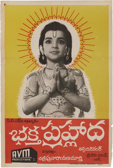
Bhakta Prahlāda | భక్త ప్రహ్లాద, 1967
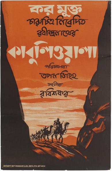
Kābuli’ōẏālā | কাবুলিওয়ালা, 1957

Read about this collection and see more posters in @tanyatypes’ 2022 article: https://letterformarchive.org/news/indian-movie-posters/

#Lettering #India #Bollywood #MoviePosters #Telugu #Hindi #Bangali

This Just In: Indian Movie Posters

From Bollywood to Tollywood, Tanya George looks at her country’s varied cinematic industries and writing systems through our new collection of film posters.

Letterform Archive

From last post’s bungalow to a palace this time — check out the sign for the exquisite Art Deco building, Dhanraj Mahal, in Mumbai. @tanyatypes tells me this new sign was installed last year after the building underwent renovations. The letter widths are admittedly wonky, but the play of light and shadow makes it 👌🏼

More about the building and its architecture here https://www.artdecomumbai.com/research/princely-states-and-the-emergence-of-art-deco-in-bombay/

📍 Fort, Mumbai (Maharashtra)
📅 November 2024
🔗 https://indiastreetlettering.com/sighting/dhanraj-mahal/

#IndiaStreetLettering #Mumbai

Princely States and the Emergence of Art Deco in Bombay - Art Deco

In 1858, the East India Company officially extended its mission from trading to colonising the Indian subcontinent, as a result of which the British implemented direct and indirect rule in the region.[1] An area under direct rule would be controlled entirely by the British, which included departments like education, health, judiciary, municipality, and police, to

Art Deco - Digital diarist showcasing Mumbai's Art Deco
@rosetta @typographica @mwichary Nothing but the sign is left there unfortunately

10 years ago today I published my article “Variable Fonts for Responsive Design” at A List Apart:
https://alistapart.com/blog/post/variable-fonts-for-responsive-design/

I was very happy when, a year and a half later, the OpenType specification was updated to support variable fonts.

Since then, I’ve spent a lot of time making and working with variable fonts, including building up the https://v-fonts.com directory (now sadly out of date).

There have been bumps in the road, but it’s been satisfying to see the technology spread over time.

Variable Fonts for Responsive Design

Today’s web fonts are not living up to their potential. What if the stylistic parameters of a typeface were fluidly variable? What if the design of a typeface could be as flexible and responsive as…

A List Apart
A very good thread for anyone who makes fonts (though also relevant to other creative fields):
https://typo.social/@letterror/113197010813210485
✏️ Erik (@[email protected])

Let's do a series of educational posts for the young colleagues. But rather than highlight how easy it is to draw (I love drawing, but it is never easy), let's talk about what to look out for when someone offers to publish your fonts. #contracts

typo.social

This Saturday, we published a batch of Uses for typefaces with horizontal contrast, i.e., thick tops and bottoms. In particular, there’s:
• the classic Zipper (Bob Newman, Letraset, 1970)
• the lesser known Sintex (Aldo Novarese, VGC, c.1970)
• the downright obscure Kangaroo (Dave West, PLINC, c.1969)
• and the OG, Gothic Bold (Hamilton, 1889).
See them all: https://fontsinuse.com/search/advanced?v=2&match0=all&typefaces0=32521,31801,31312,88960

#FontsInUse #fonts #typefaces #ScienceFiction #paperbacks #BookCovers

Advanced Search Results

Fonts In Use

Is anyone affiliated with an academic institution able to help me get a copy of the 23 October 1936 issue of The Illustrated Sporting and Dramatic News here:

https://microform.digital/boa/collections/111/the-illustrated-sporting-and-dramatic-news-1874-1970/access?documentId=33476

It contains a preview of the Inn Signs Exhibition of 1936 that I'm currently researching.

I'd be happy to offer something nice via snail mail in exchange...

#signs #academia #AskFedi

The Illustrated Sporting and Dramatic News, 1874-1970 - Access | British Online Archives

British Online Archives offers scholars and academics the primary sources to advance their research within the humanities and social sciences.

British Online Archives
Another surprise: how the type was made. @tanyatypes acquired a set of handcut rubber stamps from the company and interviewed former employees. Rather than using a pantograph to trace a pattern and cut type with a mechanical router, as was common in the West (https://printinghistory.org/virgin-demo/), workers would cut these stamps by hand, then use them to mark a mirrored letter on wood blocks that were then chiseled by hand to create the resulting type.
Wood Type Fabricating Demo - American Printing History Association

Geri McCormick & Matt Rieck: “Making Wood Type Today: Using the Same Methods from Yesteryear” 9 am-noon thursday, october 22 Geri McCormick & Matt Rieck hosted a…

American Printing History Association
Roughly hand-bound in blank covers, two specimen books nonchalantly contain a wealth of fascinating type history, from both India and the West. When we first acquired these catalogs, we were struck by the range of styles and scripts represented, and knew there was a story to tell. So we sent our Indian correspondent, @tanyatypes, to shine a light on some Diamonds. https://letterformarchive.org/news/diamond-wooden-type-works/
#WoodType #TypeSpecimens #Typography #IndianDesign
This Just In: Diamond Wooden Type Works

An untitled catalog and some tiny wood blocks from India invite us to rewrite type history.

Letterform Archive

A collection of innovations by women in the fields of computer science and technology

No Web Without Women

https://nowebwithoutwomen.com/

"A Selman Project. This website is typeset in Base 9 and Base 12 by Zuzana Licko"

No Web Without Women

An educational website featuring a collection of innovations by women in the fields of computer science and technology.

No Web Without Women