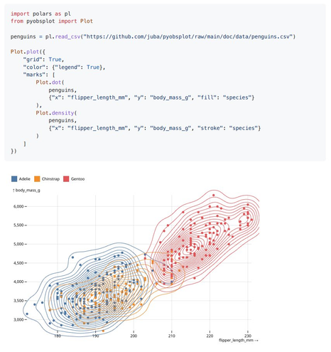
pyobsplot 0.3.7 is out, with Plot updated to 0.6.9.
pyobsplot is a #Python package which allows to use #ObservablePlot in jupyter notebooks and #quarto documents with a syntax as close as possible to the JavaScript one.
| GitHub | https://github.com/juba |
| Web | https://data.nozav.org |
pyobsplot 0.3.7 is out, with Plot updated to 0.6.9.
pyobsplot is a #Python package which allows to use #ObservablePlot in jupyter notebooks and #quarto documents with a syntax as close as possible to the JavaScript one.


Given the news today I wanted to see how quickly one can find live air quality data and create a DIY map. Please check official resources for any health-related guidance. First, the map. Below, I’ll walk through the steps to create it with Observable Plot. 1. Data I went to airnow.gov, created an account, read the documentation, then generated a URL for a query of active PM2.5 monitors in CSV format, which we can load directly from this page: 2. colors There is a usual color index for AQI, from green to ora
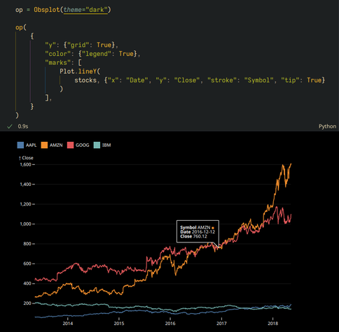
New pyobsplot 0.3.5 release. Plot has been updated to 0.6.8, allowing for tooltips and interactions (with the widget renderer only).
This version also introduces light and dark modes.
pyobsplot version 0.3.3 is out (pysobsplot is a #Python package which allows to use #ObservablePlot in notebooks and #QuartoPub documents).
The jsdom renderer now uses a local http server, improving rendering speed.
Full changelog: https://juba.github.io/pyobsplot/changelog.html
Repository:
https://github.com/juba/pyobsplot
Let me relieve you of that secretly held guilt for not testing your #rstats pipelines
https://www.milesmcbain.com/posts/assertive-programming-for-pipelines/
In #rstats #tidyverse + {targets} is the have your cake + eat it too combo.
High level expressive code, with freedom from much of the performance penalties associated with higher abstraction via caching computational results. IMHO this is the entry level toolkit for doing real data science work with R. But too often targets gets shunted from courses and books, leaving people to figure it out for themselves, and a missing discourse about best practices for building pipelines with graphs.

Since version 1.7 of `bertin`, an update function function is available. It allows you to modify some specific attributes and styles without having to redraw the entire map. Not everything can be modified. Only the attributes <ins>underlined</ins> in the documentation are. Simple layer How it works? In 2 stages. First, we have to draw a map with the `draw` function. Then, we use the `update` function to modify things. For example, the fill as defined in a color input. Choropleth If your map is a choropleth
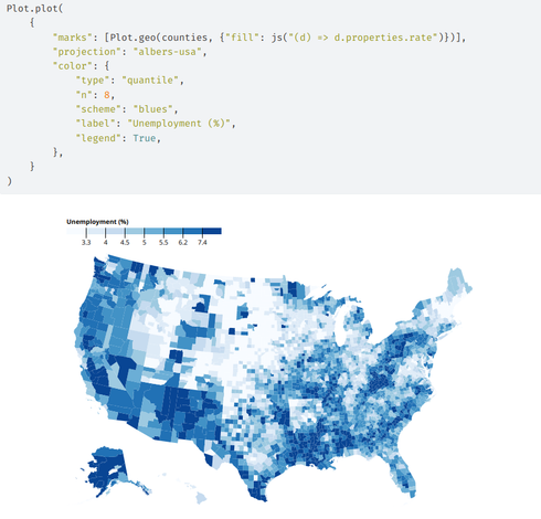
pyobsplot 0.3.2 is out. It allows to recreate these kind of #ObservablePlot charts, directly from #python, in notebooks or #QuartoPub documents, with a syntax as close as possible to the JavaScript one.
This version introduces default specification values and fixes the jsdom renderer on Windows.


