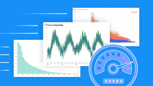
When visualizing big data for business intelligence, charts can get bogged down by database latency and slow, computationally-expensive chart rendering. That stifles exploration and iteration, which means you might be missing out on valuable discoveries in your data. Learn how we keep charts fast in Observable Canvases, even when representing millions of values: https://observablehq.com/blog/big-data-fast-data-visualizations

Observable
@observablehq@vis.social
- 1.4K Followers
- 12 Following
- 288 Posts
The collaborative data canvas
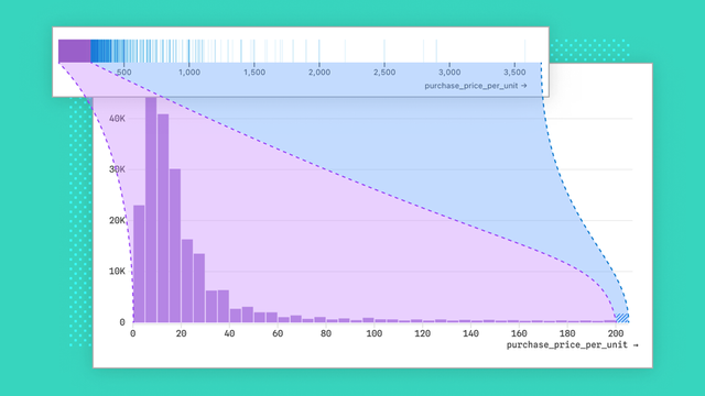
Histograms are useful, easy to interpret, and among the most common chart types for business intelligence. But building histograms that work well out of the box — no matter the data — is trickier than it sounds. We share some of the challenges faced, and decisions made, when designing histograms for Observable Canvases: https://observablehq.com/blog/designing-better-histograms
Data analysts are knee-deep in company data on a day-to-day basis. That puts them in a unique position to help their teammates find, use, and trust analyses that can improve their business decisions. In our new post, learn how data analysts can help build a stronger data culture across their organization: https://observablehq.com/blog/how-to-build-data-culture
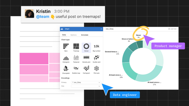
How data analysts can improve data culture across their organization
It’s 2025. Nobody is fighting the idea that data can help companies make better decisions. But recognizing that data culture is good for business, and putting it into practice, are very different things. Learn how data analysts can contribute to a stronger data culture within their organization.
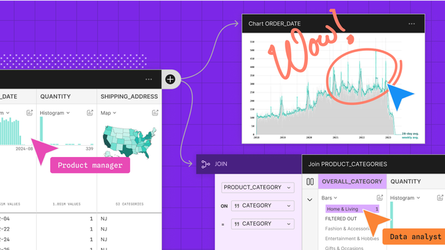
When data visualization is confined to the endpoints of analysis — initial exploration and final data storytelling — you can miss out on insights, anomalies, and mistakes that are revealed in the messy middle. Learn how end-to-end visual data analysis helps you and your collaborators find hidden insights, and dangerous errors: https://observablehq.com/blog/visual-data-analysis
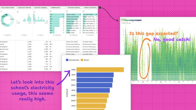
End-to-end visual data analysis improves discovery, accuracy, and collaboration
Visual data analysis helps data teams keep a close eye on their data throughout the entire analysis process. Learn how that expands opportunities for discovery, facilitates collaboration, and helps uncover mistakes sooner than later.
Most BI and data visualization tools let you make histograms with a single click or command. So, you might think that designing good default histograms is a simple task. Turns out, it's harder than it sounds. Learn how we handle some common challenges to make better out-of-the-box histograms in Observable Canvases: https://observablehq.com/blog/designing-better-histograms

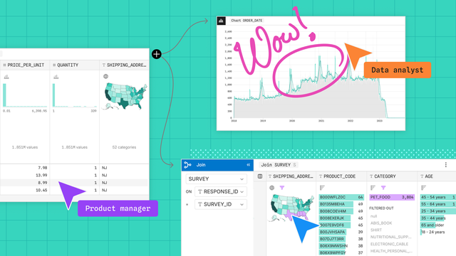
Including collaborators and stakeholders throughout the data analysis process helps you avoid redundant work, crossed wires, and rehashing big decisions right at the project finish line. Learn how collaborative analytics gets you from raw data to better and more trusted business decisions, faster: https://observablehq.com/blog/collaborative-analytics

Move faster, together, with collaborative analytics
When collaborators are only involved as an afterthought in the data lifecycle, analysts can find themselves mired in unexpected last-minute requests, or overhauling deliverables that didn’t match stakeholder needs. By involving collaborators from the start, analysts can do more focused, efficient, and valued work with fewer back-and-forths.
With end-to-end visual data analysis, you can keep eyes on your data throughout the analysis process. Learn how that helps you discover unexpected value in your data, catch mistakes earlier, and improve cross-functional collaboration: https://observablehq.com/blog/visual-data-analysis
End-to-end visual data analysis improves discovery, accuracy, and collaboration
Visual data analysis helps data teams keep a close eye on their data throughout the entire analysis process. Learn how that expands opportunities for discovery, facilitates collaboration, and helps uncover mistakes sooner than later.
Collaborative analytics brings data teams and stakeholders into the analysis process from ideation to final product. Discover how that helps you all reach the finish line, faster: https://observablehq.com/blog/collaborative-analytics

Move faster, together, with collaborative analytics
When collaborators are only involved as an afterthought in the data lifecycle, analysts can find themselves mired in unexpected last-minute requests, or overhauling deliverables that didn’t match stakeholder needs. By involving collaborators from the start, analysts can do more focused, efficient, and valued work with fewer back-and-forths.
Join us May 20 at 10 AM PT for a first look at Observable Canvases. Learn how canvases support fast, visual data exploration and analysis, with whiteboarding tools that let data teams and stakeholders all participate in the same place. Sign up today: https://streamyard.com/watch/vpmmiyXKuPAT
Observable Canvases: A first look
We recently introduced Observable Canvases and now is your chance to be among the first to see it in action! Canvases are a new way to analyze data, explore insights, and create dashboards — all in one collaborative, AI-powered platform. In this live, 45-minute event, you’ll see how easy it is to connect your data, explore a hypothesis, customize with SQL, and collaborate with stakeholders using whiteboarding features like comments. Plus, we will show off how you can use AI — integrated right in the canvas — to make your data workflow even more fast and fluid.
In Observable Canvases, data teams can break free from linear workflows to explore data in branched, visual analyses across an infinite canvas. Work seamlessly between code and UI, and collaborate with stakeholders using whiteboarding tools: https://observablehq.com/blog/introducing-canvases-early-access