Katherine Small Gallery

@ksmallgallery@typo.social
153 Followers
59 Following
75 Posts
Small exhibits about graphic design and typography. Also, a bookstore.
webhttp://ksmallgallery.com
email signuphttp://ksmallgallery.com/signup
We’re extra-open with books about graphic design and typography for yourself and some things you can buy for others if that’s your thing. Also, we just got a stack of Bram de Does book and specimens. And we also just ordered a pizza. Come get a free slice before we eat the whole thing.
.
Friday: 11–6
Saturday: 11–6
Sunday: noon–5
Monday: 11–6
Tuesday: 11–6
Wednesday: 10–3
Suppose you had a specimen book for a single face. Say that single face is Eine Schraffierte Antiqua or Reform Grotesk. Let’s further say the book shows a series of sample settings, some of which include dates. The book itself is undated. There are only dates in the sample settings. Is there anything one can infer from the dates? Like, in this Eine Schraffierte Antiqua specimen I see 1914, 1918 & 1911. The Reform has a sample setting with a single date of 1924. Does any of this mean anything?
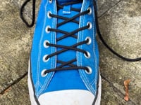
In case you want to know how Cyrus Highsmith ties his shoes with almost no chance of his laces coming undone, see here: https://vimeo.com/1132177020?fl=ip&fe=ec
Cyrus Highsmith Demonstrates How to Tie a Shoe

Vimeo
@jla @kai @mass_driver Actually, the history of the world is largely filled with war & disease & suffering & misery & rats. And sometimes there are sunny days. History books need drama, so we know all about the bad stuff + a few remarkable achievements. Graphic design history books need nice things to look at, so our history of visual garbage is overlooked. I read history books & feel lucky to be alive now. Some read (or look at) design history books and think things were much better back then.
@kai @mass_driver The history of everything is largely filled with garbage. We only tend to learn about the greatest hits and that tends to make us think things were better before. The ratio of bad to good is pretty constant throughout history.
@kentlew @TiroTypeworks "Close enough" might be "just right" for this one.
@frankrolf Interesting. Playing with it now. Thanks for the tip, Frank!
@fhardwig I could do that, sure. I think I was just trying avoid it if possible. I kinda just wanted to click a button. Seemed a shame that so many faces had half of what I wanted, but not *all* of what I needed. (Been scrolling through this manuscript for 4 hours today and was hoping for a quick fix. 200 pages left. . . .)
I need some sort of oldstyle text face that has full superior lowercase *and* superior uppercase. Any suggestions? Or, does anyone know how or where to search for such a thing?
@kentlew Ah. Didn't catch the Tippecanoe. I thought it was some sort of Bodoni. Glad I kept my mouth shut on that.