Bye forever, WeTransfer.

| Dashes | en/em |
| Micro-Reviews (on hold) | @366fonts |
| Bluesky | https://bsky.app/profile/typographer.bsky.social |
| Don’t visit | https://lopez-ayala.eu |
SURROUND is the second concept font I developed during my Bachelor's thesis at HKB (Bern Academy of the Arts).
Using three variable font axes (Animation, Wave Amplitude and Wave Direction) to control the motion, 208 masters were created to cover all steps. A Python script took around 20 hours to complete the pixel displacement for all 26 letters. But once rendered and saved as a font file, it runs butter-smooth — at least in the browser.
Bachelor thesis mentored by Edgar Walthert @eWalthert
Today I learned there is a pair of font-themed high-rise apartment buildings in Queens, named The Bold (https://boldanditalic.com/bold/) and The Italic (https://boldanditalic.com/italic/).
Of course they are marketed with pun-filled copywriting, like “your type of place”, “where luxury and style are written boldly”, and “amenities that put an exclamation point on ease”.
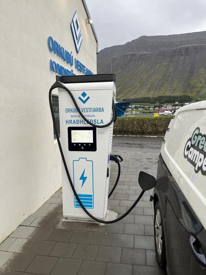
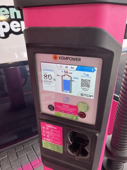
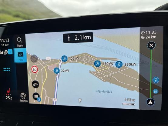
I’m currently on a 10 day road trip in Iceland in an EV camper, the VW ID. Buzz
Going into this trip I wasn’t sure how easy it would be to find charging stations, how long charges would take, how much they’d cost, and overall if it would feel like a hassle or not that big of a deal. So I thought it would be interesting to keep track of the details and report for anyone else interested. 5 days in and it’s been amazing⚡️
I’ll use the hashtag
#EVtravelCJ so feel free to mute if not interested : )

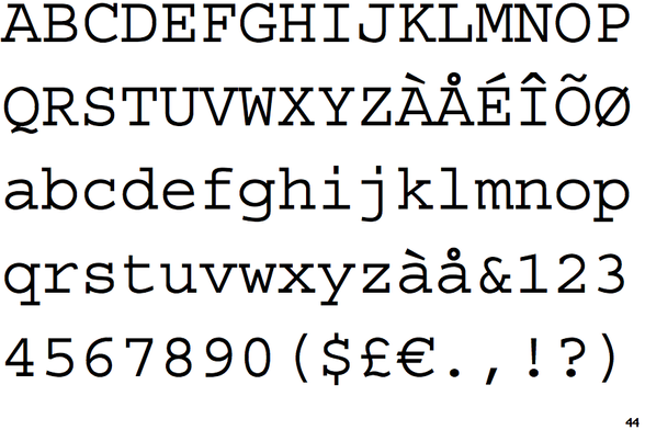
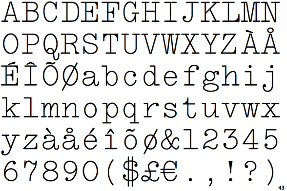
There are surprisingly few fonts based on, or used by, actual typewriters. In the interests of finding out the right answers by posting wrong ones:
Prestige Elite, Typewriter Elite (balls and fillets), Courier (no balls, slab serifs), LTC Remington Typewriter (wavy seven).
A2 Typewriter, 1403 Vintage Mono, and Orator feature in the next post.
Please boost (to increase the rage replies).
(samples from identifont)
1/
InDesign question:
When I type in a text box (in normal speed), random letters get duplicated.
I neeed to carefullly read everything twiice to makee sure the text isnn’t messed upp like tthis.
This only happens in the current and the last versions of InDesign on Windows 11, no other program.
I used to do a lot of writing in InDesign. That’s impossible now. Instead, copy & paste from a text editor it is.
Would love to get back to my old routine. How do I fix this?
title text: We're building on our earlier success getting web developers to pay to change the backslashes in our displayed payment URL to forward slashes.
(https://xkcd.com/3113)
(https://www.explainxkcd.com/wiki/index.php/3113)
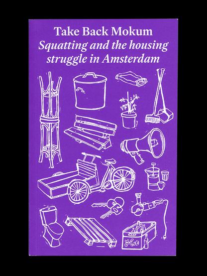
Take Back Mokum, a collection of essays, interviews, illustrations and more, around the theme of squatting and housing in Amsterdam.
The first (and I hope not the last!) book set in my typeface, MD Lórien.
Designed by @janegbers (https://janegbers.info), who has my eternal gratitude for using oldstyle, lining *and* small cap figures in a single project.
Via @FontsInUse: https://fontsinuse.com/uses/67027/take-back-mokum
Typeface: https://mass-driver.com/typefaces/md-lorien/