Götz Salzmann

@gtz42@infosec.exchange
29 Followers
99 Following
243 Posts
I'm getting my ducks are in a row. I'm putting my chickadees in a column. The squirrels are stored in SQLite. I'm getting my chipmunks in Redis. I've been getting my crows into Postgres. I'm storing my pigeons in Mongo. There are raccoons in YAML? Who put raccoons in YAML? We've got snakes in an OracleDB? Why do we have either of those? Legacy acquisition? We have cockroaches in... well at least that makes sense. You say they're load-bearing cockroaches? And... is this an FTP server for ants?
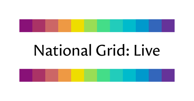
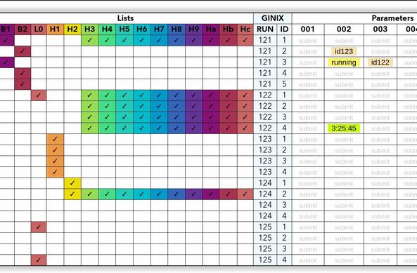
I designed the 12-bit rainbow palette for use on https://grid.iamkate.com. It consists of twelve colours chosen with consideration for how we perceive luminance, chroma, and hue. The palette uses a 12-bit colour depth, so each colour requires only four characters when specified as a hexadecimal colour code in a CSS or SVG file. For more details, see https://iamkate.com/data/12-bit-rainbow/
National Grid: Live

Shows the live status of Great Britain’s electric power transmission network

I know people like to make fun of niche operating systems, but for the five years I was at Microsoft I used Windows (10 then 11) as my daily driver. It’s much less stable than a professional OS, but it does kind-of work. I wouldn’t say it’s ready for the desktop. The UI is inconsistent and changes randomly between releases, a load of common software is basically useable only in a VM, it lags and freezes periodically (unlike an OS designed for interactive use, random drivers run a load of things directly in interrupt handlers, so you get latency spikes that you wouldn’t see in a more mainstream desktop OS) and the update process can hose the system, so it’s mostly of interest to people who like tinkering with their machines than people who actually want to get work done. Oh and a load of random bits of the OS have ads, but that’s what you get from a free ad-supported system instead of one developed by an active open-source community.

I don’t think I’d recommend anyone use it as their daily driver or in a work setting, but it’s not totally unusable. It’s not at the level of maturity than you’d expect from, say, Linux or FreeBSD, especially not for client workloads. If you do have to use it, I recommend that you install FreeBSD in a Hyper-V VM for real work. That’s what I did and it works quite well.

can't remember where I saw it but "Using AI in education is like using a forklift in the gym. The weights do not actually need to be moved from place to place. That is not the work. The work is what happens within you" is a solid quote
By the way, I still think this paragraph I wrote is a pretty good paragraph.

That's how serious fiction ought to be written!

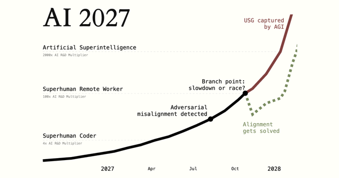
https://ai-2027.com/

There's a story to engage with the reader and convey the basic idea, AND there's a non-fiction part to explore deeper ideas that don't fit in the fictional format.

The non-fiction part provides evidence for the story, explains why things unfold as they do, and presents the thesis in an unambiguous, non-metaphorical way.

Bonus points if the story also has footnotes and references, but AI-2027 is the only piece I've seen that does it.

AI 2027

A research-backed AI scenario forecast.

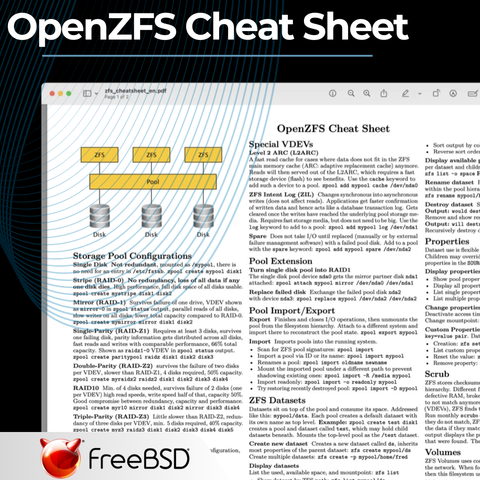
Master OpenZFS with Ease!

Navigating OpenZFS for the first time can be overwhelming, but we've got you covered! The FreeBSD Foundation has created an OpenZFS Cheat Sheet. Whether you're a beginner or a seasoned storage admin, this cheat sheet will help you unlock the full potential of ZFS with confidence.

https://freebsdfoundation.org/blog/openzfs-cheat-sheet/

OpenZFS Cheat Sheet | FreeBSD Foundation

OpenZFS provides a lot of enterprise storage features in FreeBSD and other systems. Developed and actively maintained by a worldwide open source community, OpenZFS receives new features, updates, and bug fixes regularly. Companies and users alike rely on OpenZFS for its rock-solid stability, data integrity, feature-set, and cost effectiveness. OpenZFS maintains its own documentation as

FreeBSD Foundation | A non-profit organization dedicated to supporting and building the FreeBSD Project
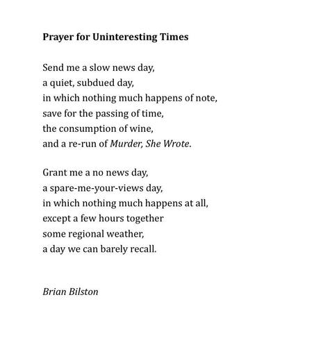
Here’s a poem called ‘Prayer for Uninteresting Times’.
BibBot – Mit Bibliothekszugang durch die Paywall 🫶 https://stefanw.github.io/bibbot/
BibBot – Mit Bibliothekszugang durch die Paywall

Dieses Add-On ersetzt bei Artikeln deutscher Medienseiten die Paywalls mit dem Artikeltext.

So 'n ganz normales, stinklangweiliges Jahr. Das wäre schön. #justthinkin
×
I designed the 12-bit rainbow palette for use on https://grid.iamkate.com. It consists of twelve colours chosen with consideration for how we perceive luminance, chroma, and hue. The palette uses a 12-bit colour depth, so each colour requires only four characters when specified as a hexadecimal colour code in a CSS or SVG file. For more details, see https://iamkate.com/data/12-bit-rainbow/
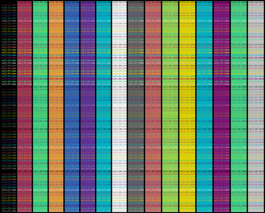
@katemorley hm, now I want to figure out using these for a terminal/editor theme.
@benjamineskola @katemorley that's exactly where my brain went 🤩
Terminal is relatively straightforward and I think they work well. An editor theme is going to be more complex, of course And it's slightly arbitrary which colour is the "bright" one, since the whole point is that none of them are brighter than the other.
actually that blue on a black background isn’t great, not enough contrast.
@katemorley I've been following you on mastodon for a relatively long time and I've been using the 12-color palette since forever ... and I never realized you were that Kate!
@katemorley ooh, I'm glad you reposted this
@katemorley It is very aesthetically pleasing.
@katemorley I think both this, and your national grid site, are really cool projects—thank you for making them and for dedicating them to the public domain!
@katemorley Ooo, this is timely: I'm trying to figure out how to pick colors for a 10-step pattern for a painting project. Thanks!
@katemorley The bit about allowing constrained variance in luminance is very helpful, but how did you actually *do* it? Was this manual, or did you writing something to divide it up given some constraints?
@a I chose three colours (the yellow, red, and blue) and interpolated between them in the LCH colour space, and then chose 12-bit colours that approximated these ideal intermediate colours

@katemorley @a

Oh, I maybe this partly explains why I pecieved the yellow as standing out so much. But if this is the case, why are there only 2 colours between red and yellow, and 5 between yellow and blue? Is that to make up for the fact that yellow is offset from green in the RGB primary space?

@katemorley it's beautiful, and it looks great "in the wild" on your page as well!
@katemorley I like the first three; purple, blood orange, peach.
@katemorley enjoyed your use on the national grid visualization
@katemorley that is a nice pallet.
I do like it...
I wounder how it works in terms of #contrast for #accessibility...

@katemorley I dunno if it's just me, but the yellow stands out as very different from the colours around it, while the ~5 green-blue colours are very similar. If it's perception-distributed, I would have expected more evenness (or perhaps this is me finding out that I'm slightly colour blind?).

Looks pretty as hell though.

@naught101 I think the main reason for the yellow standing out the most is that it’s where the luminance peaks (because if you lower the luminance of a yellow too much it looks unpleasant against a white background).

It does feel like there are a lot of blue-green colours, but I’ve noticed that this is a property of all colour spaces that are designed to be perceptually uniform. I’d speculate it’s an illusion caused by the fact we have lots of distinct names for colours at the red end of the spectrum and fewer at the blue end, and that affects how we interpret the rainbow, in the same way we see pink as a distinct colour (rather than light red) but light blue as just a kind of blue.

@katemorley Doesn't that seem oxymoronic though? Like, if it seems like there's too many, isn't that because we perceive that there's too many => it's not perceptually uniform?
@naught101 Perceptual uniformity means we perceive the same amount of difference between two pairs of colours the same distance apart, but that doesn’t mean we’d give them different names. Using my rainbow palette as an example, I would say that the 2nd, 3rd, and 4th colours do seem as distinct as the 9th, 10th, and 11th, despite the former ranging from red to orange and the latter all being kinds of blue.
@katemorley @naught101 I think there's a real effect here. It's quite possible that everybody designing perceptual color spaces is using the same data set (specifically, this one from the 1940's: https://www.rit.edu/science/munsell-color-science-lab-educational-resources#munsell-renotation-data ) The relevance of this data to people looking at their monitors under LED lights may be imperfect. (People's vision may even have been different then!) There also might well be a common bias in translating the colors in that data to modern color coordinates.
Munsell Color Science Lab Educational Resources | Munsell Color Science Lab | College of Science | RIT

This page contains a collection of educational resources related to the Munsell Color Science Laboratory.

@katemorley yeah right. Huh.

For me, colours around yellow are definitely much more distinct than the ones between blue and green. Like, substantially more distinct. To me the orange-yellow-lime triplet seems to cover as much variation as the next green to the last blue (5 colours).

@katemorley love this! great work. I often use 12-bit/4-character definitions just for a fun extra limitation. going the extra mile to create a palette with them is 👌
@katemorley
Sure seems legit, Kate, but will it endow me with powers beyond the human ken?
(Which Eye solemnly swear to use only for good, and never for evil. Great power, great responsibility, yadda, yadda, yadda.)
The 12-bit rainbow palette | Hacker News

@katemorley Oh this is a very lovely color palette! 🥰

I might have to slip this into my back pocket for an opportunity to use it~ 💞

@katemorley You have got the attention of all the old Amiga nerds. Amigas used 12bit color.

@katemorley

Oh this looks wonderful! Going to steal the background colour as well to make a palette for JetBrains and Terminals...

@katemorley this is beautiful <3
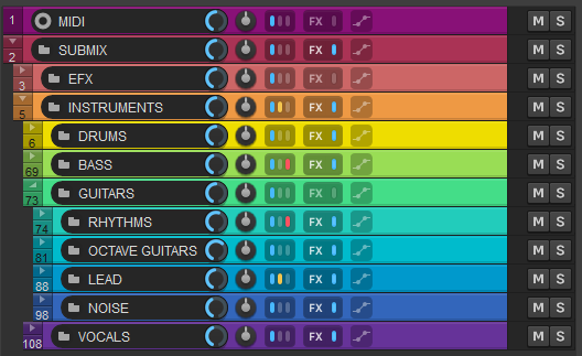
I started using it as color scheme for tracks in Reaper
@katemorley this is great! How have I never heard of this before?!
@katemorley what pride flag is this
@katemorley
I want to paint a pallet with this palette.
@katemorley It looks great! Have you evaluated how the palette stands up to various types of colorblindness?
@katemorley I ❤️ that color palette 🎨 and used it in some projects, and on my blog. Thank you for it! 🙏

@glaforge @katemorley

I wish setting a colour palette in JetBrains IDEs was simpler than it is...

@katemorley I love this. And it's also a great example of the mach bands illusion (well it is on a big screen)
@katemorley do these work just as well on light and dark backgrounds, or could the brightness be adjusted to make two palettes?
@katemorley Thanks, I'm just using it now to colour columns in a table!