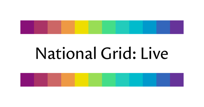
I designed the 12-bit rainbow palette for use on https://grid.iamkate.com. It consists of twelve colours chosen with consideration for how we perceive luminance, chroma, and hue. The palette uses a 12-bit colour depth, so each colour requires only four characters when specified as a hexadecimal colour code in a CSS or SVG file. For more details, see https://iamkate.com/data/12-bit-rainbow/
National Grid: Live

Shows the live status of Great Britain’s electric power transmission network

@katemorley I dunno if it's just me, but the yellow stands out as very different from the colours around it, while the ~5 green-blue colours are very similar. If it's perception-distributed, I would have expected more evenness (or perhaps this is me finding out that I'm slightly colour blind?).

Looks pretty as hell though.

@naught101 I think the main reason for the yellow standing out the most is that it’s where the luminance peaks (because if you lower the luminance of a yellow too much it looks unpleasant against a white background).

It does feel like there are a lot of blue-green colours, but I’ve noticed that this is a property of all colour spaces that are designed to be perceptually uniform. I’d speculate it’s an illusion caused by the fact we have lots of distinct names for colours at the red end of the spectrum and fewer at the blue end, and that affects how we interpret the rainbow, in the same way we see pink as a distinct colour (rather than light red) but light blue as just a kind of blue.

@katemorley Doesn't that seem oxymoronic though? Like, if it seems like there's too many, isn't that because we perceive that there's too many => it's not perceptually uniform?
@naught101 Perceptual uniformity means we perceive the same amount of difference between two pairs of colours the same distance apart, but that doesn’t mean we’d give them different names. Using my rainbow palette as an example, I would say that the 2nd, 3rd, and 4th colours do seem as distinct as the 9th, 10th, and 11th, despite the former ranging from red to orange and the latter all being kinds of blue.
@katemorley @naught101 I think there's a real effect here. It's quite possible that everybody designing perceptual color spaces is using the same data set (specifically, this one from the 1940's: https://www.rit.edu/science/munsell-color-science-lab-educational-resources#munsell-renotation-data ) The relevance of this data to people looking at their monitors under LED lights may be imperfect. (People's vision may even have been different then!) There also might well be a common bias in translating the colors in that data to modern color coordinates.
Munsell Color Science Lab Educational Resources | Munsell Color Science Lab | College of Science | RIT

This page contains a collection of educational resources related to the Munsell Color Science Laboratory.

@katemorley yeah right. Huh.

For me, colours around yellow are definitely much more distinct than the ones between blue and green. Like, substantially more distinct. To me the orange-yellow-lime triplet seems to cover as much variation as the next green to the last blue (5 colours).