Christian Mackenrodt

@chwoma
59 Followers
95 Following
71 Posts
Statistician at Bundesagentur für Arbeit
private account – public data

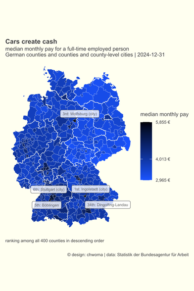
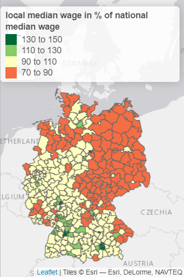
Today the German Federal Employment Agency published its annual data set on salaries for 21,859,958 employees.

The map highlights the median pay in the counties where the main factories of the big carmakers are located. These counties are at the top of the list with a median pay well above the national median (4,013 €).

xlsx-file from @bundesagentur: https://t1p.de/cskbt. coding and mapping: https://codeberg.org/chwoma/entgelt_maps_2024

#rstats #germany #car

#30DayMapChallenge #BundesagenturfürArbeit
#rstats

day 5 – A journey: The commuters' line

457,594 employees commute to Munich; 396,415 work, but don't live in Hamburg.
People from all over Germany. 

For each district I calculated whether there are more commuters to Hamburg or to Munich. And I got a new line (see day 2 for the old one) dividing Germany in two parts.

#30DayMapChallenge #BundesagenturfürArbeit
#rstats

day 4 – Hexagons: Commuters' destination

I appreciate hexmaps for being  a good mean between a waffle chart and a Choropleth map. 

Each hexagon in today's map stands for 1 out of 400 German districts.
Via the ht-index by Jiang and Yin I got four central destinations for commuters: Munich, Frankfurt, Berlin, and Hamburg.

https://tinyurl.com/3ppajtx5

Head/Tails breaks

#30DayMapChallenge #BundesagenturfürArbeit

day 3 – Polygons: North-South gap bigger than East-West divide

To calculate a (simplified) unemployment rate, you need data for the unemployed and the employed. These are available at https://statistik.arbeitsagentur.de for more than 10,000 German communities. I calculated two figures: one for the northern and one for the southern polygon.

Did you expect that the gap between North and South is bigger than between East (7,7%) and West (5,8%)?

Startseite - Statistik der Bundesagentur für Arbeit

Homepage des deutschsprachigen Auftritts

#30DayMapChallenge #Germany

day 2 – Lines: The German equator

Where does the North end and the South begin?

Here is my proposal: Every place closer to Hamburg than to Munich belongs to Northern Germany; every community closer to Munich than to Hamburg is part of the South. In so doing we get a line dividing Germany in two halves.

D'accord?

#30DayMapChallenge

day 1 – Points: Pearl of the North & Southern star

There is much talk about East and West. But in my first posts, I'll focus on North and South Germany.

In contrast to East and West, it's hard to tell where the North ends and the South starts. @BKG Do you have an answer? (P. S. Thank you so much for https://tinyurl.com/yz3m2fh2!)

However, there are two focal points: Hamburg, "Pearl of the North", and the "Southern star" – Munich.

Open Data

Default Description

#30DayMapChallenge #rstats #Arbeitsmarktstatistik

day 30 - My favourite ...: small multiples

I like to study visualisations of small multiples. So I wanted to create one myself; showing the seasonality of unemployment in the German Bundesländer.

I created this chart with the R-package tmap using tm_facets.

It's my 15th challenge! But there's still work to do ... improving the design, learning more about facets in ggplot etc.

#30DayMapChallenge #rstats #Arbeitsmarktstatistik

day 26 - Minimal: digital beermat

Going back to day 5 I created a digital version of the beermat analysis of the German labour market.

Thanks to the R-package showtext it has become easy to use fonts in R graphs: https://CRAN.R-project.org/package=showtext

showtext: Using Fonts More Easily in R Graphs

Making it easy to use various types of fonts ('TrueType', 'OpenType', Type 1, web fonts, etc.) in R graphs, and supporting most output formats of R graphics including PNG, PDF and SVG. Text glyphs will be converted into polygons or raster images, hence after the plot has been created, it no longer relies on the font files. No external software such as 'Ghostscript' is needed to use this package.

#30DayMapChallenge #rstats #Arbeitsmarktstatistik

day 17 - Flow: The Flow of money

I followed @adriangadientbruegger advice and had a look into #tmap R-package https://CRAN.R-project.org/package=tmap. I especially like the "view" mode.

I used this great package to inspect one of the most interesting publicly available figures on the German labour market - the statistic on the median wage: https://statistik.arbeitsagentur.de/SiteGlobals/Forms/Suche/Einzelheftsuche_Formular.html?nn=1523076&topic_f=beschaeftigung-entgelt-entgelt

tmap: Thematic Maps

Thematic maps are geographical maps in which spatial data distributions are visualized. This package offers a flexible, layer-based, and easy to use approach to create thematic maps, such as choropleths and bubble maps.

#30DayMapChallenge #rstats

day 15 - OpenStreetMap: Back to the beginning

I revised my personal view on the labour market (day 1 - day 3). I wanted to use an existing map as background. I did this using the R-package maptiles: https://CRAN.R-project.org/package=maptiles.

I haven't yet understood all the features of this great package. And I wonder whether there are other possibilities in R (e.g. GeoTIFF) to use an existing map as a background layer for one's own map making?