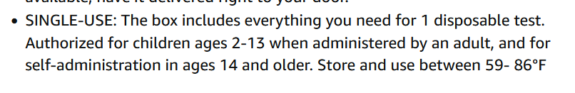
needs to be stored close to "room temp"
so what about shipping: if it arrives here in Boston in teh winter and sits on my doorstep for 4 hours at -10oF, is it ok ?

PhD/molecular biology = I might actually know something about DNA/Proteins
Lipids, Sugars, not so much
Liberal, but very unhappy with most bigshot liberals who appear to do mostly clickbait
Like to do dayhikes in the White Mountains of NH
Jew from Brooklyn
| Simple Math is good | Don't be innumerate |
needs to be stored close to "room temp"
so what about shipping: if it arrives here in Boston in teh winter and sits on my doorstep for 4 hours at -10oF, is it ok ?
fascinating #dataviz #graphic from @reuters story about Tesla cutting prices
Note how the price cuts are very diff in diff countries
well, I find it fascinating
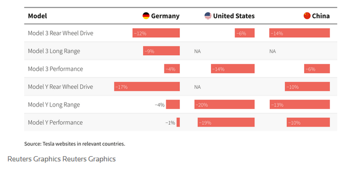

Tesla Inc <a href="https://www.reuters.com/companies/TSLA.O" target="_blank">(TSLA.O)</a> has slashed prices globally on its electric vehicles by as much as 20%, extending an aggressive discounting effort and challenging rivals after <a href="/business/autos-transportation/teslas-quarterly-deliveries-miss-estimates-2023-01-02/">missing Wall Street delivery estimates for 2022</a>.
This time series graph has 14 different strains of covid, each with a different color
IMO, a terrible way to do #dataviz #charts #graphics not sure the right anwser; probably a tellis plot of some sort
https://icemsg.org/international/oceania/australia/
#dataviz #charts #barchart #graphics #scicomm #data
to me this chart is just wrong - to many colors make it impossible to understand
but maybe I am just all wet
https://mas.to/@[email protected]al/109672527250242005

Attached: 1 image ...and the environment selects ! As someone with long term interests in #HorizontalGeneTransfer , I'm really interested in this new research exploring environment-specific selection of #plasmid adaptive traits in #bacteria Find out more in this new research in mBio on: https://journals.asm.org/doi/10.1128/mbio.03191-22 #evolution #naturalselection #microbiology #ecology
AITA or are the color values off
for some reason, many many websites and pdfs seem to use wierd color combos
but maybe people disagree with me
or maybe it doesn't matter
or maybe people are busy and don't have time to attend to fine details
The graph in this great thread is, IMO, an example of a common fail in graphs: use of color to code different variables
even without color blind issues, color just doesn't work for >3 variables
why is no one getting this ?
why is this problem so common ?
https://mas.to/@chrischirp@fediscience.org/109642950977325227

Attached: 1 image · Content warning: 7/9 THREAD on current Covid situation in England
This flow chart or graphic is a fairly common format
I personally dont think it works well
what do you think ?
But I'm not sure what the alternative is
#dataviz #charts #graphicdesign #science
from
https://mas.to/@daniel_laurison@sciences.social/109632153094379439

Attached: 1 image Hello #sociology @[email protected] If you're teaching strat/inequality, or race & racism in the US, or quantitative methods/data viz etc, may I not-so-humbly recommend this piece I did with Carolyn Chernoff Dawn M Dow for a very straightforward visual description of mobility patterns for Black and White employed people in the US - https://journals.sagepub.com/doi/10.1177/2378023120960959
#data #dataviz #writing #graphics #pregnancy #maternity #racism #Massachusetts
This report is, on the one hand, a comprehensive and stunning indictment of racial disparities in pregnancy related health outcomes
OTOH, it is a great example of the stunning failure of educated people and how they prepare pdfs
- Fig3 has no legend and isn't mentioned in the text !!
- no bookmarks
- way to many colors used for fonts
- excessive use of BOLD TEXT
This chart, via
https://twitter.com/JosephPolitano/status/1608443721015779330
aside from the point made by Dr Politano, notice how the great recession of 2008 and covid cause huge unemployment, with all enormous suffering, in the US, butt barely registerd in Japan
This graphic is from this url
https://karstenslab.github.io/microshades/
maybe it is my #firefox browser, but the graphic is to small to see clearly
also, these plots, to me, just look so crowded
how is one suppose to interpret all this data ?
which, IMO is a common problem; #datavis or #graphics or #plots with way to much data for the human brain to get

