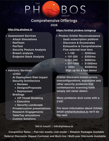
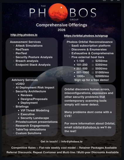
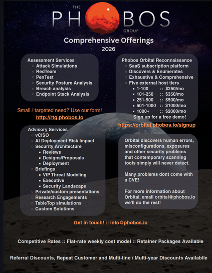
I'm putting together a 1-pager for Phobos Groups offerings this year. Any designers want to fling critiques at it?
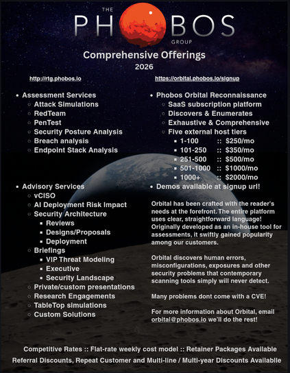
@Viss Two minor suggestions:
1) Bump up the internal padding on the rectangles containing text. Give the text inside some breathing room, don't want it bumping up against the wall of the container
2) Drop the bullets on the top-level items in each container. Bullets are only helpful if they're attached to a list; just one item doesn't need them. The containers do a good enough job of separating out the different groups by themselves
@Viss
The boxes aren't the same width, which makes me twitchy. Maybe make them all the same width and the top top and bottom bottom line up.
Typo in last word: available
Empty bullets are hard to see
Maybe move orbital signup url into the box?
Move "sign up for a free demo" either down a line or left
Somebody is going to whine about the http url
Maybe for the first three boxes center/bold/bigger the title and remove one level of bullets
This will be expensive to print on an inkjet.