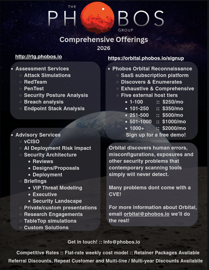
I'm putting together a 1-pager for Phobos Groups offerings this year. Any designers want to fling critiques at it?
@Viss Two minor suggestions:
1) Bump up the internal padding on the rectangles containing text. Give the text inside some breathing room, don't want it bumping up against the wall of the container
2) Drop the bullets on the top-level items in each container. Bullets are only helpful if they're attached to a list; just one item doesn't need them. The containers do a good enough job of separating out the different groups by themselves
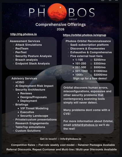
@Viss Exactly!
The padding on the bottom of the top right container is a little tight, but otherwise I think that's right on