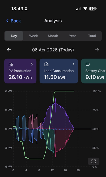
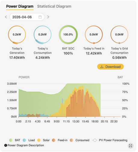
The app that controls and reports on the dance that takes place between my solar panels, the battery system, the heat pump, the house and the grid has many simple graphs (usually comparing just two things). I say that because I know that some may complain this one, knitting everything together, is overwhelmingly complex. After a few days, however, I’ve come to appreciate what it does, displaying the phases of operation in a single day. Read on as I explain…