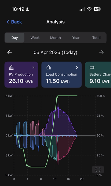
The app that controls and reports on the dance that takes place between my solar panels, the battery system, the heat pump, the house and the grid has many simple graphs (usually comparing just two things). I say that because I know that some may complain this one, knitting everything together, is overwhelmingly complex. After a few days, however, I’ve come to appreciate what it does, displaying the phases of operation in a single day. Read on as I explain…
The easy one first: The bright green line shows the state of charge of the battery. The SOC was 100% at this time last night. At that time solar generation ended and the house was essentially off grid with the battery meeting all demands. In this graph it had already depleted to about 50% at midnight (far left) and you see it steadily dropping to the 10% safety margin by about 4.50am. It stays there with the house now now drawing grid power until around 9am when the solar comes back on in ..
..sufficient strength to charge the battery back up. Solar provid3d enough power to completely recharge the battery by noon. I had hoped the battery would last till the solar came back on for a full 24 hours without the grid but last night was very cold and so the heat pump drew more power to keep the house a constant 19C. Tonight is milder and I hope for success this time. As to the rest of the graph, things above the x-axis are sources of power which we aim to juggle: solar, battery and grid.