šŸ“± New member special! šŸ“±

ATP Tier List: Home Screen Icons
https://atp.fm/atp-tier-list-home-screen-icons

Ranking the app icons on our iPhone home screens, including built-in Apple apps, third-party apps, and — somewhat awkwardly — even our own.

Join now to listen! https://atp.fm/join

Accidental Tech Podcast: ATP Tier List: Home Screen Icons

Three nerds discussing tech, Apple, programming, and loosely related matters.

@atpfm does no one else see the App Store icon as the letter ā€˜A’ ?

ā€˜A’ for App Store

@cframe Yes, everyone does, I think.
@atpfm Pretty sure the bottom right corner of the Calendars 5 icon is the flag of Ukraine. (The previous version of the icon did have a page curl.)
@atpfm It’s certainly disappointing that this tier list doesn’t have chapter artwork for each app icon like you’ve done in the past.
@atpfm Either Overcast was being buggy, or y’all pushed a fixed file. Either way, chapters are somehow working now, so I retract my complaint. Looking forward to listening to the rest of the episode.
@lukeratta The chapter images have been in there from the start, FWIW.
@atpfm I’d love an ATP Insider/Dev where you discuss your specialties. One episode per host. For example, @marcoarment on SQL schemas and shepherding Mac Minis. @caseyliss on SwiftUI and Docker magic. @siracusa on Unix and backend wizardry.
@atpfm Really fun episode! FYI the blue/yellow swoosh in Calendars 5 represents Ukraine pride and solidarity, and I believe was added to all of Readdle’s major apps around the start of the Russian invasion, as the company was founded by four Ukrainian developers.
@atpfm @siracusa This will not have gotten all of your needed icons, but many could have been extracted from web browser pages of the App Store in Safari or using one of my favorite shortcuts:
@mvk I tried all the public App Store websites and APIs I could think of! I got some images from there, but most of the stuff they vended was not useful to me.
@atpfm Ok I literally have never noticed the text on the Mail App icon until this episode.
@mvk Ah, the telltale truncated edges of an app icon extracted using one the promising but ultimately non-working techniques that I had to discard.
@siracusa I believe this is a consequence iOS 26 😭. It didn’t used to do that.
@mvk Tell me about it…

@atpfm guys… have you never ever seen Support Ukraine ribbon before??? It’s been only FOUR years since the brutal invasion by ruZZians.

šŸ’™šŸ’™šŸ’™ blue for sky
šŸ’›šŸ’›šŸ’› yellow for sunflower fields

I use great PDF editor from the same dev. I think you can opt for non-support icon.

@atpfm @siracusa Calendars 5 is made by Readdle, a Ukrainian company. Maybe a great homage to their country, but terrible for every icon. At least their email client Spark lets you opt out
@atpfm @marcoarment you missed my favorite thing about the Flighty icon, which is that in dark mode, the plane has little lights on its wingtips just like a real plane! Very clever!
@mandrous @atpfm OMG that’s incredible.
@atpfm I believe the Calendar 5 ribbon corner of blue and yellow is in support of ukraine. the developer Readdle is Ukrainian. https://en.wikipedia.org/wiki/Readdle
Readdle - Wikipedia

@atpfm great episode. One thought I had during my verbal disagreement with the episode during my drive to work; why doesn't @siracusa add a tier list input to the member portal so we can see how we stack up against ATP as individuals and as a audience? Just a thought for member benefits.
@atpfm @caseyliss @marcoarment @siracusa What would you rank the WordFlow icon? I HAVE to know!
@TheEjj 😬
@siracusa does it help that the app is called WordFlow and it’s supposed to look equal parts word processor and flowing water?

@atpfm just finished the episode, and as a calendars5 user I’d like to add… the blue/yellow in the corner is a Ukrainian flag. Readdle’s HQ is in Ukraine

They also removed it on the new app @siracusa

@atpfm you sent me off on a mission. I'm with @marcoarment and never liked the new Google icons. I've always get them mixed up so started looking for ways to revert them.

Still a work in progress but I like the mid 2010s look more.

@v600 @atpfm Your kid is making the same face I do when I look at their current official icons.

@atpfm my son (14) caught the discussion of the Phone.app icon with me, I asked him if he knew what the thing on the icon was:

ā€œa phoneā€
ā€œhave you seen one like that?ā€
ā€œI think, like at the museum, but just a rectangle wouldn’t look good on the iconā€
🫠

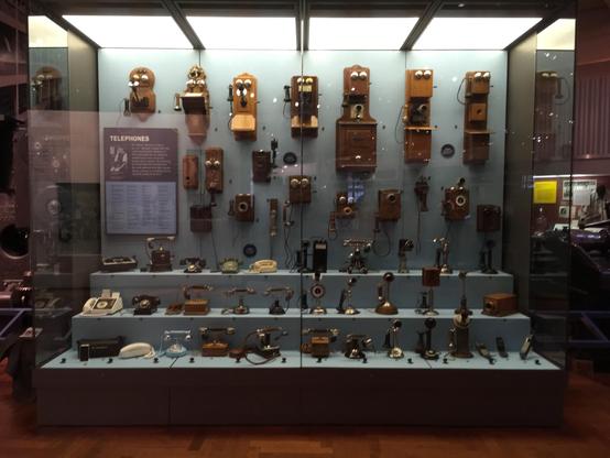
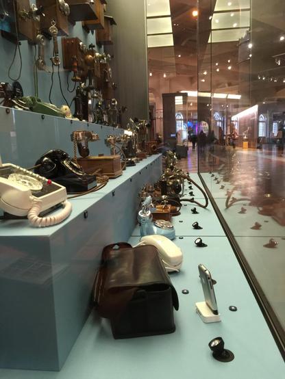
@zenwheel @siracusa @atpfm I mean… I’m gen z and have a rotary telephone in my house right now, but even for me I brought a spare one in to class in elementary school for a lesson on antique technology bc nobody else (except the teacher) had seen one

Landline phones in general, but especially wired ones, aren’t very common anymore and are thus used as icons because they’re *the* de facto icon for a telephone. Much like how floppy disks are the save icon, phone cameras make a shutter sound, etc. It used to be skeuomorphism, but at this point, esp for kids, that’s just the icon.

@avakining oh yes, explaining pulse dialing to the kids was fun; into the 90s phone companies had a surcharge for tone dialing which my dad refused to pay so we always had a rotary phone growing up.
@avakining @zenwheel @siracusa @atpfm I was born in the 80s, I haven’t seen these much in my life, last time was probably 20 years ago?
@zenwheel pay phones are all but gone in the UK but that’s where this shape of phone lives on in 2026. Not in people’s houses.
@zenwheel @atpfm I got flashbacks to few years ago the time I was explaining VHS tapes to my teenage nieces. ā€œWhat do you mean ā€œrewindā€?ā€
@zenwheel @siracusa @atpfm In 2016, the Henry Ford museum had a display of the evolution of phone design…
@atpfm I always felt that the Messages app icon should be a blue bubble
@atpfm This episode highlights the mantra of "taste is not evenly distributed" by showing that even _within_ a single person, it varies wildly šŸ˜†