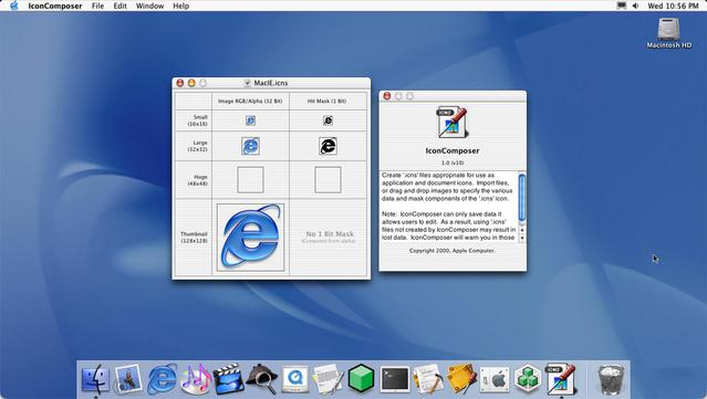
Icon Composer looked a little different in 2001
@uliwitness @stroughtonsmith Thanks for the explanation! 🙏
Sounds a bit overkill for an icon. Why would you want to make it harder to click/open your app? Guess that’s why it doesn’t exist anymore 😅
@stroughtonsmith @uliwitness That makes sense, so by default the full transparent areas didn’t register clicks, but you could manually force it. Not the other way around.
Still a weird choice in the first place, to make transparent areas not registering clicks. At least for an icon.
@stroughtonsmith @alexkaessner @uliwitness macOS *is* doing hit testing automatically, to this day! In icon view in the Finder, try clicking an icon with a fancy shape: the 0-opacity parts are not clickable.
I think that’s pretty much an anti-feature, but it must have been very cool in 2001.
@Cykelero @stroughtonsmith @alexkaessner @uliwitness The hit mask was a cool thing in 1984 with System 1. Those masks also acted as the 1-bit alpha channel of the icon at that time.
I don't think they are a UI mistake. Clicking outside an icon is expected to deselect whatever is currently selected, so if you click somewhere that looks outside an icon it should do that. Perhaps it's silly when there's a hole in the middle, but I think it makes sense for the outer areas to define the shape.
@Cykelero @michelf @stroughtonsmith @uliwitness Oh I see, it indeed still works in Finders icon view. Though, it does ignore the transparent areas for deselect. The auto mask only works for *select* hit testing 👀
The Dock also ignores the transparent areas. Which IMO is a good thing! Would be quite annoying otherwise.
In fact, I don't see a good reason you want that at all. I mean who is stacking icons on top of other interactive elements anyways? 🤔
@Cykelero @stroughtonsmith @alexkaessner @uliwitness It was always "unnecessary" in the sense that there was always enough space around. Unless you manually arrange your icons too close.
I think in general there's a usability gain in having "what you click on is what you get" without having to consider invisible hit rects.

