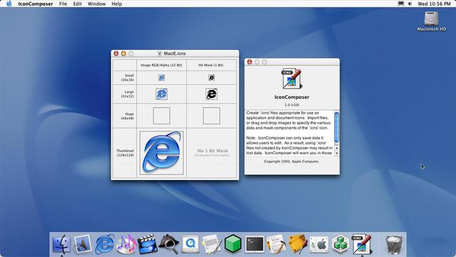
Icon Composer looked a little different in 2001
@uliwitness @stroughtonsmith Thanks for the explanation! 🙏
Sounds a bit overkill for an icon. Why would you want to make it harder to click/open your app? Guess that’s why it doesn’t exist anymore 😅
@stroughtonsmith @uliwitness That makes sense, so by default the full transparent areas didn’t register clicks, but you could manually force it. Not the other way around.
Still a weird choice in the first place, to make transparent areas not registering clicks. At least for an icon.