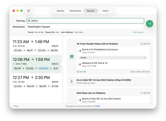
I wanted a more interesting selection state for my app. Initially I wanted the highlight to be pointy on the right side so you know data & details flow to the right.

But my friend @tuomas_h (always challenging me to something better) suggested a little triangle tab pointing from the details to the selected row.

Through illusion, I got it to work using NSSplitViewController without doing something gross or abusing AppKit. The little arrow tab even follows on scroll! 😄

#AppKit #SwiftUI #macOS

Of course, this is just a proof of concept -- not close to being complete. Just trying out things :) But I am liking it.
🧵⬆️
Other ideas including just relying on a shadow from the right/details pane overlaid the left/source list by removing the visual divider. #AppKit #SwiftUI #macOS
@marioguzman FWIW I liked the previous one with less blur radius/shadow as divider better, but the highlighted cell background works beautifully! The idea is really cool to make the split view do a bit more than usual
@marioguzman @tuomas_h that is really nice 👏🏼
@marioguzman @tuomas_h I like the conceptual change behind the direction of the arrow, from pointing *at* the thing on the right to emanating *from* the thing on the left, sort of like a thought bubble or an NSPopover. Whatever you end up deciding, it's a neat creative exercise and a flex of your coding skills.
@marioguzman @tuomas_h Love the triangle detail, “but:” It’d be so awesome if the Edit Options link had a good old disclosure triangle. After all, it expands/collapses that control panel "drawer." Without that visual affordance, it wasn't immediately clear to me what that link would do. 🧐