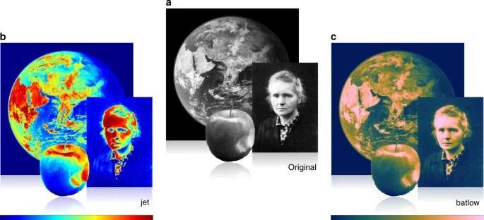
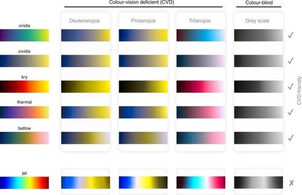
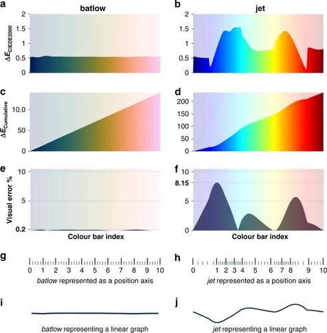
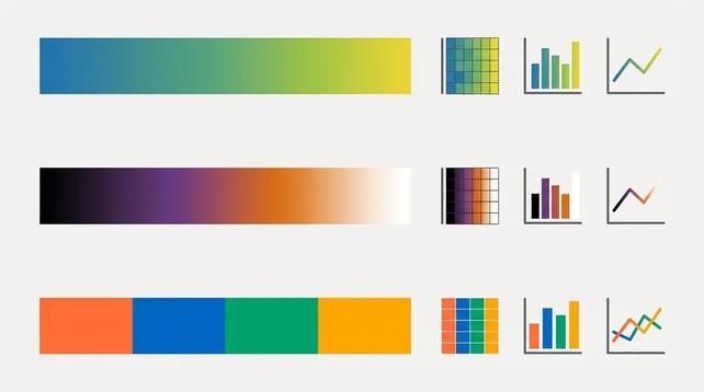
๐Ÿ“Š This paper by Crameri et al. from 2020 shows why #color choice in figures matters.

Rainbow ๐ŸŒˆ and redโ€“green colormaps ๐Ÿ›‘โ‡๏ธ can distort gradients, create artificial boundaries, and exclude readers with color-vision deficiency. They quantify the visual error and argue for perceptually uniform, #CVD-friendly scientific colormaps instead.

๐Ÿ“„ https://doi.org/10.1038/s41467-020-19160-7

#DataVisualization #OpenScience #ColorVision #DataScience

And just found this: 7 #Colorblind-Safe Color Palettes for Scientific Figures. Copy-paste #OkabeIto, #Viridis, Paul Tol & Wong palette #HexCodes. #CVD-friendly palettes recommended by Nature, with side-by-side comparisons and usage examples:

๐ŸŒ https://conceptviz.app/blog/scientific-color-palette-for-research-papers-and-posters

#DataVisualization #OpenScience #ColorVision #DataScience