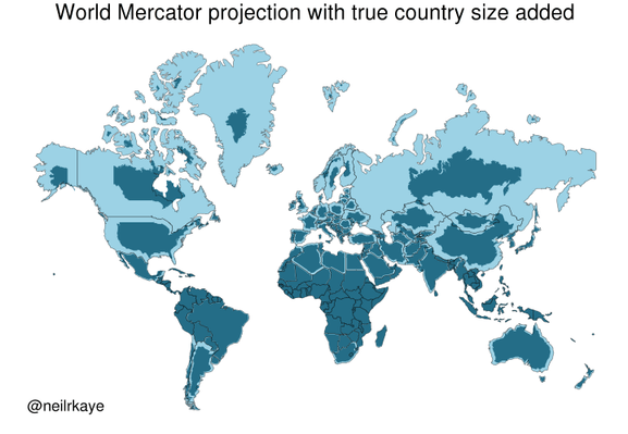
Yet another reason to tut at the Mercator map projection
https://brilliantmaps.com/mercator-vs-true-size/
https://brilliantmaps.com/mercator-vs-true-size/
Can we see a map where it's flipped? I mean where the south is made bigger just as now the north is. Just to have a comparison of what we have been looking at all the time.
Ah yes, I thought the equator was the height of northern africa but it's in middle africa.
No wonder human perception is so flawed with such input. I too had a misconception of where the equator fell on Africa. I'm glad the link does put Antarctica in perspective on a subsequent map. GIGO
you could use an oblique Mercator projection, but that only makes one side of the northern hemisphere larger
https://en.wikipedia.org/wiki/File:Mercator_Polar_Transverse.gif
#mapprojection #geodesy
Sure, projecting a quasi-spheroid onto a plane will always cause distortions, but you can choose what to distort. Mercator keeps compass bearings and distorts shapes. The Albers Equal-Area projection, among others, keeps sizes but distorts shapes much more. Anyway, you can always calculate the surface area of land. In fact many countries in the world have been quite thoroughly surveyed.
@tsukkitsune @toddhorowitz @infobeautiful
This!!
I asked in my ArcGIS class if the distortions resulted from using the ideal shapes of classic geometry to try to fit across the random shapes of the actual Earth. With the implied corollary of who got to choose which wrongness.
That guy said "Whoah! That [very basic question] is a bit above my pay grade" and skipped to the next question.
First calculate the (scaled) plane area of the figure as shown on the Mercator projection, then take the square root of the ratio between that area and the true area, and multiply the linear dimensions of the Mercator projection by that quantity. That will give you a figure of the same shape as the Mercator projection but with the area reduced to allow true comparisons. The result is not a map, but a geographical data visualization.
And then that helps to show people that, for instance, Greenland is NOT bigger than Brazil! It makes the point more vividly than a table of data. And that's usually the point of visualizations.
Greenland's land area is approximately six times the size of Germany. Greenland has roughly the same size as Saudi Arabia. The USA is rougly 5 times bigger than Saudi Arabia.)
(I have heard this this week and just verified it with wikipedia, I found this comparison helpful)
@infobeautiful ah sure Greenland is TINY.
Denmark should just hand it over and quit this dog in the manger stuff.
/s
Author of this map:
https://www.metoffice.gov.uk/research/people/neil-kaye
The USA isn't that big, let's invade it!
It's already *has* been invaded. Successfully. That's where the "stolen land" in "built by slaves on stolen land" comes from.
Let's create new slaves and rebuild what they destroyed.
We *are* the new slaves. If you *have to" work, you're a slave.
"Formerly the master selected the slave; today the slave selects his master." -- Albert Parsons
That's true.
@irfan @LevZadov @infobeautiful
The destroying part is pretty annoying, because they don't destroy themselves, but others and the whole planet.
@utopify_org @irfan @infobeautiful
They sow the seeds of their own destruction. It's almost as if deep down inside they actually *want* to wind up swinging from lamp posts. Why else would they want to make so many people hate them? It can't be only for money. They could actually make more money in the long run if they didn't sell their customers such crap and treat us with so little respect. Money alone doesn't explain it. It's almost as if some malicious entity was pulling their strings. Is it even human, or are the personal chat bots of oligarchs actually in charge and it's they who are telling our rulers what to do to us next? It's getting harder and harder not feel like we've fallen into some sci-fi dystopia horror story where machines rule, humans slave, and the oligarchs are just our straw bosses. Every day the news sounds more like something written by an AI. Next time you hear some talking head on a screen say, "You can't make this stuff up," remember that an AI can, has, and will again, if we the people don't put a stop to it. We could, you know, but we don't. Whose fault is that, ours or the machines'?
@infobeautiful
Just learned something.
On the typical Map, that I had in school, the size of nealry every country was wrong.
Thx for this.
Now I have a new rabit-hole...

They gave some Eastern Canada provinces to the US. Don't comply in advance!
Fascinating, thanks!
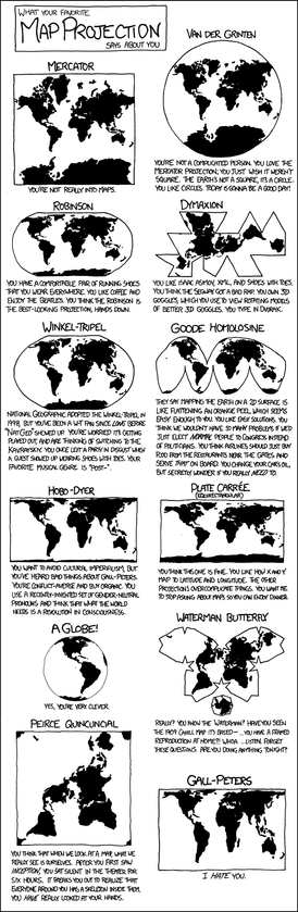
Here's obligatory link to great bit from TV's "The West Wing." Where cartographers compare Mercator versus Peters projections for stunned C.J. and Josh.
The head map guy is played with perfect drollery by the invaluable John Billingsley (Star Trek: Enterprise; The Man from Earth, etc.).
Cartographer: "Nothing's where you think it is."
C.J: "Where is it?"
Cartographer: "I'm glad you asked…"

Kazakhstan is huge, but it's not that huge.
Maybe I'm confused about what this is showing.
@infobeautiful Very useful to see. Done by a professional, so I must be wrong, but where I am (north New Zealand) is at about the same latitude as San Francisco, but we seem to be less shrunk?
Re discussion about more realistic projections, my favourite is Cahill-Keyes. http://www.genekeyes.com/world_map_poster.html
@quixote @infobeautiful Here is a better Cahill-Keyes world map, without the extremely misleading overlaid rectangular grid. Instead, just actual geographic parallels and meridians are shown. Also, Antarctica is handled better, even if partially duplicated.
But as always with non-contiguous projections, there will be small or even large islands that get split, or at least separated widely from their close neighbours. And the easternmost bit of Siberia is cut off from the rest.
I am sure that if this was a widely used projection, people would also start more or less wild theories that distortions in this map projection is a cause of some foreign policies. From Wikipedia: https://en.wikipedia.org/wiki/Cahill%E2%80%93Keyes_projection
@tml @infobeautiful _And_ it includes Antarctica! Excellent map.
Plus maps are always better when the political boundaries are not the main thing.
A very bad graphic. The point is taken but that map is very inaccurate. Eg the Canadian southern border should fit perfectly with the USA but it is shrink way too much. There are much better maps which account for there projection errors.
What this map shows is that America's penis (Florida) is much smaller than Americans think.
@infobeautiful "Yet another"? Isn't that the one single reason why people keep tutting at it all the time?
(And, sadly, many probably think that Mercator is the only projection with this particular distortion or that there are ideal projections that don't distort anything.)
@infobeautiful i’m definitely a fan of the Peters Projection.
I clearly remember a 🤯 moment from first or second grade when I saw it for the first time!


 🟣
🟣