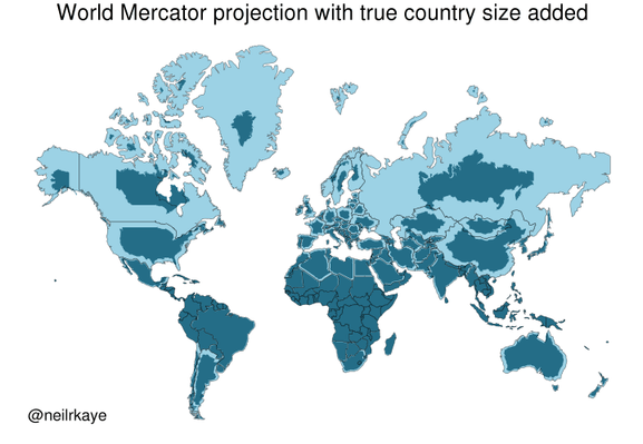
Yet another reason to tut at the Mercator map projection
https://brilliantmaps.com/mercator-vs-true-size/
https://brilliantmaps.com/mercator-vs-true-size/
@infobeautiful Very useful to see. Done by a professional, so I must be wrong, but where I am (north New Zealand) is at about the same latitude as San Francisco, but we seem to be less shrunk?
Re discussion about more realistic projections, my favourite is Cahill-Keyes. http://www.genekeyes.com/world_map_poster.html
@quixote @infobeautiful Here is a better Cahill-Keyes world map, without the extremely misleading overlaid rectangular grid. Instead, just actual geographic parallels and meridians are shown. Also, Antarctica is handled better, even if partially duplicated.
But as always with non-contiguous projections, there will be small or even large islands that get split, or at least separated widely from their close neighbours. And the easternmost bit of Siberia is cut off from the rest.
I am sure that if this was a widely used projection, people would also start more or less wild theories that distortions in this map projection is a cause of some foreign policies. From Wikipedia: https://en.wikipedia.org/wiki/Cahill%E2%80%93Keyes_projection
@tml @infobeautiful _And_ it includes Antarctica! Excellent map.
Plus maps are always better when the political boundaries are not the main thing.