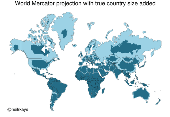
Yet another reason to tut at the Mercator map projection
https://brilliantmaps.com/mercator-vs-true-size/
https://brilliantmaps.com/mercator-vs-true-size/
A very bad graphic. The point is taken but that map is very inaccurate. Eg the Canadian southern border should fit perfectly with the USA but it is shrink way too much. There are much better maps which account for there projection errors.