Yet another reason to tut at the Mercator map projection
https://brilliantmaps.com/mercator-vs-true-size/
https://brilliantmaps.com/mercator-vs-true-size/
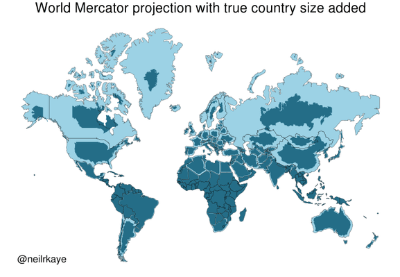
Sure, projecting a quasi-spheroid onto a plane will always cause distortions, but you can choose what to distort. Mercator keeps compass bearings and distorts shapes. The Albers Equal-Area projection, among others, keeps sizes but distorts shapes much more. Anyway, you can always calculate the surface area of land. In fact many countries in the world have been quite thoroughly surveyed.
First calculate the (scaled) plane area of the figure as shown on the Mercator projection, then take the square root of the ratio between that area and the true area, and multiply the linear dimensions of the Mercator projection by that quantity. That will give you a figure of the same shape as the Mercator projection but with the area reduced to allow true comparisons. The result is not a map, but a geographical data visualization.
And then that helps to show people that, for instance, Greenland is NOT bigger than Brazil! It makes the point more vividly than a table of data. And that's usually the point of visualizations.