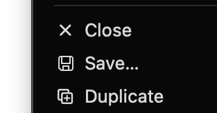
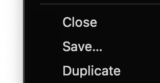
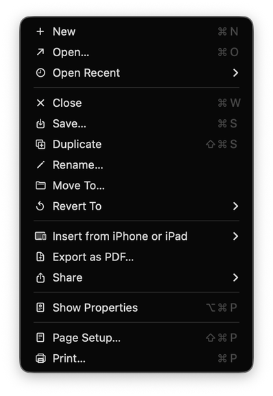
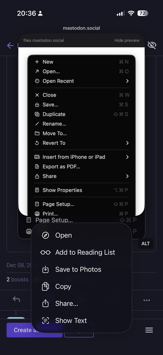
On Tahoe, why is the image next to the save command in the File menu “square.and.arrow.down”, but the export and share commands are “square.and.arrow.up” and import has the arrow pointing _down_?
@jamesthomson It's perspective. Saving is going down from app to disk. Exporting/sharing is going up from app to wherever. Importing is bringing down from wherever to the app. It would then need to go more down to get to the disk.
Or something, I dunno. I just make stuff up and post on the internet.
Why is Open a diagonal arrow to the upper right?
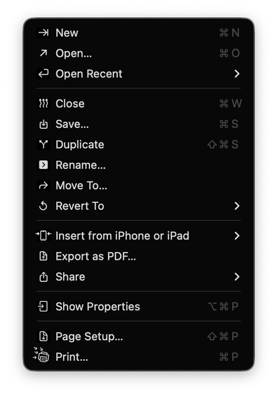
@jamesthomson down: into the app, up out of the app.
(Yes both save and export write to files, but save is inward looking, export outward)
Also consistent with longstanding use.
@jamesthomson I suspect the reason is that those icons began on iOS, where the “save” icon most often means “take this photo [from an app/website/etc.] and keep it in my device” and the “share” icon means “take this item and send it to someone else’s device.” They make sense in that context, less so on MacOS.
I can’t say why they went with the arrows they did for icons that didn’t already exist, but I wouldn’t be shocked if the people who put them there couldn’t either.
@jamesthomson it’s actually a great cognitive psychology trick!
Put symbols next to ALL items, so that the brains can not assign different priorities. Make them very small so that they have no visual weight and are hard to distinguish. Then most importantly, make them completely meaningless so that they can be correctly identified as visual noise and get filtered out by the V1 cortex long before they can hit the prefrontal cortex.
You get the SAME task performance as if they weren’t there.
@maxoakland What level of denoising would be your preference? Are fav-icons for bookmarks ok? What about tag colors? What about let’s say text justification options left|center|right? Does preference change for context menus compared to app menu?
More talk on menu icons here:
https://mastodon.social/@mrudokas/115700249433987843