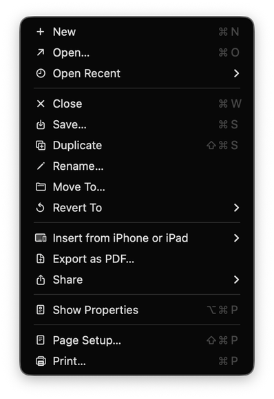
On Tahoe, why is the image next to the save command in the File menu “square.and.arrow.down”, but the export and share commands are “square.and.arrow.up” and import has the arrow pointing _down_?
@maxoakland What level of denoising would be your preference? Are fav-icons for bookmarks ok? What about tag colors? What about let’s say text justification options left|center|right? Does preference change for context menus compared to app menu?
More talk on menu icons here:
https://mastodon.social/@mrudokas/115700249433987843