If Apple still had courage they would've opened the keynote with this. @atpfm
@lensco @auxonic @atpfm But I can't r.....oh
@dan613 @lensco @auxonic @atpfm Instead of complaining about the readability you could ask Siri to read the text. Or you could take a screenshot, save it to your library and have Apple AI highlight the text for you. And I’m not even going to dive into the accessibility settings here. So many easy solutions, it‘s almost as if you wanted to complain here 🤣
@sanpan @lensco @auxonic @atpfm Yeah, in reality I would turn off the transparency or choose a more suitable background. Basically subverting the intended experience.

@sanpan @dan613 @lensco @auxonic @atpfm I'm genuinely not sure if this reply is satire!

(In the off-chance it isn't: defaults matter)

@hisham_hm @sanpan @dan613 @lensco @auxonic @atpfm I was also looking for the /s at the end!
@aerique @hisham_hm @dan613 @lensco @auxonic @atpfm Sorry for the confusion. I´ll do better next time.
@sanpan @dan613 @lensco @auxonic @atpfm I am using an Apple with Voiceover on and it couldn't read that trash either. Those of us who rely on the accessibility settings are not fans of this redesign. Stop using us as your mouthpiece.

@razzek
Wait a minute. Are you saying that Voiceover takes a screenshot of the screen area in question and shoves that into some OCR to read the result to you?

Steve is dead. Oh dear, Steve really is dead.

@sanpan @dan613 @lensco @auxonic @atpfm

@sanpan aparenlty thoughtful sarcasm is risky on here. I at least appreciated it.
@sanpan @dan613 @lensco @auxonic @atpfm thank you for this. A great bonus chuckle
@dan613 @lensco @auxonic @atpfm I assume that this is self made and wasn't ever something official, right?
@lensco srsly Apple, grow a pair...
@lensco I’m still on iOS 18 on an older device, and when watching the video from within the Apple Store app, the volume control contrast between volume slider and total bar at times was zero. When I’d try to take screenshots of it, they’d be perfectly legible. I felt like I was taking crazy pills.
Maybe it was only during HDR footage? Either way, until I took a screenshot that volume slide was entirely one shade of gray
Arg! It happens during the early part of the event video when Tim cuts to the airpod commercial that evokes old iPod commercials with the dancing and the silloettes, but the moment i screen record or screenshot the contrast goes to normal. Definitely an HDR playback thing for ios18
@lensco @atpfm @siracusa I think "Liquid Ass" is the perfect moniker, because the whole UI sure looks like it.
@lensco chef’s kiss, sir! Chef’s kiss.
@lensco @brunty @atpfm Did they actually unironically use this? I didn’t watch the keynote.
@ramsey The event really did open with that quote (but it was white text on a black background).
@lensco @atpfm Design is not just what it look, design is how it Steve

@lensco @atpfm

"Design is not just what it looks.
Design is how it.

- Steve I."

💯

@lensco @atpfm Apple is the new Microsoft - reminds me of the glory days of Windows Vista 😂

@lensco @atpfm

Good grief. You almost know that the image was created by an LLM with no useful human input.

@lensco You sir won the internet today. Scratch that, this month.

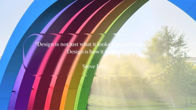
@lensco "Design is not just what it looks"
"Design is how it"
"Steve J"

Did you know that light text on a light background provides insufficient contrast to be readible?

@aeveltstra to state the apparently not so obvious: that’s the whole point of the post.
When designing UI overlays, you mustn’t make assumptions about the eventual backdrop. Liquid Glass, however, requires detailed knowledge (i.e. averages won’t do) of the backdrop beforehand and choosing foreground colours accordingly, or fails admirably, as depicted here — and as people have been vocally pointing out since the WWDC-Keynote.
@danyow Thank you! That went straight over my head. Totally agreed.
@lensco omg this is genius. Lol 😂😂😂
Apple’s “liquid glass” isn’t just an accessibility blunder — it’s an environmental one too

This flashy design language sacrifices performance and longevity for visual flair — and sets a troubling precedent for the industry.

Medium
@lensco @atpfm Weird idea: someone could create a webshop to sell prints/postcards/fracture-style prints of this masterpiece and raise money for St Jude
@lensco Lennart, not 100% sure if I’ll do it but would you mind if I use this image for a personal print? Am currently looking at Fracture style services in the UK. I’d be happy to make a StJude (or other charity) donation mentioning you
@Richard2001 I don’t mind, but the resolution is probably too low…
@lensco Thanks, I’d be looking at the smallest print size available. Not sure if I should do it but having this image printed on acrylic glass would amuse me
@lensco @atpfm
Good design is not putting white letters over almost-white ground.

@lensco @atpfm

Am I the only one who is disturbed by the order of the "rainbow" colours?

@lensco @atpfm

Seriously apple just ditch the transparency and go into pure skeumorphism. Clearly you got some neat shaders for translucency just do it. (Bring back aqua? ig?)

@lensco @atpfm

Well now that i see it i understand

@lensco @beej @atpfm I'm using Voiceover on an Apple device right now and it couldn't read that. XD
@atpfm @lensco Graphic design is my passion!🤣
@lensco @atpfm Where is that screenshot from?
@lensco Perfect. 10/10 no notes.
@lensco I think they removed their courage a few years back. Said it was to improve waterproofing.