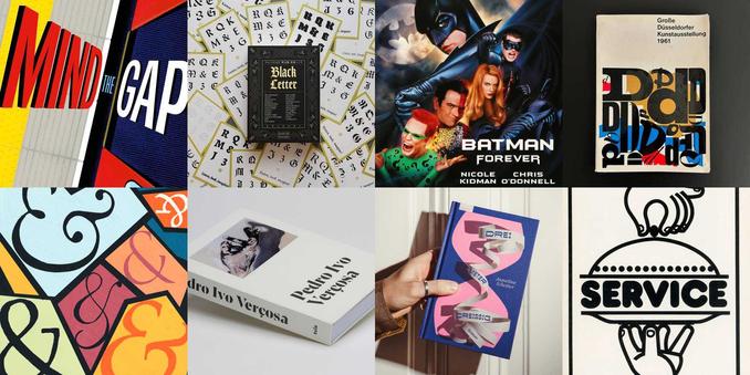
Doing research for an article I had to compile this list, and friends, it sent shivers down my spine.

Linotype, 2006; China Type, 2006; Ascender Corp., 2010; Bistream, 2012; FontShop / FontFont Library, 2014; URW, 2020; FontSmith, 2020; Hoefler & Co., 2021; Berthold, 2022; Milieu Grotesque, 2023; Fontworks, 2023; 39 typeface families by David Berlow from the FontBureau Library, 2023; Colophon Foundry, 2023; SharpType library, 2024; DSType library, 2024.

Crass seeing em all together like this.

Let me know what I missed!
Of course @FontsInUse has a great list. Thank you Fontsinuse!
https://fontsinuse.com/foundry/61/monotype
Monotype

The Monotype name has been used by three distinct firms. 1. Lanston Monotype Cooperation, founded by Tolbert Lanston in Philadelphia, Pennsylvania (USA), in 1887. In 1896 Lanston patented the first hot metal typesetting machine, known as the Monotype, see Monotype System and Monotype typefaces. Associated designers of note include Frederic W. Goudy and Sol Hess. Licenses for the Lanston type library have been acquired by P22 Type Foundry in 2004, see Lanston Type Company. 2. Monotype Corporation Limited, set up as a branch in London (UK) in 1897 under the name Lanston Monotype Corporation Ltd. Later an independent company based in Salfords. “Lanston” was dropped from the name in May 1931. A.k.a. English Monotype. Key executives included historian and adviser Stanley Morison, publicity manager Beatrice Warde, engineering expert Frank Hinman Pierpont, and draughtsman Fritz Stelzer. Associated designers include Eric Gill and Berthold Wolpe. Went into receivership in 1992. Bailed out by Microsoft “in exchange for allowing any or all of the entire MT library to be embeddable in Microsoft products” [Griffin]. 3. Monotype Imaging Inc. The successor to Monotype Corporation Ltd. was acquired by Agfa-Compugraphic in 1999 and renamed Agfa Monotype. Acquired ITC in 2000 and launched Fonts.com as font distribution website in 2001. Acquired by TA Associates, a private equity firm based in Boston in 2004, and incorporated as Monotype Imaging. Bought back Ascender Corp. in 2010, which had been formed by former employees in 2004, “taking with them quite a few major clients like Microsoft, Google, Blackberry and a few car companies.” [Griffin] Acquired by HGGC, another private equity firm, in 2019. Monotype acquired Linotype GmbH (2006), China Type Design Ltd. (2006), Ascender Corp. (2010), Bitstream Inc. incl. the major font distributor MyFonts (2012), the other major font distributor FontShop incl. the FontFont library (2014), Fontsmith (2020), URW (2020), Hoefler & Co. (Sep. 2021), the Berthold library (Aug. 2022), Milieu Grotesque and typefaces by Paulo Goode (March 2023), typefaces by David Berlow of Font Bureau (May 2023), Fontworks (July 2023), Colophon (Dec. 2023), and typefaces from Sharp Type (Feb. 2024).

Fonts In Use
@kai @FontsInUse Time for a proper map. With real time updates and so on.
@letterror @kai I think I remember @underware working on something like that. At least they had a paper sketch they were passing around ATypI Montreal.

@typographica @letterror @kai This list below is probably not correct and still incomplete. But these are likely missing from your overview.

Pre-Monotype:
1996: Heidelberg buys Linotype-Hell
1997: Agfa buys Monotype
1999: Agfa-Monotype buys EyeWire Type from Getty Images
2000: Agfa-Monotype buys ITC
2004: TA Associates buys Agfa-Monotype (font sector)
2005: Agfa-Monotype renamed to Monotype Imaging

1/2

@typographica @letterror @kai

These are still missing from your list:
2009: Monotype buys Planetweb
2012: Monotype buys Typecast
2013: Monotype buys Stone Type Foundry
2013: Monotype buys The Foundry
2014: Monotype buys Mark Boulton
2015: Monotype buys Swyft (online stickers)
2016: Monotype buys Olapic (social media marketing software)
2019: HGGC buys Monotype
2024: Monotype buys Extensis

Again, with due reserve, list could contain mistakes, and is likely incomplete. Corrections welcome.

2/2

@underware @typographica @letterror @kai But on a complete map, we will also have to include the whole past that flows into foundries they bought. How for example the IP of Lettergieterij Amsterdam (Tetterode) ended up inside the belly of the beast.
@underware @typographica @letterror @kai Talking about the belly of the beast.

One managed to escape!
@lttrspc @underware @typographica @letterror @kai “Escape” would be fitting when the original designer was involved somehow. Isn’t this more a case of “snatched”? Especially since the guy involved is credited on that website as the designer of the typeface. 😕

@lttrspc @underware @typographica @letterror @kai

❝ Mercator ST is designed by Laurenz Brunner and was first released by Source Type in 2025. ❞

https://www.sourcetype.com/typefaces/5328/mercator

Mercator - Typefaces - Source Type

Mercator – Typefaces – Source Type

@boldmonday Other than crediting Dooijes in the description text and in the colophon, what else should they have done in your opinion?

@lttrspc @underware @typographica @letterror

@kai @boldmonday @underware @typographica @letterror I also do not really follow. Brunner made this revival decades ago and it has been the identity of the Rietveld Academy.

Students have been allowed to use it, as long they studied there. Some deal made with Monotype, as far as we know.
@lttrspc how do we know that they made a deal with Mono, out of curiosity?
@kai The Rietveld?
I heard that once.
But would have to check again.
@lttrspc @kai @underware @typographica @letterror I think with publishing and monetisation come greater responsibilities. This is different from creating something just for yourself.
@clauseggers @kai @boldmonday @underware @typographica @letterror Ok, I reached out to many insiders and could not find anyone confirming an agreement with Mono(poly)type.
It seems like the consensus was, that the Rietveld, through their heritage with Dooijes as a teacher and having the type in their letterpress workshop, felt like having a natural right to use the font for their identity.

The conduct to allow students to only use it internally, was probably preconsciousness.
@kai @lttrspc @underware @typographica @letterror What is wrong with: “Mercator ST is a revival by […] after an original design by Dick Dooijes”? I don’t deny it takes skill to create a faithful digitization of an old typeface. But you’re not the designer of that work. Especially if you use the exact same name as the original.
@boldmonday @kai @underware @typographica @letterror But isn’t that widely spread practice?
Most classics are credited by their revivers, sometimes a foundry.

Looking through some Commercial Classics, DTL and Adobe revivals, the original foundry or designers are mentioned, but the design credits are most of the times only the designers that made the revival.

The about page of Mercator ST is pretty open about its origin, history and how it came to be part of Source Type.
@lttrspc @kai @underware @typographica @letterror How many of those are literal digitisations of a 20th century design by a known author, and published under their original trading name? That is the distinction that counts in my opinion. Yes – there are a lot of typefaces based on historical examples that are often re-interpreted or adapted, and published under new names. (Atlas is a very good example.) In those cases there is no doubt who the designer is.
@boldmonday @kai @underware @typographica @letterror I started a list, but thought it was to anal to post. There are many examples. If the 20th century is the cut-off, they are indeed getting less.

Reviving from led/wood to digital seems to be a fairer distinguishing factor then dividing by century.
@lttrspc @boldmonday @kai @underware @typographica Maybe the emphasis shouldn’t be what can be gotten away with without upsetting Monotype, but how you would like your work to be acknowledged and credited once some young person decides to warm it up in a couple of years?
@letterror @lttrspc @kai @underware @typographica The reason I use the 20th century as a reference point is because that is a point in time when authorship in type design got introduced and was even used as a means to promote new typefaces. Mercator is such an example. This is regardless of the material in which the original typeface was produced.
@boldmonday @letterror @lttrspc @kai @underware @typographica But is it even Dick Dooijes design work, if the brief was to rip off Helvetica?
Isn’t Laurence Brunner as a indigenous Helvète reclaiming what belonged to him in the first place? 🤭
@lttrspc @eWalthert @letterror @boldmonday @kai @underware @typographica This is not a good take, either historically or ethically.
Going back to the big picture: I think it is perfectly fine to revive Mercator for the 21st century. A little more Dooijes in the promo would have been beneficial for everyone, though.
@typeoff Dooijes worked on it together with a type committee and with G.W. Ovink, who will have established the design framework.
@MathieuLommen Indeed! A typeface like this often had many fathers.